Related

Stock Strategies
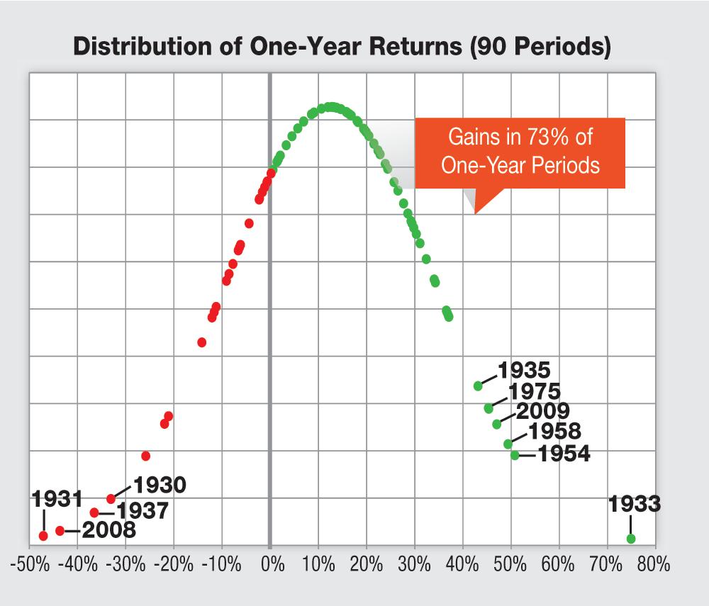
It’s often said that the market rewards long-term investors. The following four charts of large-company stock returns support this claim. As you can see, the longer your investing time horizon is, the less volatile and the less risky the stock market appears to be.
The Bell Curve: For those of you unfamiliar with statistical analysis, a bell curve plots the normal distribution of a set of data. The highest point of the curve represents the midpoint of the range of values. In our examples here, the highest point on each chart indicates the most probable return based on market history. These curves cannot tell you what will happen, only what counted as typical and extraordinary in the past.
During any single calendar year, stocks can incur price swings. Since 1927, large-company stocks have experienced single-year calendar returns as low as –47.1% (1931) to as high as 74.9% (1933). At both ends of the curve, the years with the largest negative (left side) and positive returns (right side) are notated. The location of 2008 and 2009 along the left and right tails, respectively, show just how unusual they were.
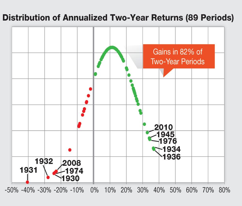
The scale of the chart is unchanged from the one-year chart, but the bell curve is narrower. This is because even increasing one’s time horizon to just two years decreases the variance in returns. The worst annualized return over two calendar years since 1927 was –40.5% (1930–1931), while the best annualized two-year return was 37.0% (1937–1938). Also, pay attention to the alignment of the bell curve. It has shifted toward the right as the occurrences of positive outcomes increased.
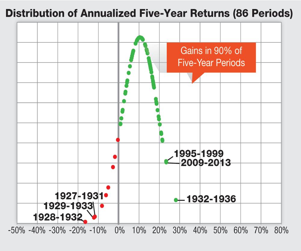
The bell curve is noticeably narrower and further to the right now. The longer holding period smooths out the volatility of year-by-year gains and losses, leading to less extreme returns. There are also fewer negative returns. Notably, six of the nine periods when stocks did drop on a five-year basis occurred during the Great Depression and during the early part of World War II.
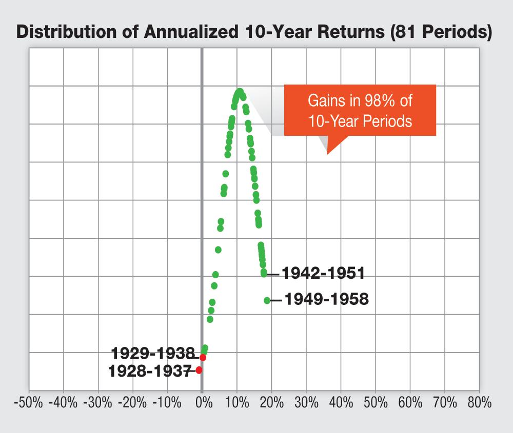
This final chart shows the reward for sticking with a long-term investment strategy. Large-company stocks have realized annualized gains during nearly all 10-year rolling periods. The two times they didn’t (1928–1937 and 1929–1938), the annualized losses were less than 1.0%. Even the so-called “lost decade” of 2000–2009 realized a positive total return (capital gains plus dividends) on an absolute basis.
Stock Strategies

Portfolio Strategies

Portfolio Strategies