


Under penalty of perjury, let me affirm that I am not now, nor have I ever been, a stock market technician. Whether I become one in the future depends upon two things: how long I live and whether I can discover a consistent technical formula or combination of indicators that works as well as my evolving fundamental approach has.
Since I am still firmly in the Warren Buffett-Peter Lynch stock market camp of not trying to outguess the stock market’s fluctuations, I see technical analysis of the stock market as an adjunct enterprise rather than a primary one. Having made my technical disclaimers and voicing my disdain for the short-term fluctuations of the stock market, my increasing concern since the crash of 1987 has been to master additional techniques for improving my chances for success in stock speculation. And this has led me to systematically perform daily and weekly technical analysis in an effort to improve my fundamental market timing and overall performance.
Not unlike fundamental criteria, which taken individually rarely uniformly support the same conclusion at the same time or to the same degree, technical indicators are often at odds with each other. Also, as is true of the effect of fundamental indicators, different technical criteria are more or less predictive at different phases of the market-economic-regulatory cycles, so it would be arbitrary to order them in terms of importance.
Rest assured that one does not have to be a mathematician to do my kind of technical analysis. If you can add, subtract, multiply and divide—actually letting a hand-held calculator or personal computer do the computational work—then you can handle the ratios and formulas that I use. Yes, it does help to have a basic facility with fractions, ratios and percentages (all of which can express the same relationship), but most spreadsheet software (and business calculators) have a simple key sequence for making those calculations.
This article describes in detail one of the indicators I follow—advances and declines.
Advances and Declines
I focus on the New York Stock Exchange (NYSE) because it provides the greatest liquidity, volumes, historical statistics and readily available data. Most of the relationships described for the NYSE can be used in analyses of the over-the-counter market or the American Stock Exchange.
Every market day, some 1,900 to just over 2,000 issues trade on the NYSE. When an equity issue—a common stock, preferred stock or master limited partnership—trades, only one of three things can happen with its market price: At that day’s close, each issue can have advanced or declined or remained unchanged in price compared to its previous close (not necessarily the previous day). Thus, one can obtain and record advance/decline/unchanged numbers from readily available public sources such as The Wall Street Journal, The New York Times, other metropolitan dailies, the weekly Barron’s or online computer data services.
While some interesting analysis can be done with the number of unchanged issues to show the flatness or ambiguity of a market day or period, most students of the market focus mainly on advances and declines and, by natural extension, on the advance/decline line (A/D). My approach doesn’t normally use the numbers on unchanged issues. But newsletter writer Norman Fosback (editor of Market Logic) points out how to derive useful information from the unchanged issues with the “going nowhere” indicators:
The “unchanged issues index” is calculated by dividing the number of issues that are unchanged in price by the total number of stocks traded. The ratio is usually expressed in percentage form. A typical reading might be 15%, although the index has ranged from as little as 5% to upwards of 25%. Low readings are considered bullish and high readings bearish. [From “Stock Market Logic,” by Norman Fosback, published by the Institute for Econometric Research, 1984.]
Supply and Demand
Advancing-in-price issues represent buying—or at least more buying than selling at the moment—on the basic notion that an excess of buyers over sellers (or greater demand than supply) tends to bid up prices. Similarly, selling is represented by stocks declining in price. On any given day, the fluctuations represented by buyers and sellers often appear to be random, as orders pour in from all over the world, some to trade “at the market” (the current price) or at a price limit with the trader hoping to get a better price than market price for a purchase or sale.
When shares offered and bid for—creating selling and buying (supply and demand) pressures—are in temporary balance, a stock may trade unchanged, at the same price as previous trades. Or when a large limit order (“I’ll buy 30,000 shares at $10!”) overhangs the markets, a stock may trade unchanged at $10 for a while, until sellers supply 30,000 shares at $10 or less.
The absolute numbers of advances and declines can be important and sometimes predictive by themselves. Somewhat noteworthy are the days in which 1,000 or more advances or declines are generated. Even more noteworthy are the days when there are 1,000 net advances less declines, or vice versa. Such results indicate tremendous buying or selling pressure.
Still more noteworthy are three or more consecutive days of 1,000 advances or declines, especially if one or more of these days contains the net 1,000 figure. Between October 6 and October 12, 1987, there were five days in a row of over 1,000 declines, which was one piece of scenery setting the stage for the bloodbath that followed. After a one-day respite, there were another five consecutive days of 1,000+ declines, this time with more than 1,000+ net on October 14 and October 15, leading up to the pre-crash collapse of Friday, October 16, wherein 1,638 more declines than advances occurred.
The configuration of declines in October 1987 is unique, and a similar recurrence is not likely. Yet, there have been many other less dramatic periods where the A/D line has provided important indications of market turns and trend reversals. Especially telling are extreme numbers, such as six-to-one to nine-to-one advance/decline days, which indicate tremendous momentum strength on the upside or weakness on the downside. Such extreme days may signal a cycle top or a washout bottom, arguing for an imminent trend reversal.
Recognizing Extremes
To make stock speculation as simple and straightforward as possible, investors need to recognize the implications of extreme readings and the interrelationships with other technical indicators. In practice, it only takes 15 to 30 minutes a day to keep track of them, at least with the aid of an intermediate-level personal computer.
From advances and declines I determine A/D figures, usually expressed as advances-less-declines. If there were 900 advances and 500 declines—with perhaps 500 unchanged—the daily A/D equals 400. As is the case for a large number of technical events, daily results often appear to be random and are usually not particularly predictive. Longer periods such as five-, 10-, 25-, 40-, 150- or 200-day trends and averages are interpreted as defining and projecting continuing trends or indicating new (in other words, reversed) trends. Some technicians favor certain multi-day periods and A/D parameters over others.
A crude rule of thumb is that when there is a cumulative total of at least 2,000 more advances than declines in a 10-day period, the market (for me, the New York Stock Exchange) has become somewhat overbought. Likewise, 2,000 more declines than advances for 10 days indicates a somewhat oversold market condition. When considering 25 days, excesses amounting to 3,000 in one direction or the other indicate overbought or oversold conditions. The greater the sum of advances or declines within each period, the greater the overbought or oversold condition.
The longer the period observed, the more long-term its implications. Ten-day excesses relate to short-term reversals, where short-term is considered a few days to a few weeks; 25-day excesses refer to intermediate-term potentials, or several weeks’ to several months’ duration. Obviously, there can be all manner of crosscurrents in such indicators, which are sometimes mediated by other, less-conflicted indicators, considered in due course.
How It Works: An Example
For practical examples of the technical indicators reviewed here, I will refer to the period of time from November 1, 1988, through March 1, 1989, a more settled (one hesitates to say normal) period than that of the crash of 1987. This period yielded a relatively clear buy signal before a 14% rally and then a topping cycle sell signal.
Figure 1 depicts the advances and declines for the period November 1 through November 16. On November 7, 1988, with the Dow Jones industrial average at 2124.64, there were 2,259 more declines than advances for 10 days (–2,259) and 1,459 net declines for 25 days (–1,459). Strictly on A/D analysis, we could say the market (the NYSE) was oversold according to the 10-day A/D total, and slightly oversold for the 25-day A/D total.
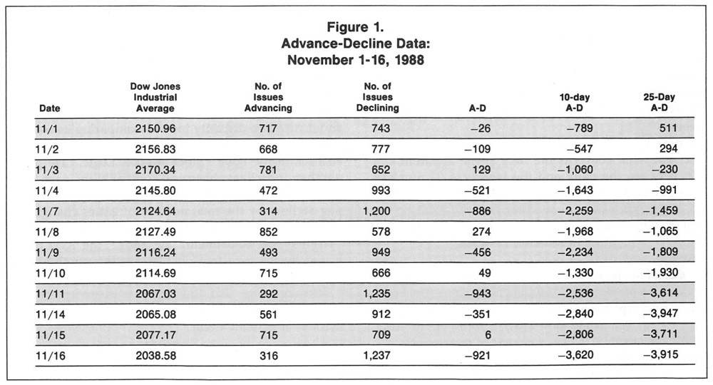
By November 16, with the Dow at 2038.58 or 4.05% lower than November 7, the 10-day A/D was net –3,620, and the 25-day A/D was net –3,915, both indicating a significantly oversold condition. Between November 7 and November 16 there were three days with over 1,200 declines, suggesting a selling-out (if not sold-out) market. Of course, the selling could continue—shades of October 1987—but the idea is that such accumulated selling means:
- Much damage had been done, and
- We were approaching a lower-risk area or a sold-out market.
Without wanting to prejudge this two-element analysis, I will mention that other indicators gave confirming buy signals on November 16. Subsequently, the Dow went over 2300 at the end of January, when it started to signal an overbought market; by March 1 it had dropped back to 2243.
Both empirical observations and commonsense notions attest to the theory that the stock market is a homeostatic mechanism, that is, it is always tending toward equilibrium, and tending to regress toward the norm after having been pushed or pulled to extremes. I like to compare the fluctuations of technical indicators to a pendulum with A/Ds and other criteria oscillating from one side to the other, usually going too far in their swings before starting back toward the midpoint or average.
In a homeostatic stock market theory, overbought markets—which advance in price due to buying pressures—will sooner or later sell off as the “exhausted buyers” give way to profit taking and a normal level of selling. Thereafter, oversold markets will sooner or later rally as bargain hunters and the normal level of buying overwhelms the “sold-out” sellers.
A look at the period around the crash of 1987 indicates how overbought and oversold the New York Stock Exchange became according to these criteria. There were 9,141 net declines for 10 days on October 19 and 11,578 net declines for 25 days on October 28, numbers that seem to make a mockery of calling 2,000 net declines in 10 days a short-term oversold indicator, or 3,000 net declines in 25 days an oversold market, intermediate term. Still, as the market returned to more average oscillations, the traditional parameters were again meaningful, representing more normal overbought and oversold conditions.
Don’t Rely on Just One Indicator
Just as in using fundamental criteria, in which one or a few undervalued fundamentals may not be sufficient to recommend a stock, so too, it is with technical criteria. It is important not to make too much of any one or two indicators, especially if they are out of sync with several others. And it is important to remember that it is the gestalt—the overall pattern, often coordinated with many non-market indicators—that suggests to investors to take aggressive, passive or defensive action in the stock market, based upon an unknown but probable future direction.
Much is made about the advance/decline line (a basic breadth measure) as a confirming or disconfirming indicator to the continued direction of a market’s major average, especially when it registers new highs. You may read that new highs in the Dow Jones industrial averages were not confirmed by the daily A/D line, which topped out several months (or years) earlier. Such relationships—known as disparity indexes—may be important or meaningless, depending upon recognized or unperceived other relationships or anomalies. You should be careful not to accept single technical pronouncements at their purported face value, even from otherwise astute stock market commentators.
There is more than one way to construct an A/D line, but what concerns me here is the apparent conflict between the daily and the weekly A/D numbers. One day I received The Addison Report, dated March 22, 1989, and learned that editor Andrew Addison was bullish long-term, augmented by his interpretation of the A/D line. In the newsletter, he stated:
One of the primary reasons for this optimism is the action of the NYSE weekly advance/decline line. Unlike its daily counterpart, it has been a consistent leading indicator for the market. While most analysts focus on the daily A/D, the weekly A/D has continued to surge to new all-time highs since January. At the market’s post-crash recovery high in mid-February, the weekly A/D was 1255 advances above its prior all-time high in August 1987, when the Dow closed at 2722.
On the same day, I received Stan Weinstein’s completely technically oriented newsletter, The Professional Tape Reader, dated March 24, 1989, and read that all was not well in A/D land:
Another important long-term negative is the ongoing negative divergence that exists between the Dow Jones industrial average and all three of our advance-decline lines ... It has not been one full year since the A-D lines peaked after hitting their post-crash recovery highs. Since then the Dow Jones industrial average has registered a series of new recovery highs but all have been unconfirmed by the daily A-D lines.
... We’ve followed both A-D lines (daily and weekly) for many years, and surprisingly what we’ve noted over the years is that strength in the weekly line usually correlates with intermediate-term up moves, while persistent strength (or weakness) in the daily figures have longer-term meaning. Note that at the August 1987 peak there was no negative divergence in the weekly advance-decline figures but there was one in the daily numbers.
How can the daily A/D line be in a long-term downtrend when the weekly A/D line is in a long-term uptrend for the same period? It is easy to see in the following example. Suppose whenever the “average stock” declines, it loses 12.5¢ (one-eighth point), but whenever it advances, it gains 25¢ (one-quarter point), on balance. If in the “average week” the average stock loses on three days but gains on two, then its daily A/D line would be down while its weekly A/D reading would be up, as the stock would be net up for the week. Or, a stock could suffer three 12.5¢ down days but gain one 50¢ day, again down in its daily readings but up for the week. Actually, there is a long-term downward bias to the daily advance/decline line.
For a solid but not pedantic review of the A/D line and its use as a disparity index—comparing its trend to another stock market average—I refer back to Norman Fosback and his book “Stock Market Logic.”He points out that, to facilitate historical compatibility, each week investors should divide the difference of advances minus declines by the total number of issues changing in price, and accumulate the weekly ratio headings. “Without this adjustment,” he adds, “the A/D line is biased by the long-term increase in the number of issues traded.”
Fosback states that the negative disparity index is flawed and thus indicates about twice as many bear markets as actually occur:
Technicians should note [that] the disparity index is better at forecasting market tops than market bottoms. The 1946-1949 experience is actually the index’s only leading buy signal in the last 50 years. In large part this is accounted for by a long-term downward bias in the advance/decline line making uptrends difficult to achieve. (For example, the A/D line is much lower today than it was 20 years ago.) The downward bias produces frequent periods of negative divergence, with the A/D line moving lower and the DJIA trending higher.
Conclusions
So much here for A/D line analysis. Meanwhile, I still like to see what the simple 10- and 25-day A/D lines—as updated daily—show in terms of overbought/oversold numbers in order to compare them with other indicators.
It is not necessary to be aware of all these relationships in order to obtain predictive or confirming signals from daily and weekly A/D lines. Each week Barron’s provides “more than you want to know” technical data in its Market Laboratory /Stocks section near the back pages, one table of which is the weekly A/D numbers for the NYSE, Amex and the Nasdaq.
Recording and reviewing these totals should give you a clearer picture of the market’s recent, current and trending breadth, according to these indicators.
This article was written by Al Frank for the May 1990 issue of the AAII Journal. At the time, Frank was editor of The Prudent Speculator, a newsletter based in Santa Monica, California, and author of “The Prudent Speculator—Al Frank on Investing.” This article is excerpted from the book “The Prudent Speculator,” and is reprinted by permission of Al Frank.
Discussion
FREE REPORT

No comments have been added yet. Add your thoughts to the discussion!
You need to log in as a registered AAII user before commenting.
Log InCreate an account