



Related

Technical Analysis
The MACD technical indicator shows the relationship between two moving averages and can help identify when declining momentum may be signaling an upcoming price reversal.
by Wayne A. Thorp | July 2019

Wayne Thorp leads a class in AAII's new Essential Investing Video Course. Go to https://www.aaii.com/ves for more information and to subscribe.
Few AAII members may consider themselves “technicians”—someone who uses technical analysis extensively in their trading or investing. However, many of you have probably looked at a stock chart at one time or another displaying one or more moving averages. That’s not surprising, given that moving averages are arguably the most popular technical indicators, as well as some of the easiest to calculate.
One criticism of moving averages, however, is that they are trend-following—they are driven by the direction of prices and the strength of price movements (momentum). As such, trend-following indicators work best in strong trending markets—either upward or downward trending. During sideways or choppy markets, moving average trading systems tend to generate false signals and are prone to “whipsaws,” where buy and sell signals are reversed in short time.
One type of indicator that overcomes these shortcomings is an oscillator. Oscillators are more sensitive, and thus more responsive, to price movement. Oscillators may be used to identify overbought and oversold conditions as well as whether there is a divergence between price and the oscillator, which often precedes a change in price direction.
In the late 1970s, Gerald Appel set out to improve upon moving averages. By combining two trend-following moving averages, he created a “best of both worlds” momentum oscillator—the moving average convergence/divergence (MACD)—offering trend-following and momentum.
The MACD shows the relationship between two moving averages of (normally) closing price. More precisely, it uses a 12-day exponential moving average (EMA) and a 26-day EMA, with the shorter-period EMA being deducted from the longer-period one. The difference between the two exponential moving averages generates the MACD line and a signal line is the nine-day exponential moving average of the MACD line. Lastly, a MACD histogram is generated by deducting the signal line from the MACD line:
MACD line = 12-day EMA – 26-day EMA
Signal line = nine-day EMA of MACD line
MACD histogram = MACD line – Signal line
Exponential moving averages differ from simple moving averages in that more weight is given to the most recent prices, whereas prices receive equal weighting with a simple moving average. As a result, this type of moving average reacts faster to recent price changes than a simple moving average.
Figure 1 shows a MACD plotted daily for Domino’s Pizza Inc. (DPZ) using StockCharts.com. The upper panel of the chart shows the daily candlesticks for Domino’s along with the 12- and 26-day exponential moving averages of closing prices. The lower panel shows the black MACD line, which is the difference between the 26- and 12-day EMAs, the orange signal line (the nine-day EMA of the MACD line) and the green and orange MACD histogram, which is the difference between the MACD line and signal line.
Note that the 12, 26 and nine parameters are the default and typical settings used with the MACD, but these values can be changed depending on your trading style and goals. In addition, while the MACD usually makes use of daily periods for the moving averages (12-, 26- and nine-day), depending on your trading style, you may make use of different period lengths (weekly, monthly, etc.).
As the name implies, the moving average convergence/divergence indicator is concerned with the convergence and divergence of the two exponential moving averages. Convergence takes place when the two moving averages move toward each other, while divergences occur when the two moving averages move away from each other.
The MACD is considered an oscillator because it oscillates above and below the “zero” line or centerline—where the 12- and 26-day EMAs intersect. The MACD is above the centerline whenever the 12-day EMA is above the 26-day. Crossovers above or below the centerline take place whenever the two moving averages cross.
A rising MACD line means the 12-day EMA is rising faster than the 26-day EMA, which indicates rising upside momentum. The MACD line falls as the 12-day EMA weakens more rapidly than the 26-day, an indication of weakening price momentum.
Figure 2 is a six-month daily chart of Domino’s with annotations explaining the interaction between the moving averages and their impact on the MACD.
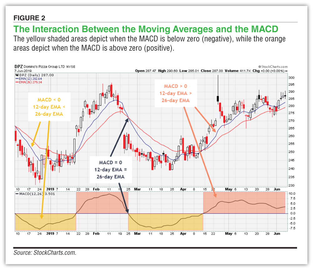 The yellow shaded areas depict when the MACD is below zero (negative). This occurs when the 12-day EMA is below the 26-day EMA. The MACD line went negative twice over the charted period—mid-December 2018 and in late February 2019. As the MACD line falls further below the centerline, so too do we see the blue 12-day EMA line diverge from the red 26-day EMA.
On two occasions, the 12-day EMA crossed above the 26-day EMA: in late January and in mid-April of 2019. This is where we see the MACD line cross above the centerline and into positive territory (the orange shaded area).
The scale of the lower panel, where the MACD line is drawn, indicates the number of points (dollars) separating the two EMAs. In mid-February 2019, the 12-day EMA exceeded the 26-day EMA by roughly 10 points, while in both late December 2018 and mid-March 2019, the 26-day EMA was higher than the 12-day EMA by roughly 7.5 points. MACD values are dependent on the price of the underlying security. You may see MACD values for $20 stocks in the range of –1.5 to +1.5, while the MACD values for $100 stocks may range from –10 to +10.
There are two types of crossovers to look for when using the MACD: signal line crossovers and centerline crossovers. Signal line crossovers are the most common. The signal line is the nine-day EMA of the MACD line, which measures the difference between the 12-day and 26-day EMAs of closing prices. Therefore, the signal line lags the MACD line as well as smooths it. A bullish crossover takes place when the MACD line crosses the signal line to the upside. In contrast, a bearish crossover occurs when the MACD line crosses below the signal line.
Returning to the one-year chart for Domino’s in Figure 3, we see the signal line crossovers—indicated by the red and green arrows in the lower panel. These are also the points where the histogram bars shift from green to orange or vice versa. Over the one-year period ended June 7, 2019, there were 15 signal line crossovers: eight bearish and seven bullish.
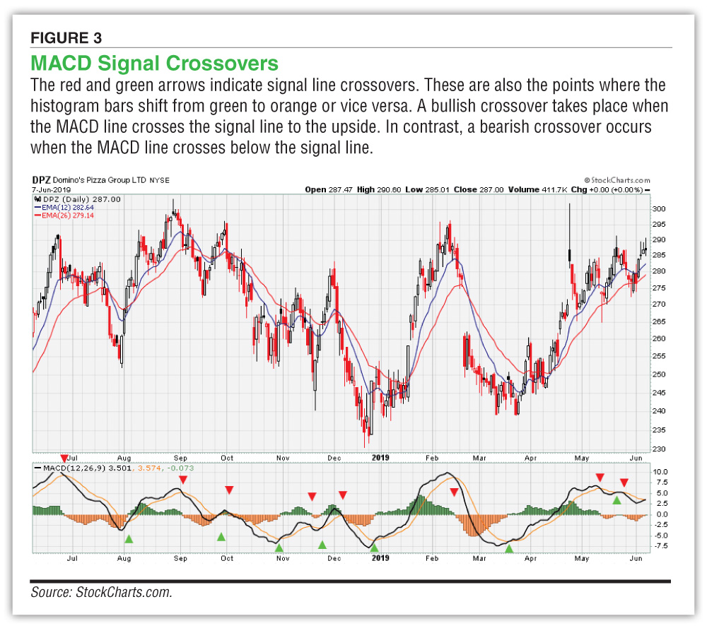 Since signal line crossovers happen so frequently, they are not as meaningful and, thus, need to be considered carefully before acting upon them. Signal line crossovers at positive or negative extremes can serve as warning signs. Strong moves are required to push the MACD line to such extreme levels, at which point momentum is likely to slow. When this happens, there is usually a signal line crossover. The most meaningful price reversals for Domino’s over the one-year period in Figure 3 took place following a signal line crossover at “extreme” levels, including those in late July and late December 2018 and mid-February and mid-March of 2019.
Centerline crossovers are the next most common MACD signals. A bullish centerline crossover takes place when the MACD line moves above the zero line into positive territory; this is when the 12-day EMA of the underlying security moves above the 26-day EMA. A bearish centerline crossover occurs when the MACD line moves below the zero line to turn negative. This happens when the 12-day EMA moves below the 26-day EMA.
Figure 4 shows the 10 centerline crossovers for Domino’s over the one-year period ended June 7, 2019. As this chart shows, centerline crossovers can last from a few days to a few months, or longer. The stronger the trend, the longer the MACD will go without a centerline crossover (the longer it will remain positive or negative).
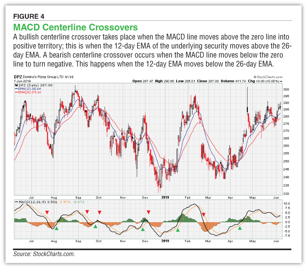 Looking at the price behavior for Domino’s shares following a centerline crossover, we see varying levels of success. On three occasions, the crossover signal was reversed in less than 10 trading days, meaning the MACD line crossed the centerline in the opposite direction as the previous centerline crossover. This underscores the primary shortcoming of the MACD—it works best when prices are moving in the same direction for an extended period of time. Over the period in Figure 4, Domino’s shares experienced periods of choppy trading that diminished the effectiveness of moving averages and, thus, the MACD. The longest the MACD stayed in either positive or negative territory over the period was 38 days, from mid-March to mid-May of 2019. Since the bullish centerline crossover on April 12, Domino’s shares were up roughly 12% through the close on June 7 (38 trading days).
Indicator divergence is when an oscillator or momentum indicator, such as the MACD, doesn’t confirm the movement of price of the underlying security. A bullish divergence forms when prices are hitting lower lows while the MACD is forming higher lows. In this situation, prices are affirming the current downtrend, but the MACD is indicating less downside momentum. This could foreshadow a trend reversal with prices moving higher.
Figure 5 is an example of a bullish divergence between the closing price of Skyworks Solutions Inc. (SWKS) and its MACD. Between November 2018 and January 2019, Skyworks shares hit multiple intermediate lows while the MACD was on an upward trajectory. The three intermediate lows—two in December and the last in early January—were met with higher lows in the MACD line. At the start of 2019, Skyworks shares reversed course, breaking through resistance while the MACD line crossed over to the upside.
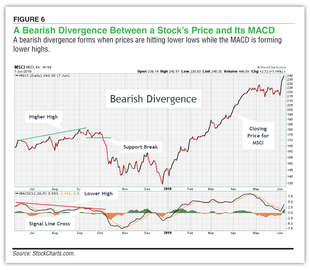
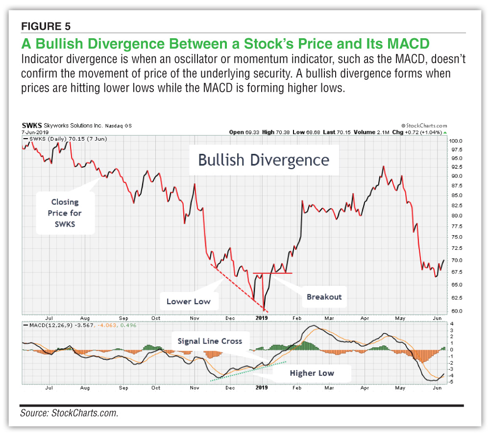 Figure 6 illustrates bearish divergence between the closing price of MSCI Inc. (MSCI) and its MACD. Between June and September 2018, MSCI shares were hitting new intermediate highs while the MACD was in a general downward slope. Each time MSCI shares hit a new intermediate high—in late July, late August and mid-September—the MACD line failed to rise to the same level as its mid-June high. In early September, the MACD line crossed over the signal line to the downside and in early October, MSCI shares fell through support.
 It’s important to be aware that these signals are not infallible. Bearish divergences are common in a strong uptrend, while bullish divergences occur often in a strong downtrend. Uptrends often begin with a strong upward move in price that produces a surge in the MACD. While the uptrend may continue, if the momentum slows, the MACD will decline from its highs. The opposite occurs at the beginning of a strong downtrend.
The moving average convergence/divergence (MACD) is unique in that it combines momentum and trend-following into one indicator. The indicator is useful when examining the interaction between two moving averages. With the MACD, we can measure the price momentum of the underlying security and identify when declining momentum may be signaling an upcoming price reversal.
Technical Analysis

Computerized Investing


Bruce Strand from AZ posted over 7 years ago:
Brian Pickering from TX posted over 7 years ago:
Paul from OR posted over 7 years ago:
David from CO posted over 7 years ago:
Jeff from OH posted over 7 years ago:
Jared from WI posted over 7 years ago:
Morris from NC posted over 6 years ago:
Hugh from WA posted over 6 years ago:
G B from MA posted over 5 years ago:
You need to log in as a registered AAII user before commenting.
Log InCreate an account