

The Benefits of Building Your Own S&P 500 Portfolio Sector by Sector

Investing in individual funds that represent the 11 sectors of the S&P 500 allows better control when withdrawing money in retirement.

For those who invest primarily in large U.S. companies, the S&P 500 index is the benchmark of benchmarks. As of September 30, 2020, over $11.2 trillion was benchmarked or indexed to it. As such, it’s worth understanding more about the composition of the S&P 500—particularly if you own a mutual fund or exchange-traded fund (ETF) that mimics it, as many investors do.

The S&P 500 comprises 11 sectors, as shown in Table 1. The sector that currently has the largest impact on the return of the S&P 500 is information technology. As of September 30, this particular sector represented 28.2% of the market capitalization of the entire index. As a result, the stocks categorized in the information technology sector (there are approximately 70 companies in this sector of the S&P 500) determine 28.2% of the return of the S&P 500. Said differently, roughly 14% of the 500 stocks in the index determine over 28% of the performance.

Clearly, the performance of companies in the sectors of information technology, health care, consumer discretionary and communication services exert a much greater impact on the performance of the S&P 500 than companies in the utilities, real estate, materials and energy sectors. This is the natural result of building an index that is market-cap weighted.

Performance Differences Among Sectors

Let’s take a look at the performance differences among the various sectors over the past 15.75 years. To do so, I’ve chosen to use 11 Vanguard sector ETFs that focus on the same 11 sectors as the S&P 500 (see the list in Table 1). You can also use 11 SPDR sector ETFs from State Street Global Advisors. The Vanguard sector ETFs shown in Table 1 track MSCI sector indexes, while the SPDR sector ETFs track S&P sector indexes. The total number of holdings in the 11 Vanguard sector ETFs was over 2,500 as of September 30, whereas the 11 SPDR sector ETFs had a total of 519 holdings. Thus, the SPDR sector ETFs are generally closer to replicating the actual S&P 500. The challenge in using the SPDR sector ETFs in this research study is that two of them—Communication Services Select Sector (XLC) and Real Estate Select Sector (XLRE)—were not in existence over the full 15.75 year period. Thus, the Vanguard sector ETFs were used because all 11 of them had a performance history back to 2005.

It is worth noting that despite the difference in total number of holdings, the collective performance of the 11 Vanguard equally weighted sector ETFs and the 11 SPDR equally weighted sector ETFs were quite similar in 2019 and so far in 2020. In 2019, the SPDR sector portfolio had a return of 28.14% while the Vanguard sector portfolio produced a return of 27.34%. Thus far in 2020 (through September 30), the SPDR sector portfolio (where all 11 ETFs are equally weighted) has produced a return of –1.05% compared to –1.76% in the Vanguard 11-sector ETF portfolio.

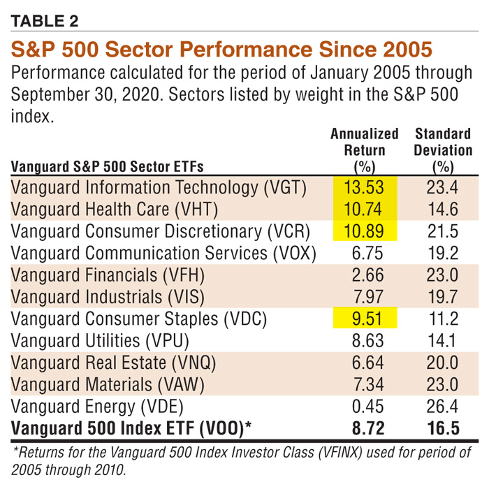
As shown in Table 2, the best-performing sector ETF over the past 15.75 years (January 1, 2005, through September 30, 2020) was Vanguard Information Technology (symbol VGT) with a 15.75-year average annualized return of 13.53%. (These 11 Vanguard sector ETFs all began in 2004, but the first full year of performance was 2005). For comparison, the Technology Select Sector SPDR ETF (XLK) had a 15.75-year average annualized return of 12.84%.

The next best performer was the Vanguard Consumer Discretionary ETF (VCR) at 10.89%. At the bottom of Table 2 is the performance of the S&P 500 as represented by the Vanguard 500 Index ETF (VOO). Its 15.75-year return was 8.72%. As noted in the table, the annual returns of the Vanguard 500 Index Investor Class mutual fund (VFINX) were used for the years 2005 through 2010 because the first full year of performance for the Vanguard 500 Index ETF was 2011. The Vanguard 500 Index ETF and the Vanguard 500 Index Investor Class fund have identical portfolios inasmuch as they both track the S&P 500.

The yellow highlighting in Table 2 indicates the four sectors that outperformed the Vanguard 500 Index ETF (the entire S&P 500). They include information technology, health care, consumer discretionary and consumer staples. In addition, utilities had a 15.75-year return of 8.63%, just slightly behind the 8.72% return of the Vanguard 500 Index ETF.

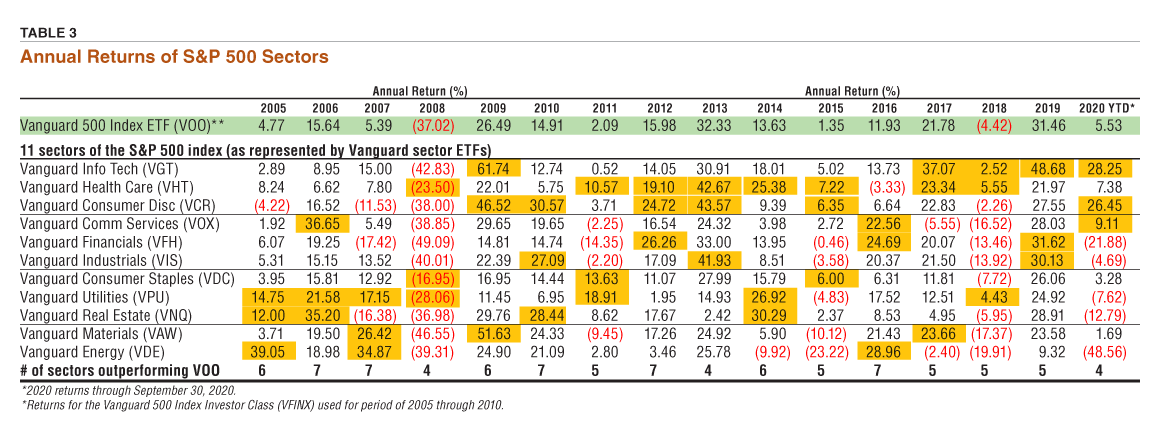
Perhaps more useful is to examine the year-to-year returns of all the sectors in relation to the return of the S&P 500 itself (see Table 3). The annual returns of the Vanguard 500 Index ETF (S&P 500) is the top row highlighted in green. In the rows below are the year-to-year returns of all 11 sectors as represented by Vanguard sector ETFs. The three best-performing sector ETFs each year are highlighted in gold.

Investing in the S&P 500: One Ticker or 11 Tickers?

It is certainly convenient to invest in the S&P 500 by using one ticker (an ETF or mutual fund that mimics the index). However, the performance of that one ticker represents the aggregate return of all 11 sectors. If you are in retirement and need to make annual withdrawals, it would not be possible to withdraw money from the best-performing components (sectors) of the index. To do that you would need to invest in each sector separately, which is easily done by the use of sector ETFs.

As shown in Table 3, the advantage of building your own S&P 500 using sector funds is that you can withdraw money in retirement from the best-performing sector(s) at the end of each year. For example, in 2005 if you had invested in the S&P 500 as a whole (via a mutual fund such as the Vanguard 500 Index Investor Class fund) your return was 4.77%. If you needed to make a withdrawal, it would have been a withdrawal based on the fund’s return of 4.77%.

Alternatively, had you invested in all 11 sector ETFs your withdrawal could have been made from the three best-performing ETFs. In 2005, the best-performing sectors were energy with a return of 39.05%, utilities with a return of 14.75% and real estate with a return of 12.00%. By using a sector approach, you have 11 buckets from which to withdraw money rather than one. After each year is over and the performance of all the sectors is known, you would withdraw money from the buckets that had the highest returns. The number of buckets from which you would withdraw money each year is up to each individual.

How would this multi-bucket approach have played out over the 15.75-year period from January 1, 2005, to September 30, 2020? We assume a starting balance of $250,000 and 16 end-of-year inflation-adjusted withdrawals. The initial withdrawal rate from the retirement portfolio was assumed to be 4% of the starting balance, which translates to a dollar figure of $10,000 ($250,000 (VCR) 0.04 = $10,000). The inflation rate in 2005 was 3.42%, thus the first withdrawal from the portfolio at the end of 2005 was $10,000 (VCR) 1.0342 = $10,342. The second withdrawal at the end of 2006 was $10,604 (based on the inflation rate in 2006). The total amount of the 16 inflation-adjusted annual withdrawals was $192,854.

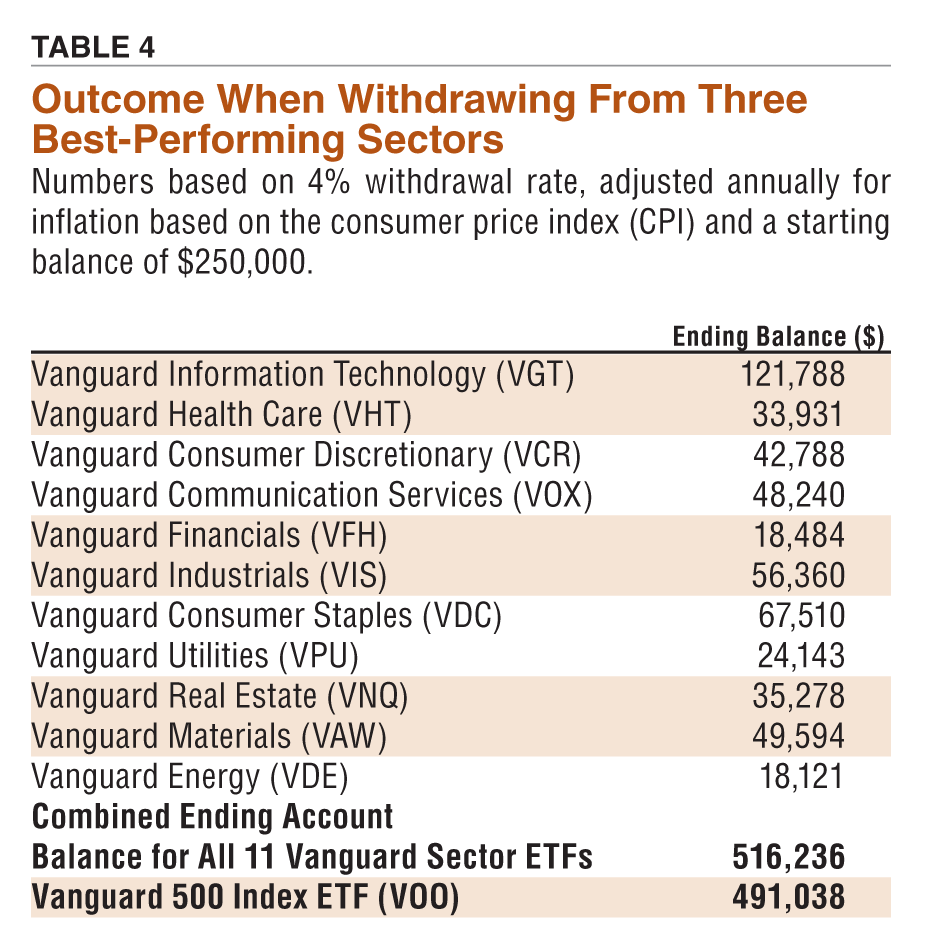
The two options were a $250,000 balance in the Vanguard 500 Index ETF (the S&P 500) or $22,727 invested equally into each of the 11 Vanguard sector ETFs ($250,000 ÷11 = $22,727). The sector ETFs were not rebalanced back to equal weighting after the start date, meaning that they each finished the 15.75-year period with very different ending account balances (shown in Table 4). Each annual withdrawal was made from the three best-performing sector ETFs at the end of each year (an equal dollar amount from each ETF). If investing solely in the Vanguard 500 Index ETF, the withdrawal was simply made from that ETF.

At the end of the 15.75-year period (and 16 annual withdrawals), the remaining balance in the Vanguard 500 Index ETF was $491,038 versus $516,236 using the 11 sector ETFs. We see a benefit of $25,198 by giving ourselves the opportunity to withdraw money from the three best-performing sectors of the S&P 500 each year rather than simply the S&P 500 as a whole.

The expression “divide and conquer” certainly applies as it pertains to investing in the S&P 500.  ▪

Discussion

NELSON L from GA posted over 5 years ago:

I wonder if a similar approach could be used to simply rebalance an equal-weighted portfolio of 11 sector funds periodically (say annually). If it works for withdrawals, it should work equally well for a portfolio where the "withdrawal" is simply reinvested in the sectors with a lower annual return. Do you have any data to back this up? Nelson Lawson


LEONARD C from CT posted over 5 years ago:

Hi Nelson L I am not an expert, so please keep that in mind when reading my comments. I tried using the 11 Vanguard sector ETFs for a three year period while in accumulation mode. I did this because the individual sectors are less correlated to each other than the small cap / mid cap / large cap categories. I thought rebalancing within the sectors would provide a slight performance edge over the S&P 500 (buy low / sell high). The problem I had is that the best performing sectors continued to perform better than the worst performing sectors. For example, when I sold some of the tech sector to buy into the energy sector, tech continued to outperform energy, so my performance lagged the S&P 500. The Vanguard sector ETFs hold small and mid cap stocks which underperformed large cap during the same period. This likely contributed to my underperformance. I realize that 3 years is too short to determine if the strategy is effective. Maybe I would have seen benefits if I had stayed with the strategy longer. But I decided that a simpler portfolio was a better option for me. Good luck! Len


John S from MA posted over 5 years ago:

This has led to about a 5% improvement over VOO over a 16 year period. It seems like a fair amount of work for a relatively small gain to me.


Hugh P from WA posted over 5 years ago:

Reminder: not rebalancing sectors is reasonable per https://www.aaii.com/journal/article/10629-a-question-of-rebalance John S: ...With Roth IRA, avoiding gains taxes, it might be worth considering VOO for simplicity in accumulation and convert to sectors when in no-longer-distracted-by-time-at-work withdraw mode.


BLAKE T from NY posted over 5 years ago:

I wondered why the 3 top performers were sold at the end of each year. What would happen if the top 1, 2, 4, or 5 performers were sold instead of the top 3? I copied the sector and VOO ETF performance numbers to a spreadsheet and repeated the analysis by selling the top 1, 2, 3, 4, and 5 performers. The resulting sector balance in excess of the VOO balance at the end of 2020 was as follows: Sell 1: $39,093 Sell 2: $38,937 Sell 3: $25,199 Sell 4: $14,070 Sell 5: $15,665 It was interesting to note that the balance in excess of VOO for each approach, peaked in 2016, and then started to decline. If the downward trend continues after 2020, it may be better to stick with keeping your money in VOO.


DAVID K from NC posted over 5 years ago:

The article could have been improved by comparing the selling of the top 3 performers with selling the bottom 3 performers. The first approach - the approach the article takes - is to continually cash in your winners over time. The second approach - selling the worst 3 performers - is to continually minimize your "dead" money over time. I'm guessing that the relative performance over time of the 2 approaches depends, in part, in the year to year volatility of the individual sectors as well as the sector correlations with one another. Note this is not a rebalancing strategy in that the money withdrawn is not reinvested in other sectors.


PAUL C from TX posted over 5 years ago:

To Blake T from NY: I'm addressing this email to you, since you took the time to create a spreadsheet to analyze taking various distributions from 1-5 sector funds over time. I'm still in the accumulation phase of funding my own retirement, with the plan to retire in about 10 years. My gut feeling is that you could improve the results by buying the worst-performing sectors during the accumulation phase, and then selling the best-performing sectors during the distribution phase. Perhaps something like this: Instead of investing $5,000/year in each of the 11 sectors, why not invest $3,000 in each of the 5 best-performing sectors and $7,000 in each of the 5 worst-performing sectors (with $5,000 invested in the 'middle'-performing sector)...for a total of $55,000 invested each year. Do that for 10 years. And then start taking distributions from 1, 2, 3, 4, or 5 best performing sectors after that. Can your spreadsheet be adjusted for that?


GREG S from FL posted over 5 years ago:

I thought the article might provide some quantitative evidence about whether or not to sell winners, in answer to Peter Lynch's question, "Should you pick the flowers and water the weeds?" The author cites a 5% benefit from "picking the flowers", so I tried to emulate the method described in the article in order to understand why? The author's explanation was very clear but I must be missing something very significant. My results were drastically different to his e.g. taking the 4% just from the top three sectors resulted in my VHT finishing at 104K while his finished at 34K (Table4). Would it be possible to provide examples of the calculation that the author used to try to ascertain why our results are so different? His explanation seems quite clear so I'm really puzzled as to why we are so far apart?


GREGORY T from WI posted over 5 years ago:

The practice of selling the winners does not give the best returns by my numbers, which confirm what Blake said above. Selling the losers gives better returns at least for 2005-2020. By my math, taking the withdrawals equally from each sector gives the highest return of the techniques I tried. (615,400 vs 516,000 by Israelson's method. ) This is presumably because VOO is a weighted average of the various sectors, and some of the under-represented sectors performed better especially in the early years when compounding would matter most. (Utilities, Real Estate) Selling the winners is a worse and worse strategy as the percent withdrawn increases; at 8% withdrawal Isrealson's strategy goes negative in 2021 at -70,000, whereas equal withdrawals has +144,000 and selling the losers has +134,000.


EDWARD K from NC posted over 5 years ago:

Investing in market sector products rather than than a market benchmark may be useful if the investor has the discipline to stay the course. Referring to the author's Table 3, the 2008 "Great Recession" caused massive double-digit losses across almost all sectors. How would a person who invested in a single S&P 500 ETF react to a single 37% loss, versus a person who invested in sector ETFs facing 11 losses? I suspect that most investors would have bailed out of many, if not most, of the sector funds after seeing 11 lines of double-digit losses. The S&P 500 ETF person would likely have stayed the course.


GREG S from FL posted over 5 years ago:

If I'm not mistaken, aren't we comparing apples and oranges in the article? If you buy VOO, because it is cap weighted, you are exposed to the distribution of sectors per Table 1 of the article ? But the method described in the second last paragraph says to buy equal weights of each sector ($22,727.11). If we are equal weighting shouldn't the comparison be against an equal weight EFT like RSP, rather than VOO?


FRED S from CA posted over 5 years ago:

I don't understand the bottom line of Table 3. It's titled #of sectors outperforming the VOO yet the numbers appear to be wrong in most cases: 2007 SB 8, 2009 SB 5, 2010 SB 6, 2011 SB 6 , 2015 SB 6, 2017 SB 4, 2018 SB 4, 2019 SB 2 If you are going to invest in the sectors why not pick the top 3 or 4, as they far outperformed the VOO over the years?


WILLIAM B from PA posted over 5 years ago:

I have been executing a Sector Rotation strategy using First Trust Alphadex funds since 2008. It has by far out performed all passive investments i've had in past 12 years. That may be luck or due to the investment cycles we have been in during the timeframe. The management expense fees for those funds are much higher than Vanguard funds and i bet the same strategy using Vanguard funds would have likely outperformed First Trust. I also think Sector Fund investing is a great way to diversify when investors have a disproportionate amount of assets and overweight in certain sectors due to unique circumstances.


PAUL C from TX posted over 5 years ago:

William B: Can you describe your Sector Rotation strategy?


KEVIN S from MA posted over 5 years ago:

Is it safe to assume dividends are reinvested? Also, what is the recommended sector management of ETFs as trades are in whole not fractional shares?


JOSEPH C from AZ posted over 5 years ago:

Regarding dividends, a quick Google search of 2020 dividend ratios by sector, added together and divided by 11 to produce a mean average, got me to 2.14%, whereas the VOO yield was 1.81% . Thus, for 2020, the overall portfolio dividend is 18% higher than VOO alone (2.14/1.81)=1.18. This is explainable by the roughly inverse relationship between dividend ratios and annual fund returns. In the fortunate situation when an investor has enough money in VOO to be content with receiving dividend income in cash rather than reinvesting it, to switch to the equally-balanced portfolio of 11 funds would increase his or her payout significantly, without affecting tax liability that is incurred regardless.


LARRY B from LA posted over 3 years ago:

I've played with this during 2021 and 2022 with favorable results. I was deficient in a couple of duties: 1) I targeted the balance %'s as per Table 1, but not precisely; 2) I overweighted news worthy sectors during the year as I saw opportunities while underweighting on the contrary; I took advantage of multiple entry and exits to take advantage the sway of general market ups/downs. Excellent results overall relative to the S&P 500. Question: where do we get updated weightings for Table 1 at each new year?


BARRY J from TX posted over 3 years ago:

This article is 3 years old. I keep coming back to this article because it offers so much promise. It provides hints at an ability to build a strategy based on sector performance that will outperform an SPX proxy, but it underperforms on actually delivering on that goal. I see using low-cost, high-liquidity SPX sector ETFs to outperform SPX as a high-potential strategy. However, there are a lot of missing statistics that need to be computed to help see how to deploy this strategy best. The “hidden” data in Table 3 point to a possible best strategy for using sectors to outperform the market … and to outperform the Vanguard sector fund managers. Beating any of the pros and their massive database capabilities at their primary skill would rival the impact of the Cowles Commission findings from the 1930s and the discovery that passive funds outperformance actively managed funds from the 1970s. The goal is to outperform VOO, which was selected as the best proxy to track overall SPX performance (top line in Table 3). The bottom line (# sectors outperforming VOO) should be used to rank the sectors in overall performance, not absolute annual performance data. The “golden” Top 3 is nice eye candy, but it is a distracter for achieving the goal. Bottomline performance (# sectors outperforming VOO) is what matters. Outlier performance will skew comparisons because these sectors may have higher variation which revert to the mean over time and cancel out over time. The main clues are in the "bottom line" of data (# sectors outperforming VOO). The key statistic is the percent of time that each sector outperformed the SPX proxy (VOO). The overall impact of the different approaches is seen by computing the magnitude of the numerators – “Top 3” vs ”Outperform.” The total number of “Top 3” performers over 16 years provides 48 data points. Summing the number of” Outperformers” doubles the number of sector ETFs that outperformed VOO to 100. Overall, each sector has 16 opportunities to outperform VOO. With this NEW number of “outperforms” we can calculate the probability of each sector outperforming VOO (SPX) and we can rank them according to their efficacy. We could calculate the rolled yield throughput or the chain of Bayesian posterior probabilities for each sector to outperform VOO. And we could use the inverse probabilities (number of times the sector did NOT outperform) weighted by the magnitude of the total relative underperformance to calculate and rank which underperformers to avoid because they add the largest “downside” drag of overall performance. Averages only tell you the most likely value but they hide the impact of variation. Probabilities provide the odds of how likely the spread of a distribution will impact your ability to achieve the average. That type of data matters when you are dealing with uncertainty.


THOMAS S from FL posted over 1 year ago:

Why do you publish this old article without updating the data? That should not be difficult given the present state of technology.


You need to log in as a registered AAII user before commenting.
Create an account

Log In

Get your free copy of our special report analyzing the tech stocks most likely to outperform the market.

Download the FREE Report Here: