


Wayne Thorp leads a class in AAII's new Essential Investing Video Course. Go to https://www.aaii.com/ves for more information and to subscribe.


Technical analysis is the study of price and volume activity to try to predict how prices will move in the future. As investors and traders, we are most concerned with price action, since this determines our gains and losses. However, ignoring volume can be a mistake. While the market determines the price of a security, the underlying trading volume represents the level of interest in that determination. Without knowing the trading volume of a security, we do not know how much conviction there is in a move. If a small amount of volume is moving a stock price, the odds are lower that the move is sustainable. Alternatively, if we see price moves on high volume, this may indicate the trend is sustainable.
Traditionally, volume is incorporated into a price chart via volume bars that are typically drawn at the bottom of a price chart. Without the volume bars, you cannot see the level of trading activity associated with price moves. However, there is a unique type of chart that incorporates volume into each period’s price plot—equivolume. Developed by Richard W. Arms Jr., who is also responsible for the Arms Index (TRIN indicator), equivolume charts look similar to candlestick charts, but the candlesticks are replaced by equivolume boxes that may be square or rectangular. Arms came up with Equivolume because he felt that “volume needed to be made a full partner with price to understand the underlying dynamics of price movement.” Integrating volume with price plots makes it easier to verify the trading volume for price tops and bottoms, support and resistance breakouts, and more.
Calculation
Referring to Figure 1, equivolume boxes consist of three components: high price, low price and trading volume. One box represents one period, which can be a day, week, month, etc. The high price for the period forms the upper boundary of the equivolume box, the low price of the period forms the lower boundary and the relative volume for the time represented by the chart indicates the width of the equivolume box. For “up” periods, when the closing price is above the prior period’s close, the equivolume box is black. When the period’s closing price is below the prior period’s close, the equivolume box is red.

The width of the equivolume box represents the normalized volume for the look-back period (the period displayed on the chart). In other words, the width of an individual equivolume box shows that box’s percentage of the total volume for the time frame represented by the chart. That means that the boxes for individual periods will differ depending on their relative trading volume. The higher the volume for a given period, the wider its equivolume box. Periods with the same trading volume will have boxes of the same width. Because not all equivolume boxes have the same width, the date axis of an equivolume chart does not have uniform spacing for each period. So, for example, if you are using a daily equivolume chart, some weeks will take up more space on the X-axis than others will.
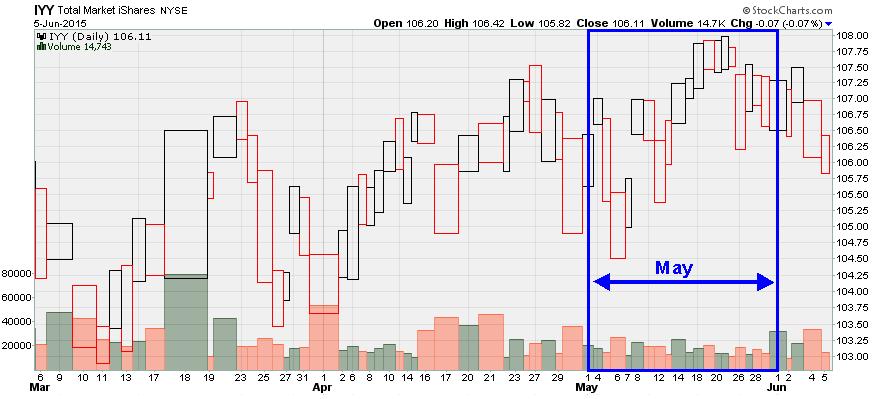
Figures 2 and 3 show two six-month daily price charts for the iShares Dow Jones U.S. Index ETF (IYY). Figure 2 is a traditional open-high-low-close bar chart while Figure 3 is an equivolume chart. The wide boxes in Figure 3 indicate days with relatively high trading volume, while the thin boxes represent days with relatively low trading volume. Compared to March and April, May has fewer wide boxes, so it takes up less space on the X-axis. You can also see that the months on the equivolume chart take up different amounts of space on the X-axis compared to the bar chart in Figure 2.

Tops & Bottoms
Usually the most obvious boxes on an equivolume chart are those that signal a top or a bottom.
At the top of an upward price move, we often see heavy volume with little price movement—a box or series of boxes that are very wide for their height. Arms refers to these types of boxes as “oversquare” boxes. In Figure 4, we see an example of squares and oversquares at what turned out to be the end of an upward price move for Genpact Limited (G). Between December of 2014 and mid-March of 2015, Genpact shares gained roughly 30%. After breaking out of a trading range in mid-March, we see a series of squares, followed by an oversquare on March 20. The price range on these days was tight, but the trading volume became heavy.
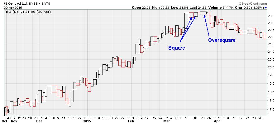
The heavy volume on these days indicates that there are still buyers trying to bid the price higher, but there are also a number of sellers who are willing to sell all the shares the buyers want in the $23.50 to $23.80 range. This has become a significant resistance level, which is a clear indication that the price run-up is ending and a reversal may be coming. Looking at the chart, we see that prices did start heading lower after this series of squares and oversquares.
The equivolume behavior for bottoms differs from that of tops. As the market or security reaches a low, it is not uncommon to see a wave of sellers, such that trading volume is high and the trading range is wide. In these situations, we are likely to see very large equivolume boxes as prices reach a bottom. However, they tend to be taller instead of the squares or oversquares we showed earlier at the top of a price run-up.
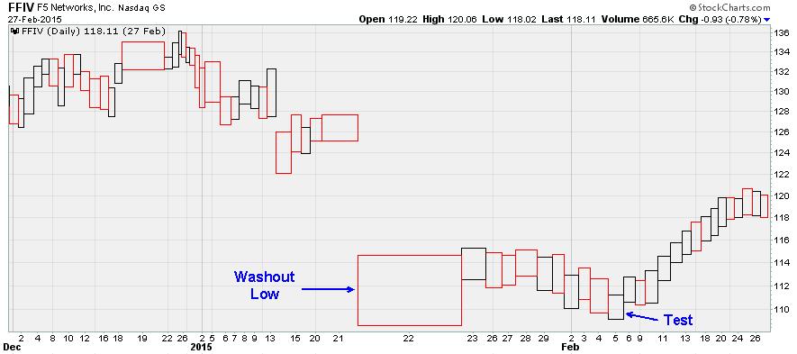
Figure 5 is an example of a price bottom for F5 Networks Inc. (FFIV). In December of last year, the stock reached a square top, which we now see marked the end of the uptrend that had started in October. Over the next couple of weeks, prices fell, rallied and fell again. On December 22, the price gapped downward on above-average volume. Arms calls these tall, wide squares at the apparent bottom of a price decline “washout lows,” where there is a drop in price on high volume that sweeps away the last of the sellers. Following the washout low, FFIV shares make a slight rally and then re-test the low around $109 before starting a new upward climb.
Support & Resistance Breakouts
As we have mentioned before, volume is an important element when verifying the strength of a price move, especially when breaking through levels of support or resistance. Breaks on low volume are less likely to succeed than those on high volume. The lower the volume, the less interest there is in the direction of the move, meaning weak buying or selling pressure. Higher volume means there is more interest in the direction of the price move, making the break more convincing.
Figure 6 illustrates a breakout through resistance for PC Connection (PCCC). Between March and October 2013, the stock traded in a range roughly between $14.25 and $17.
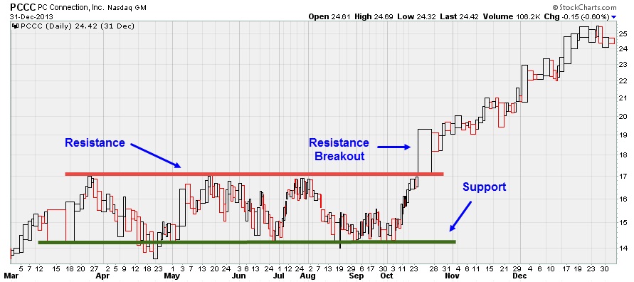
On three occasions, the price tested each of these boundaries, only to be rebuffed. On October 25, 2013, PCCC shares broke through the $17 level on very heavy trading volume. In fact, October 25 turned out to have the second-highest trading volume for all of 2013. Volume clearly confirmed this breakout and after that, the stock gained roughly 50% in less than four months.
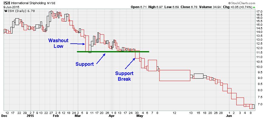
In contrast, Figure 7 is an example of a breakdown through support for International Shipholding (ISH). Support had been established by the washout low in early March 2015, which marked the temporary end of the downward slide in price that began in February. Buyers boosted the stock temporarily following this “bottom,” but selling pressure once again brought prices back to the $11.50 level. For a little over two weeks, buyers and sellers played a game of tug-of-war, with price trading in a very narrow range on relatively light volume. Finally, on April 30, the sellers prevailed and the price dropped through support on very heavy trading volume. In fact, that was the heaviest trading day of the year for FCCC shares to that point.
Conclusion
Equivolume charts partner volume with price, putting the two on an equal footing for easy visual analysis. These charts present price on the vertical axis and volume on the horizontal axis. The wider the box, the heavier the trading volume for that period. The taller the box, the greater the price movement for the period. Analyzing equivolume charts allows investors and traders to see how easily price is moving in a given direction.
Discussion
FREE REPORT

Allan Pacela from CA posted over 11 years ago:
Sylvan Karfiol from CA posted over 11 years ago:
Scott Freeman from MI posted over 11 years ago:
Wayne Thorp from IL posted over 11 years ago:
Gary Blackburn from TX posted over 11 years ago:
You need to log in as a registered AAII user before commenting.
Log InCreate an account