

Related

Trading Strategies
Trendlines can offer insights even though they have an artistic element to them. Using bar and line charts can help in their analysis.
by Jeffrey Weiss | April 2017
Perhaps no other aspect of technical analysis lends itself to as many varied interpretations as trendlines—an analytical tool with the potential to enhance your investment performance while simultaneously offering a risk management component.
How much you weight this analytical gauge in your analysis is, of course, up to you. You must be comfortable and confident with any approach, but personally I can’t invest without utilizing trendline analysis.
Before we go any further, I’d like to stress that no matter what your investment discipline is, perhaps the key question it needs to answer is “does it address market risk and emphasize capital preservation considerations?”
Unlike other market gauges that have “overbought” and “oversold” (two terms I don’t use and which can be misleading) parameters to assist investors in determining a course of investment action, trendlines usually aren’t as straightforward. In fact, if you give the exact same chart to a group of market observers and ask them to draw what they consider to be important trendlines, there’s a good chance that no two charts will look exactly alike. That’s because trendlines contain a more artistic element than many basic oscillators. I refrain from using the terms “overbought” and “oversold” in my market analysis because a market that gets rapidly “overbought” and stays in that condition can be a bullish development, just as an “oversold” market can remain in that condition for quite some time and claim your capital even as it appears to possess rally potential. Varying markets demand differing interpretations of these terms.
Rather, I prefer to speak in the language of risk management—the key investment variable that needs to be regularly addressed in any investment program, whether it is fundamental or technical in nature. One of the reasons I spend so much time drawing trendlines is because of their potential risk management value. Trendlines can assist an investor in discerning underlying trends, since these lines can remain in effect for months or even years (in the case of longer-term lines). They can also potentially help determine, as part of a broader strategy, whether a rally that appears convincing on the surface is simply a bounce within a downtrend or a genuine northerly move. Similarly, trendline analysis can also assist you in deciphering whether a decline is the start of a potentially prolonged downtrend or simply a correction in an ongoing uptrend.
Trendlines offer an investment tool that’s well suited to shorter-term, intermediate-term or longer-term trend analysis. They can offer valuable insights in assessing the extent of buying power or selling pressure, since significant breaks often foreshadow a continued move in the direction of the trendline’s penetration. Trendlines have nothing to do with what analysts are saying or what reporters are writing or what people are thinking but, most importantly, are based on what investors are doing—as reflected by monetary inflows or outflows of capital. That’s what technical analysis tries to measure, and one of its guiding principles is that actions speak louder than words. It separates a mere opinion from a view backed by capital.
The only way to get a feel for trendlines is to practice drawing them—until your fingers are ready to separate from your hands if you’re printing them out and using a pencil/pen and a ruler. You can also utilize one of the many popular computer programs available these days, although even after four decades in this business, I prefer to use both. These are among my “technical” tools, coupled with a respect for the market and a belief that its movements speak louder than any analyst or commentator on the face of the earth.
The toughest part of discussing trendlines here is to try and put some parameters and an analytical framework on a largely artistic endeavor, a tough task given that each of you has your own individual investment approach culled from a seemingly infinite reservoir of research possibilities. I personally only use technical analysis. Having said that, let’s delve into the world of trendlines, starting with their definition and two specific chart types I’ll be focusing on.
Trendlines are an analytical tool that seek to address one of investing’s key objectives: gauging the market’s underlying trends. Each and every market day, millions of these lines are drawn by multitudes of traders and investors seeking insight into the market’s direction. Whether you draw your own trendlines or depend on the advice of seasoned professionals who do so, it’s helpful to review some of the basics—starting with uptrend and downtrend lines. While there are exceptions to every rule, an uptrend line connects price lows over time and a downtrend line connects price peaks over time. The keys are which peaks and troughs to originate your trendlines from, what length of time they cover, how many points lie along/around the line and what constitutes a break of that gauge. Again, please remember that technical analysis is an art and not a science, so investors will each have their own varying rules for buying or selling when it comes to interpreting these gauges. Generally speaking, the longer a trendline has been in effect, the more importance may be assigned to it. There are also horizontal lines.
Trendlines can be drawn on daily, weekly and monthly charts, as well as other time frames of both longer-term (such as quarterly) and shorter-term (such as intraday) durations. I cover daily and weekly charts in this article. You may also use them for other time periods. Trendline analysis may be applied to stocks, markets or sectors (industry groups).
For our purposes here, I analyze charts of both the “bar” and “line” variety. The former illustrates a stock’s high and low (known as the “range”) for the period in question. Thus, a daily bar chart would display five bars for a week of trading, whereas a weekly chart would contain just one bar. The monthly chart would illustrate the range for the whole month of trading on a single bar. The top of the bar indicates the high for the period in question, while the bottom of the bar indicates the low. The closing price is indicated by a dot next to the bar or a dash extending from the bar. This closing price may be of use in interpreting potential technical formations, but does not factor into trendline construction.

A line chart illustrates a different look, analyzing only the stock’s closing price for the period in question. Thus, a daily line chart would only plot the closing stock price once each trading day. The weekly line chart would include only the closing share price on Friday (or Thursday, if it’s the final session of the week). The individual day’s closing quotes are not considered on a weekly line chart. And as for the monthly closing graph, it’s updated only once per month (at month’s end), for a total of just a dozen times each year. Remember, updates on line charts do not become official until the periods in question end, whereas bar charts include any and all prices attained during those periods. Basically, when attempting to find trendlines of import on line charts, you are connecting the dots.
Bar and line graphs offer differing market looks. I use a combination of both, finding the latter useful in confirming the action of the former. That’s because what looks like a trendline break on the bar chart for the period in question may not be confirmed from a closing price standpoint for that analytical period. The flip side of this equation is that waiting for a closing price break before acting can cost you additional capital since you’re waiting until the close (or at least near the close if a break looks obvious) before acting. This wait doesn’t entail as much potential risk on a daily closing basis (where you may be waiting several hours for confirmation of an intraday trendline break) as it does for weekly closing or monthly closing spans. Let’s face it, waiting for an entire week’s action for confirmation of a daily closing break that occurs on a Monday or Tuesday in volatile markets is risky, and all the more so when monthly closing prices are used. Factors such as the size of your position relative to your portfolio worth, or whether you’re focused on a shorter-term or longer-term time frame, are among the variables that can enter into the decision-making process.
While these factors apply to buying and selling, my investment discipline demands that we put greater emphasis on the downside part of the equation. I’d also like to say that buying and selling stocks is not an all or nothing event, and that partial position purchases and sales (which I refer to as “phase investing”) is a strategy that can be utilized. It emphasizes multiple stops/sales on the southerly end, as I believe that one shouldn’t reward bad stock behavior by continually funneling additional capital into it on the way down.
Speaking of the downside, when it comes time to sell a stock I always prefer to do so “at the market” and not try to get that extra several cents. Sure, you’ll receive that extra bit sometimes, but risking your hard-earned capital for such a risky and dangerous (guessing game) maneuver makes no sense to me. Remember, it’s your money, so don’t try to be too cute when it comes time to sell. Get your capital back ASAP! Personally, I wouldn’t be afraid to sell on the way down if a stock has had a serious technical break. Some of my best sales in this regard certainly didn’t seem so at the time, but in retrospect proved to be quite timely. And if the stock still doesn’t act properly thereafter, I’ll continue to sell it. The bottom line is that I don’t reward a stock for acting poorly by buying more, no matter how cheap it looks! Just like one wouldn’t want to become increasingly involved in a worsening relationship with their boyfriend or girlfriend.
Drawing trendlines is more art than science but, as I’ve noted, so is technical analysis in general. Finding the lines that stand the test of time isn’t easy, but when you find them it gives you added confidence in both taking the appropriate market action and in setting your risk management parameters. As I mentioned earlier, the keys in drawing trendlines include which peaks and troughs to originate your trendlines from, what length of time they cover, how many areas lie along/around the line, and what constitutes a break of the gauge.
Keep in mind that the more trendlines you can draw, the better. Some charts will contain more than one line, often forming a price pattern. (There are books galore on price formations.) For starters, look at a bunch of graphs of varying types and lengths, grab a ruler and pen or your computer mouse, and start to connect varying highs and lows—over and over and over again. Analyze stocks, sectors, indexes and markets. You’ll need to gain enough of a comfort level to be able to invest your hard-earned capital based upon your findings (if that’s one of the methods you’ll be employing).
I’ll draw my lines from several different angles. I do not simply extend them from a stock’s or market’s major high or major low. I’ve seen that done too frequently; it can cause a trader or investor to get whipsawed. What I’ll often do is extend my trendlines from a secondary peak or secondary trough following major highs or lows. In some cases, I may even go back to a low preceding a major low or a peak preceding a major peak. Obviously, you never want to place your capital at risk based on only one or two indicators, but finding a long-standing trendline that has stood the test of time is an indicator worth having in your investment corner. Keep in mind that the line need not be perfect to be of value; temporary, minor violations of a well-defined uptrend or downtrend line can occur. It’s when a line is re-violated (especially on the downside) convincingly that I become more concerned.
The trader who is trying to sell the final portion of his or her position may decide to simply act on a bar chart break or wait until just before the close to act if a daily closing decision is the preference. Someone with a larger position can act on the bar chart violation, wait for the final few minutes of the session before acting on a closing basis, or sell part of the position on the bar chart violation and await the close to determine whether to take action on another portion (or the remainder) of the position. Another option is to sell a portion of the position every day the shares are about to finish below their trendline(s) on a daily closing basis, while giving the stock a chance to successfully hold its weekly closing basis trendline locations. These are just some of the many possibilities.
For purely illustrative purposes, let’s proceed to a discussion of several different trendlines on a daily closing, weekly closing and weekly bar chart basis.
Figure 1 is a weekly closing basis graph of the S&P 500 index. Weekly closes along/around the down-trending line dating back to the week ending July 17, 2015, are boxed, including the trio of weekly finishes from May 27 to June 10, 2016. Following the S&P 500’s clear weekly close above the line back in July 2016, note the successful test of that gauge in the week ending November 4, 2016, (arrowed) from where a substantial rally ensued. One of the rules about trendlines is that, when bettered on the way up, they transform into potential areas of support (where declines may hold) on the southerly end. The same is true when trendlines are clearly violated on the downside; they become potential regions of resistance (where rallies may fail) on the way up.
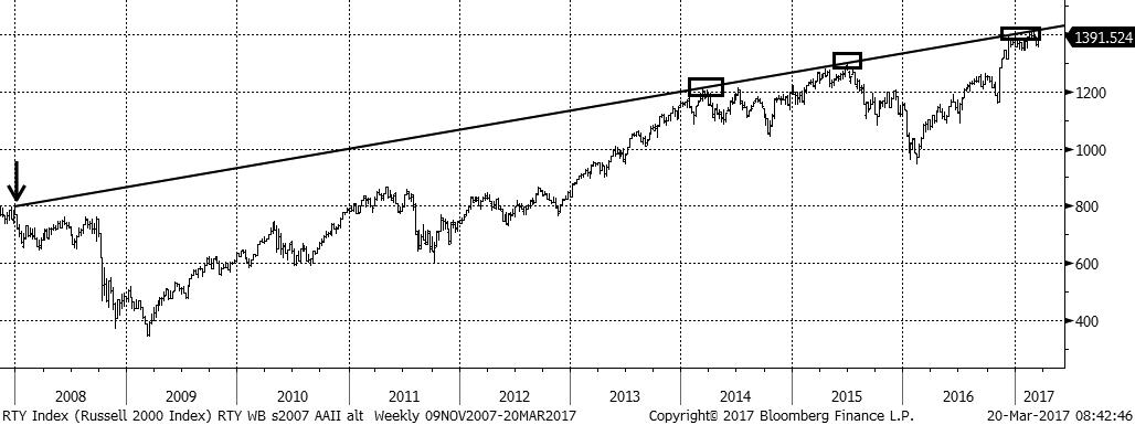
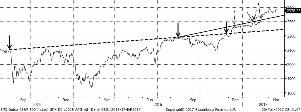
Figure 2 also charts the S&P 500, but from a daily closing basis angle. Note the dashed trendline stretching back to August 2015, along/around which three peak regions are marked by solid arrows. The index’s ability to clear that line by a visible margin transforms it into one of potential support on the southerly end. On a shorter-term basis, however, a higher zone of potential daily closing basis support is evident in the vicinity of the solidly drawn trendline stretching back to August 15, 2016, indicated by the middle solid arrow. Dotted arrows indicate the December 13, 2016, and January 25, January 26 and February 9, 2017, closes along/around that trendline. Like its dashed counterpart, the 500’s ability to visibly better it transforms the line into a potential support zone. Convincingly violating it on a daily close basis should increase the chances for a potential test of the dashed trendline vicinity, but that has yet to occur as of late March 2017.
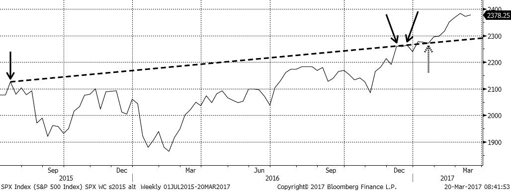
Sandwiched in between the two daily closing basis trendline locations in Figure 2, Figure 3 shows a weekly closing basis trendline on the S&P 500 index dating back to the week ending July 17, 2015. Three weekly closing peaks along/around the line are marked with solid arrows, with a recently successful test of that gauge in the week ended January 20, 2017 (indicated by the dotted arrow). This action suggests that the lined region offers a potential intermediate-term support area.
Note that numerous resistance regions are bettered in a primary bull market and multiple support zones are violated in a major bear market. That’s why attempting to gauge the market’s major trend is so important for those who incorporate technical analysis into their trading strategies.
The weekly bar chart for the Russell 2000 (Figure 4) illustrates a line extending all the back to December 2007 (arrowed). Boxed peaks lie along/around the line, which presently offers a respectable potential investment resistance zone. The most recent rally failure in the vicinity of the line occurred in early March 2017.

A weekly line chart for the Russell 2000 over the same time period is shown in Figure 5. A trendline here offers potential investment resistance on a weekly closing basis. The most recent failure in the vicinity of that line is marked with an arrow. The length of time these trendlines have been in force suggests that they have potential investment importance from a technical analysis standpoint.
Obviously there’s much, much more to the art of trendlines, including the important topic of pattern recognition (using multiple trendlines to search for price formations). Space doesn’t allow for a discussion of that topic here, but I hope I’ve at least given you a comprehendible introductory lesson on trendlines. You may wish to visit Market Technicians Association website (www.mta.org) for more information.
Disclosure: Clearview Trading Advisors Inc. is a member of FINRA/SIPC. Neither Clearview Trading Advisors Inc., nor any of its affiliates, or their respective members, shareholders, officers, directors, agents and employees (collectively “Clearview Trading”) recommends or solicits any investment by readers of these materials. Clearview Trading assumes no responsibility for the accuracy, completeness or timeliness of any information in these materials or for updating the information in these materials, which is subject to change without notice at any time. Clearview Trading has not verified such information, makes no warranty, express or implied, regarding it and shall not be liable for any losses, damages, costs or expenses relating to its adequacy, accuracy, truth, completeness, timeliness or use. Past performance of any security discussed or mentioned in this document is not an indication of future performance. Clearview Trading does not provide investment, tax or legal advice with respect to any investment opportunity or security discussed or mentioned in this document. Under no circumstance is the information contained within this article to be used or considered as an offer to buy or sell or a solicitation of an offer to buy or sell any particular security.
Trading Strategies

Technical Analysis


John Brewster from NJ posted over 9 years ago:
UBUKATA from FLORIDA posted over 9 years ago:
Al from NYS posted over 9 years ago:
You need to log in as a registered AAII user before commenting.
Log InCreate an account