


Wayne Thorp leads a class in AAII's new Essential Investing Video Course. Go to https://www.aaii.com/ves for more information and to subscribe.
According to investment guru Sir John Templeton, “bear markets have always been temporary. And so have bull markets.” The stock market follows cycles where it rises, falls and moves sideways. It is virtually impossible to predict where the market is going. However, according to Leslie Masonson’s book, “Buy—Don’t Hold” (FT Press, 2010), you can listen to the market telling you where it is headed.
In his book, Masonson states that the market is always doing one of three things:
- Rising: in an uptrend where you should hold stocks and add to positions with available cash;
- Declining: in a downtrend where you should sell existing positions, or at least not add new positions; or
- Moving sideways: in a trading range where you wait for a breakout to either the upside or downside.
According to Masonson, the foremost investment decision is to determine when the market’s direction is changing and then act accordingly. To do this, he uses a combination of freely available indicators—which he has dubbed the Stock Market Dashboard—that signal when to buy, sell or stay on the sidelines. Masonson believes that monitoring changes in market direction with his Stock Market Dashboard takes the guesswork out of trying to predict where the market is headed and, instead, allows you to see exactly where it is going.
While Masonson’s book deals primarily with trading in exchange-traded funds (ETFs), knowing how to read the direction of the overall market is useful when you are trading stocks too.
In this article, we discuss the indicators Masonson uses and how he arrives at a composite score that indicates when to buy and when to sell.
Dashboard Components
Why is it important to know the direction in which the market is headed? Well, as the old adage goes, “the trend is your friend.” According to research cited by Masonson, overall market direction is the main determinant of how well your investment portfolio performs. In fact, Masonson has read that fully 70% of an individual stock’s return is a result of the stock market’s overall trend. The remaining 30% is driven by the stock’s industry or sector (20%) and individual stock performance (10%). Based on these numbers, Masonson believes that knowing and investing in the market’s trend is important to becoming a consistent winner in the stock market.
Masonson’s Stock Market Dashboard uses eight indicators that tell him when to buy, hold, and sell because he feels that no single indicator can accurately and consistently identify every market turning point. The following highlights the eight indicators of Masonson’s Stock Market Dashboard.
Percentage of NYSE Stocks Above Their Moving Average
When the market becomes extremely overbought or oversold, a reversal may be on the way. To help judge this, Masonson looks at the percentage of stocks on the New York Stock Exchange (NYSE) that are trading above their 50-day moving average. When a large percentage of stocks are trading above their 50-day moving average, he considers this an overbought condition, with an increased chance of a market reversal to the downside. Alternatively, when a small percentage of stocks are trading above their 50-day moving average, this may indicate the coming of a reversal to the upside.
NASDAQ Composite Index 100-Day Moving Average Crossover
While many investors track a 200-day moving average to gauge the trend in the market, Masonson uses a 100-day moving average. He does so because it generates quicker buy and sell signals, thereby producing better profits in both bull and bear markets.
When the NASDAQ composite index closes above its 100-day moving average, Masonson views this as a bullish signal, while index values below the 100-day moving average are bearish.
One pitfall of using a moving average as a trading signal is the potential for “whipsaws.” Masonson defines whipsaws as “buy and sell signals near a moving average.” When the market is moving within a trading range (moving sideways), moving averages tend to flatten out, increasing the likelihood that the index can close above or below the line in short succession. Acting on these buy and sell signals can result in a string of unprofitable trades and higher trading costs. It is for this reason that Masonson does not rely solely on moving averages as a trading tool. In his opinion, using his market dashboard indicators in conjunction with each other will reduce the risk of whipsaw trades.
NYSE New Highs/New Lows
For the next dashboard indicator, Masonson takes the number of new daily highs for stocks trading on the NYSE and deducts from it the number of NYSE stocks hitting new daily lows. When this number becomes extremely negative and begins to rebound to the upside, according to Masonson, the market is likely to reverse course to the upside (a low has been reached).
Masonson points out that a large positive number—the number of new highs outnumbering new lows—does not offer a usable signal of a coming market reversal to the downside. Instead, he looks at the percentage of NYSE stocks reaching weekly new highs—the number of weekly new highs divided by the total number of issues traded that week. When this percentage reaches extreme levels and then begins to fall, this is a good sign that a market top has been reached.
NYSE Bullish Percentage Point & Figure
The NYSE bullish percentage (NYSBP) indicator tallies the number of NYSE stocks whose point & figure charts are currently indicating a buy signal and expresses the number as a percentage of all NYSE stocks. (For a primer on point & figure charting, refer to the Technically Speaking column “Point & Figure Charts” in the Second Quarter 2010 issue of Computerized Investing, available online at ComputerizedInvesting.com, or go to the Chart School at StockCharts.com.)
When this percentage reaches extremly high levels and begins to decline, the market may be headed for a reversal to the downside. Likewise, when this percentage begins to rise from extremly low levels, the market may be forming a bottom.
MACD on NASDAQ Composite
The moving average convergence/ divergence (MACD) is a trend-following indicator developed by Gerald Appel. It is calculated by subtracting the 26-period exponential moving average (EMA) from the 12-period EMA (periods can be days, weeks, months, etc.). Exponential moving averages place greater weighting on more recent prices, making them more reactive to recent price moves than simple moving averages, which place equal weighting on each periodic price.
This indicator also consists of a “signal line,” which is a nine-period moving average of the MACD. The indicator generates buy and sell signals when the MACD line crosses the signal line—a crossover from below is a buy and a crossover from above is a sell.
Since the MACD makes use of moving averages, like the NASDAQ composite index moving average crossover indicator, it is sometimes prone to generating false short-term signals. This again highlights the importance of using multiple indicators when determining when to buy and sell.
Beyond using crossovers between the signal line and MACD to identify possible buy and sell points, traders also look for divergences between the direction of the MACD and the underlying security or index. When you see the MACD making new highs while the underlying security or index is falling, this points to a possible reversal in the index or security.
(For a more in-depth discussion of the MACD, see “The MACD: A Combo of Indicators for the Best of Both Worlds” in the January 2000 issue of the AAII Journal, available at AAII.com.)
AAII Investor Sentiment Survey Bullish Percentage
Investor sentiment is often used as a contrarian indicator—individual investors tend to be most bearish at market bottoms and most bullish at market tops.
One sentiment indicator that is widely followed by professional traders and the financial press is AAII’s Investor Sentiment Survey. Each week, AAII members can vote online as to where they think the market is going over the next six months—up (bullish), down (bearish), or sideways (neutral). The results are published each Thursday at the AAII website (www.aaii.com/sentimentsurvey).
Best-Six-Months Strategy With MACD
Numerous studies indicate that there are months of the year when the stock market performs better than others. Masonson cites research by Sam Stovall, chief investment strategist for S&P Equity Research. Stovall’s research found that since 1945, the S&P 500 gained an annual average of 6.6% for the period November through April, versus an annual average return of only 1.4% for the May through October period. Stovall’s research also showed that the November through April period has outperformed the May through October period 71% of the time.
Building on this research Yale Hirsch, founder of the Stock Trader’s Almanac, developed the Best-Six-Months Strategy, which involves buying a stock index on November 1 of each year, then selling it on April 30 of the next year and holding cash equivalents until the end of October. Since 1950, investing in the Dow Jones industrial average (DJIA) using this strategy would have generated a 7.3% annualized gain, while investing in the DJIA in the May through October period would have generated an annual loss of 0.1%.
For his Stock Market Dashboard, Masonson uses an adaptation developed by Sy Harding, publisher of the Street Smart Report. This adaptation uses the MACD indicator to time buying and selling instead of following Hirsch’s fixed buy and sell dates. The approach increased the annualized return since 1950 to 9.2% (versus 7.3% for Hirsch’s original research).
Masonson applies the MACD to the S&P 500 index for his analysis.
NASDAQ Summation Index Moving Average Crossover With MACD Confirmation
The final piece of Masonson’s Stock Market Dashboard is the NASDAQ summation index (NASI). The NASI consists of two parts. The first is the difference between the number of advancing stocks and the number of declining stocks in the NASDAQ composite index. The second is the five-day exponential moving average (EMA) of the summation (NASI) line. When the NASI line crosses above the EMA, this is considered a buy signal, while a crossover to the downside is a sell signal. As confirmation of the crossover buy and sell signals, Masonson adds a MACD of the NASDAQ composite index. A NASI buy signal is confirmed when the MACD line crosses above its signal line; likewise a NASI sell signal is confirmed when the MACD crosses below its signal line.
Furthermore, when both the NASI and MACD are showing positive divergence with the NASDAQ composite—reaching new highs while the index is declining—Masonson considers this a very strong buy signal. Likewise, negative divergence with both indicators is considered a strong sell signal.
Scoring the Dashboard
Having specified the indicators that make up his Stock Market Dashboard, Masonson then sets out to establish a singular composite indicator that helps him identify when to buy and sell. He does this by assigning a +1, 0 or –1 value to each of the dashboard indicators. Therefore, his composite indicator can range in value from –8 (most bearish) to +8 (most bullish).
The following describes how Masonson assigns numeric values to each of the dashboard indicators and points you to free sources for the underlying data.
Percentage of NYSE Stocks Above Their 50-Day Moving Average
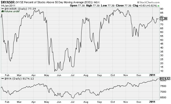
Figure 1 is a daily chart from StockCharts.com of the percentage of NYSE stocks trading above their 50-day moving average (the symbol for this indicator on the site is $NYA50R), with the NYSE composite index ($NYA) plotted below it. For Masonson, a buy signal (+1) is generated when the percentage drops to 25% or lower and then begins to rise. Likewise, a sell signal (–1) occurs when the percentage reaches 75% or above and then begins to decline.
For the week ending January 14, 2011, 77.4% of NYSE stocks were trading above their 50-day moving average. Furthermore, this was above the previous week’s level of just under 72%. While the percentage level is above 75%, it is continuing to rise. Therefore, this indicator is currently giving off neither a buy nor a sell rating, so we assign it a 0 score.
NASDAQ Composite Index 100-Day Moving Average Crossover
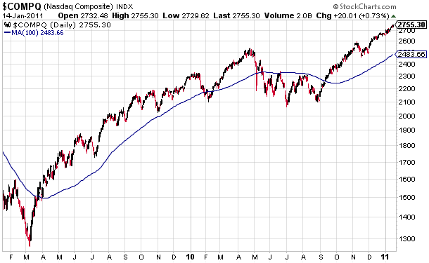
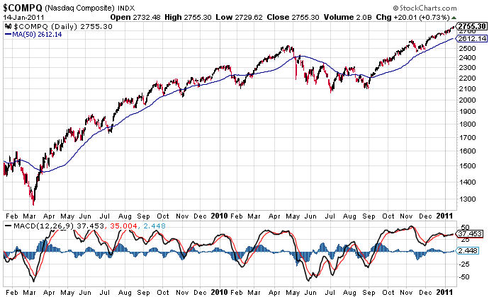
Figure 2 is a daily, two-year chart from StockCharts.com for the NASDAQ composite index ($COMPQ) with a 100-day simple moving average. A buy signal (+1) is generated when the index rises above the 100-day moving average. A sell signal (–1) is generated when the index crosses below the moving average.
For the week ending January 14, 2011, the $COMPQ was well above its 100-day moving average, which it had crossed above in mid-September 2010. As a result, we assign a buy rating (+1) to this dashboard indicator.
NYSE New Highs/New Lows
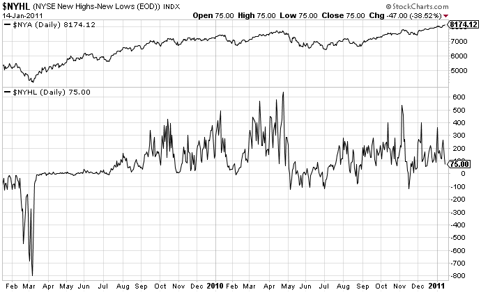
Figure 3 is a daily chart from StockCharts.com of both the NYSE composite index ($NYA) and the difference between the number of new highs and the number of new lows for the index ($NYHL). A buy signal (+1) is generated when the difference falls to –750 or lower and then begins to increase. For the week ending January 14, 2011, there were 75 new highs, which is not a buy signal.
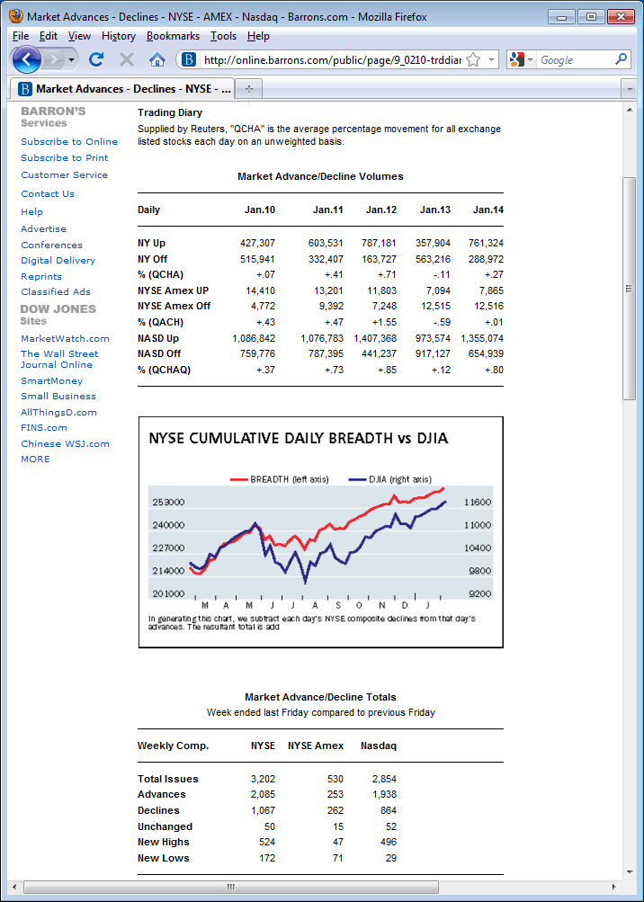
There is no corresponding sell signal when examining the difference between new daily highs and lows for NYSE stocks. Instead, Masonson looks at the number of weekly new highs for NYSE stocks as a percentage of the total number of issues traded for the week. A sell signal (–1) is generated when this percentage reaches 25% and begins to fall. We use the Trading Diary area of Barrons.com for this indicator, as shown in Figure 4 (online.barrons.com/public/page/9_0210-trddiary.html). Here we see that, for the week ending January 14, 2011, 524 of the 3,202 NYSE stocks traded reached a new 52-week high (16.4%). This is below the sell signal threshold of 25%, so no sell signal is generated, either. Therefore, a score of 0 is given to this dashboard indicator.
Also, if there hasn’t been a change in this indicator’s signal in the last six months, a neutral signal (0) is generated whether the current signal is a buy or a sell.
NYSE Bullish Percentage Point & Figure
Figure 5 is a daily point & figure chart from StockCharts.com of the percentage of NYSE stocks whose point & figure charts are currently indicating a bullish signal. To create this chart, select P&F Chart from the “Create a Chart” drop-down menu at the top of the page, type in the symbol $BPNYA and click the Go button.
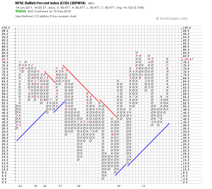
A buy signal (+1) is generated when the bullish percentage falls to 30% or below and starts to turn upward. A sell signal (–1) is generated when the percentage peaks above 70% and begins to turn downward. If no new signal has been generated over the last six months, a neutral signal (0) is generated.
As of January 14, 2011, 80.67% of NYSE stocks had point & figure charts with a bullish buy signal. This was up from 80.34% for the week ending January 7, 2011. Although the percentage is above Masonson’s 70% level for a sell signal, until the percentage begins to fall, no signal is being generated. Therefore, we assign a score of 0 to their indicator.
MACD on NASDAQ Composite Index
Figure 6 is a daily chart from StockCharts.com of the NASDAQ composite index ($COMPQ) along with the 50-day moving average and MACD. A buy signal (+1) is generated when the MACD line crosses above the signal line; a sell signal (–1) is generated when the MACD line crosses below the signal line. If no new signal has been generated in the last six months, a neutral signal (0) is generated.
For the week ending January 14, 2011, the MACD line (black line in lower chart) was above the signal line (red line in lower chart), having crossed above it the previous week. This is a buy signal (+1) for this indicator.
AAII Investor Sentiment Survey Bullish Percentage
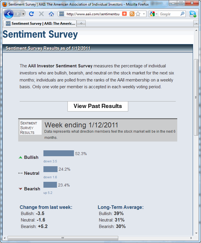
Figure 7 is the weekly reading for the AAII Investor Sentiment Survey from AAII.com as of January 12, 2011. For Masonson, a buy signal (+1) is generated when the percentage bullish reading drops to 25% and then rises the next week; a sell signal (–1) is generated when the percentage bullish reading rises to 50% and then drops the following week; if no new signal has been generated in the last six months, a neutral signal (0) is generated.
As of January 12, 2011, 52.3% of those surveyed were bullish on the direction of the market over the next six months, which was 3.5 percentage points lower than the previous week. Since the bullish reading is above 50% and falling, a sell (–1) signal is generated.
Best-Six-Months Strategy With MACD
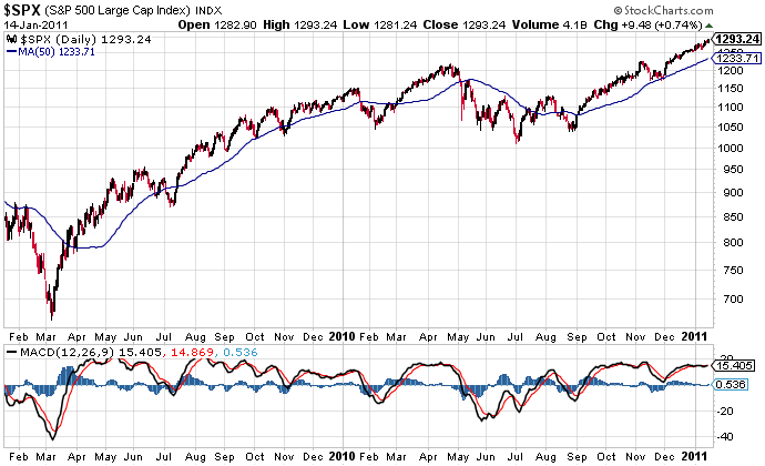
Figure 8 is a daily chart from StockCharts.com of the S&P 500 index ($SPX) with the MACD indicator. A buy signal (+1) is generated if, during the period from mid-October through early April, the MACD line crosses above the signal line. If the MACD line crosses below the signal line during the period from mid-October through early April, a neutral signal (0) lasting for the rest of the “favorable” period is generated. A sell signal (–1) is generated if the MACD line moves below the signal line anytime during the period from mid- to late April through early October. Again, however, a neutral signal (0) lasting the remainder of the “unfavorable” period is generated if the MACD line crosses above the signal line.
Currently, we are in the midst of the “favorable” November to April period, so we would be looking for a point where the MACD line crosses above the signal line. As we can see in the chart in Figure 8, this happened in early November 2010 (the black line in the lower chart crosses above the red line). However, shortly thereafter the market slid for a few weeks, testing its 50-day moving average. During this same period, the MACD line dipped below the signal line, negating the earlier buy signal. Even though the MACD line has again crossed above the signal line, this indicator will remain with a neutral rating (0) until the beginning of the “unfavorable” period in April.
NASDAQ Summation Index Moving Average Crossover With MACD Confirmation
Figure 9 is a StockChart.com chart plotting the NASDAQ summation index, its five-day exponential moving average (EMA), and the NASDAQ composite index ($COMPQ) in the upper pane and the MACD of the NASDAQ summation index in the lower pane.
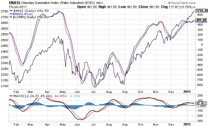
A buy signal (+1) is generated when the $NASI rises above its five-day EMA and that is confirmed by the MACD crossing above its signal line on or near the same day. A sell signal (–1) is generated when the index falls below the five-day EMA and the MACD has a confirming sell signal on or near the same day.
As of January 14, 2011, the $NASI was above its five-day EMA. However, its MACD line had crossed below the signal line earlier that week. Therefore, neither a buy nor a sell signal is being generated by this indicator and we assign it a 0 value.
Tallying the Results
Having run through Masonson’s Stock Market Dashboard, it is now time to tally the results:
-
Percentage of NYSE stocks above their 50-day moving average:
Indicator signal 0
Tally 0 -
NASDAQ composite stock index crosses the 100-day moving average:
Indicator signal +1
Tally +1 -
NYSE daily new highs minus daily new lows:
Indicator signal 0
Tally +1 -
NYSE bullish percentage on a point & figure chart:
Indicator signal 0
Tally +1 -
MACD indicator reading on the NASDAQ composite index:
Indicator signal +1
Tally +2 -
AAII weekly Investor Sentiment Survey bullish percentage:
Indicator signal –1
Tally +1 -
Best-six-months strategy with MACD indicator:
Indicator signal 0
Tally +1 -
NASDAQ summation index moving average crossover with MACD indicator conformation:
Indicator signal 0
Tally +1
As of January 14, 2011, our dashboard composite reading was +1, which places it in Masonson’s “indeterminate” range, where he suggests taking no action until the dashboard indicates a pronounced upward or downward trend.
Market Entry Strategies
For his trading, Masonson reviews his Stock Market Dashboard each week after the market has closed. If the trend in the market has not changed from the prior week, no changes are needed to your portfolio.
Masonson views composite scores between –2 and +2 as indeterminate readings where no action should be taken.
Masonson advises that when the composite score reaches a +3 value, you should have the majority of your money in the market. As the composite value rises, he suggests incrementally adding to your holdings.
Masonson proposes three different market entry strategies:
- Invest all of your funds immediately. By far the most aggressive option, this also affords you the greatest opportunity for profits by entering the market early in the expected uptrend.
- Invest 80% with a +3 reading and then an additional 15% for each additional one-point increase in the dashboard composite. While this approach involves less risk than the first option, you are potentially sacrificing some gains by entering the market more slowly.
- Invest 25% with a +3 reading and then invest an additional 20% for each additional one-point increase in the composite until +7 is reached, at which point the remaining 15% of your funds can be invested. This is by far the most conservative approach. There is also the possibility of not reaching a +7 reading, in which case you would either not be fully invested or you would choose to invest fully at a lower reading.
Sell Strategy
Masonson’s sell strategy is much simpler. When the dashboard composite value dips to –3, he suggests selling all equities and holding 100% cash until the composite rises back to +3. While he admits this is an extremely aggressive downside-protection strategy, Masonson also contends that it is a sure way to protect your capital in the event of a severe or prolonged market downturn.
Conclusion
The market downturn of 2008–2009 showed that buy-and-hold investing can wreak havoc on a portfolio over shorter time periods. To aid in identifying the overall trend in the market, Leslie Masonson developed his Stock Market Dashboard. This collection of eight indicators can help short-term investors and traders stay on the “right side” of the market and protect their portfolios on the downside.
While no market timing system is 100% perfect, Masonson believes that the indicators he uses for the dashboard will help cut down on the number of false signals and allow you to become a more successful, and profitable, investor.
Discussion
FREE REPORT

Jerry from AZ posted over 15 years ago:
Kenneth from SC posted over 15 years ago:
George from NC posted over 15 years ago:
Sally from CA posted over 15 years ago:
Chuck from WY posted over 15 years ago:
Robert e. from KY posted over 15 years ago:
Kenneth from WI posted over 15 years ago:
Jim from CO posted over 15 years ago:
Ramesh from OH posted over 15 years ago:
Richard from AL posted over 15 years ago:
Steve from GA posted over 15 years ago:
David from FL posted over 15 years ago:
Hal from MN posted over 15 years ago:
David from VA posted over 15 years ago:
David from VA posted over 15 years ago:
Donald from PA posted over 15 years ago:
Tom from IL posted over 15 years ago:
Ron from FL posted over 15 years ago:
Gil from CA posted over 15 years ago:
Stephen from VA posted over 15 years ago:
John from ME posted over 15 years ago:
Matthew from CA posted over 15 years ago:
John from NC posted over 15 years ago:
Karl from PA posted over 15 years ago:
Larry from CA posted over 15 years ago:
Eric from MA posted over 15 years ago:
Geoff from AR posted over 15 years ago:
William from PA posted over 15 years ago:
Alan from CA posted over 15 years ago:
Robert from MI posted over 15 years ago:
Irwin from IL posted over 15 years ago:
Gerald from VT posted over 15 years ago:
Britni from CA posted over 15 years ago:
John from PA posted over 15 years ago:
Kenneth from CO posted over 15 years ago:
Sanman from TX posted over 15 years ago:
Al from MA posted over 15 years ago:
Hugh from OH posted over 15 years ago:
Jean from MA posted over 15 years ago:
Jean from MA posted over 15 years ago:
Richard l. from IL posted over 14 years ago:
Wayne from IL posted over 14 years ago:
James from CO posted over 14 years ago:
Kim from NC posted over 14 years ago:
Charlie from FL posted over 14 years ago:
Joe from MD posted over 14 years ago:
Paul Thiry from WA posted over 11 years ago:
You need to log in as a registered AAII user before commenting.
Log InCreate an account