

The rapid market collapse brought a sharp end to the long-running bull market. As they say, nobody rings a bell at the top or the bottom of a market cycle. Often the top or bottom is confirmed well after the fact. Fear has certainly gripped investors as we try to understand the impact of the novel coronavirus disease (COVID-19), and its impact is examined through the volatile market swings that we have observed recently.
While it’s natural to be anxious during this time of uncertainty, we also know that panic is not an investment strategy. In an October 16, 2008, op-ed in the New York Times, Warren Buffett noted that he was buying stocks during the financial crisis. Why?
“A simple rule dictates my buying: Be fearful when others are greedy, and be greedy when others are fearful. And most certainly, fear is now widespread, gripping even seasoned investors. To be sure, investors are right to be wary of highly leveraged entities or businesses in weak competitive positions. But fears regarding the long-term prosperity of the nation’s many sound companies make no sense. These businesses will indeed suffer earnings hiccups, as they always have. But most major companies will be setting new profit records 5, 10 and 20 years from now.
“Let me be clear on one point: I can’t predict the short-term movements of the stock market. I haven’t the faintest idea as to whether stocks will be higher or lower a month or a year from now. What is likely, however, is that the market will move higher, perhaps substantially so, well before either sentiment or the economy turns up. So if you wait for the robins, spring will be over.”
The stock screens and first cuts we present on AAII.com are designed to help provide you with a starting point for investment candidates worthy of your consideration for further research. The majority of the screens are based upon our quantitative interpretation of stock market gurus with strong historical track records, while the factor screens are designed using attributes that have been shown to generate high returns.
For our Stock Ideas Update email this month, we present a discussion of the historical risk and return characteristics of the 60 stock screens that we track on AAII.com.
The table below presents performance on the 60 screens that we have tracked since 1998. The performance of the stocks passing each screen is tracked on a monthly basis. The month-to-month closing price is used to calculate the performance, which assumes an equal investment in each stock at the beginning of each month. The impact of factors such as commissions, bid/ask spreads, cash dividends, time-slippage (time between the initial decision to buy a stock and the actual purchase) and taxes is not considered. Sell rules are the same as the buy rules: The screens are simply reapplied using each subsequent month’s data. Thus, a stock is “sold” (no longer included in the portfolio) if it ceases to meet the initial buy criteria, and new stocks are added if they qualify.
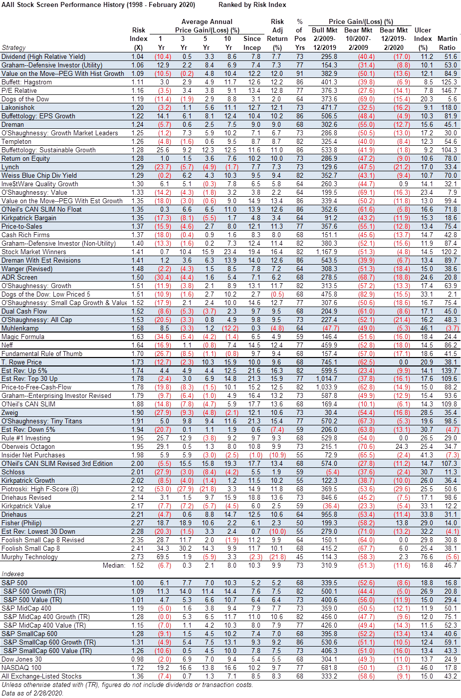
Our goal in tracking the performance of these screens was to see how effective each strategy proved to be over time and how they would perform over the economic and stock market cycles. Most investors look closely at the performance of a screen when choosing an investment methodology. Perhaps just as important, however, is a comparison of the overall risk, or volatility, of the screens.
We have sorted the table by the risk index, which is calculated by dividing a screen’s monthly standard deviation since inception by the monthly standard deviation the S&P 500 index. In essence, the risk index quantifies how volatile on a price-return basis a screen is compared to the S&P 500: A risk index of 2.00 means that the screen is twice as volatile as the S&P 500.
All of AAII’s screens have risk indexes above 1.00, which is somewhat expected as all of the stock indexes, with the exception of the Dow Jones industrial average, are also more volatile than the S&P 500. Stock screens typically have resulted in a passing list of anywhere from a handful of stocks to around 50. The screens focused on dividends, utility sector, deep value with momentum and value with quality have the lowest relative volatility: High Relative Dividend Yield, Graham Defensive Investor Utility, Value on the Move—PEG With Historical Growth and Buffett Hagstrom.
On the opposite end of the spectrum, we have several screens with risk indexes above 2.00. The top-performing screen over the last year, the Murphy Technology screen, has a risk index of 2.73, meaning that it is 2.73 times as price-volatile as the S&P 500.
Risk-Adjusted Return
The table also presents the risk-adjusted return for each of the screens. This calculation is a bit more complicated, but essentially it adjusts the performance of each screen using their standard deviations of returns, penalizing screens with higher standard deviations.
The Estimate Revisions Up 5% screen has the greatest average annual price gain of 21.6% since inception, but its risk index of 1.74 reduces its risk adjusted return to 16.3%. The Stock Market Winners screen has a lower average annual price gain of 19.4%, but with a lower risk index of 1.41 it has the greatest risk-adjusted return of 16.4%.
Percentage of Positive Years
We have been tracking the stock screens for over 22 years. The column labeled “% of Pos Yrs” reveals how often a screen has had a positive calendar-year price gain. Our simple tracking of the Value on Move—PEG With Historical Growth screen shows that the approach had only two negative calendar-year gains, indicating that is has had gains 91% of the individual years. In contrast, the Murphy Technology screen has more down years than up years with a 45% of positive years calculation. AAII members can review the year-by-year performance of the screens on the stock screens performance table on AAII.com (www.aaii.com/stockideas/performance).
Bear Market Return
The longest bull market in history is over after its 11-year run. Less than a month after closing at a high of 3,386.15 on February 19, the S&P 500 sold off sharply, falling more than 26% through Thursday’s close. The broad stock market has been down since the start of this year. The monthly returns of all the broad stock market indexes turned negative this year, so considering monthly returns are calculating the bull market return from the end of February 2009 through the end December 2019. The previous bear market return was calculated from end of October 2007 through the end of February 2009. The current bear market return is being calculated for the first two complete months of 2020. The table presents the recent bull market price gains along with the capital losses for the prior bear market and current bear market.
The Stock Market Winners screen had the greatest price gain during the bull market period, gaining 1,167.9% compared to a price gain of 339.5% for the S&P 500, 359.0% gain for the S&P MidCap 400 index and 395.8% gain for the S&P SmallCap 600 index. It is worth noting that the Stock Market Winners screen is fairly restrictive, with only six stocks passing the screen each month on average over the last 22 years.
The O’Neil CAN SLIM screen had the best performance during the bear market of 2007 to 2009. It only had a price loss of 10.1% during the last bear market. The S&P 500 lost 52.6% during the last bear market while the S&P MidCap 400 index lost 50.5% and the S&P SmallCap 600 index lost 52.2%. The O’Neil CAN SLIM screen combines price momentum along with earnings momentum and earnings consistency. Our interpretation of the approach includes a requirement that a passing stock be within 10% of its 52-week high. During broad market sell-offs, few stocks pass this filter and push the strategy into cash. The screen had a loss of 6.1% during the first two months of 2020.
Ulcer Index
Two other measures of risk and risk-adjusted return are also presented in the table. The Ulcer Index is a measure of downside volatility; it was named as such because downside volatility causes stress and stomach ulcers. Needless to say, a lower number is better, indicating that there is less volatility on the downside. The Ulcer Index looks at both the depth of drawdowns and the length of the drawdowns.
The P/E Relative screen has the lowest Ulcer Index of 7.8%. The screen for profitable companies with attractive valuations that also had their earnings estimates recently revised upward. The screen has a risk index of 1.16, indicating that its monthly volatility has been around 16% greater than that of the S&P 500. Its risk-adjusted gain is strong at 12.8%. The screen’s high risk-adjusted return comes from its relatively low drawdown and bear market return. It outpaced the market slightly during the latest bull market (376.3% gain vs. 339.5% for the S&P 500), but only fell 27.6% during the last bear market when the S&P 500 lost 52.6%.
Followers of the approach note that strategies with high overall volatility, as measured by standard deviation, but relatively low downside volatility, as measured by the Ulcer Index, are especially attractive as price movements have historically been to the upside instead of to the downside. The O’Neil CAN SLIM screen is an example, with a risk index of 1.88 and an Ulcer Index of 14.3%, below the median Ulcer Index of all the screens (16.8%).
Martin Ratio
The Martin ratio, or Ulcer Performance Index (UPI), is similar to the risk-adjusted return, which measures the amount of excess return an investment generates for each unit of total risk, as measured by standard deviation.
The Martin ratio is calculated by subtracting the risk-free rate from the return and dividing this total by the Ulcer Index. The ratio measures returns above the risk-free rate per unit of risk, with the unit of risk being the Ulcer Index. The Martin ratio looks for high values. Using this metric, the P/E Relative screen still has the best overall performance, with the Estimate Revisions Up 5% screen second and the Buffett Hagstrom screen third. So, while the Buffett Hagstrom screen returned “only” 12.2% on an annualized basis since 1998, its Ulcer Index is a mere 8.5%, resulting in a strong Martin ratio of 125.3.
We are used to hearing the common disclaimer that past performance is no guarantees of future return and that is certainly true. However, it remains important to study and understand historical market patterns, because while history does not always repeat itself it often rhymes.
Discussion
FREE REPORT

No comments have been added yet. Add your thoughts to the discussion!
You need to log in as a registered AAII user before commenting.
Log InCreate an account