

Related

Financial Planning
Long-time AAII Journal columnist Mark Hulbert shows you how to spot inflated performance claims in this classic article from the September 2001 issue.
by Mark Hulbert | August 2019

I am continually mystified by individuals’ gullibility in the face of exaggerated investment performance claims. Investors who are nobody’s fool when it comes to outrageous advertisements in other areas of their lives suddenly become naive when confronted with equally outrageous investment performance claims. It doesn’t make sense.
For example, most of you wouldn’t give the time of day to a used car salesman who told you that an old car had only been driven to church on Sundays. Yet many of you not only gave the time of day, but actually paid good money—to refer to a successful ad campaign of several years ago—to an investment newsletter that claimed that in 13 years’ time it had turned $10,000 into more than $40 million.
In order to boost your immunity to such claims, I’m devoting this column to a review of some recent advertising that, in my opinion, strains credulity. In the process I will identify certain warning signs that you should be on the lookout for when reading an investment ad.
If you’re convinced that your immunity to outrageous claims already is strong, and therefore you don’t need any help from me, then all power to you. But remember that, at least in my experience, some of the most gullible investors are those who believe they are not.
Let me stress that not all advertising for investment newsletters is false or misleading. Some ads are admirable in telling the truth, the whole truth and nothing but the truth. But until and unless all ads live up to that standard, you need to be on your guard.
One of the most important lessons to learn concerns the highest return you can realistically expect to earn over long periods. I believe that this practical maximum is around 20% to 25% annualized, and even that is achievable by only a select few.
An illustration of the use to which you can put this lesson comes from an email I received a few days ago concerning a newsletter that is not currently tracked by the Hulbert Financial Digest (HFD). It claimed to have produced an 847% annualized return over the past three years. Since the HFD has not calculated a track record for this service, I have no basis for ascertaining the veracity of this claim. But even if it were true, I nevertheless would not place high odds on this service being able to sustain this pace into the future.
There are several different perspectives that help us appreciate why such a practical maximum exists. One is that returns much higher than 20% to 25% annualized are economically impossible over long periods. Consider how large your portfolio would grow to if it were able to achieve an 847% annualized return. Even if it began with as little as $1,000, within 10 years it would be worth more than the combined gross domestic products of all nations.
Another perspective is provided by the highest long-term returns that have been produced historically. Take Warren Buffett, for instance, who is widely credited with being the most successful investor alive today. Since the mid-1960s, the book value of his company, Berkshire Hathaway, has grown at an annualized pace of around 23%. While that return is more than enough to turn both Buffett and his shareholders into extremely wealthy individuals, it’s a far cry from the exaggerated performances that too often are advertised.
The next time you receive an advertisement for performance as good or better than Buffett’s, ask yourself how often such individuals come along and how likely it is that they would be selling advice to you.
It is possible, but I wouldn’t bet on it.
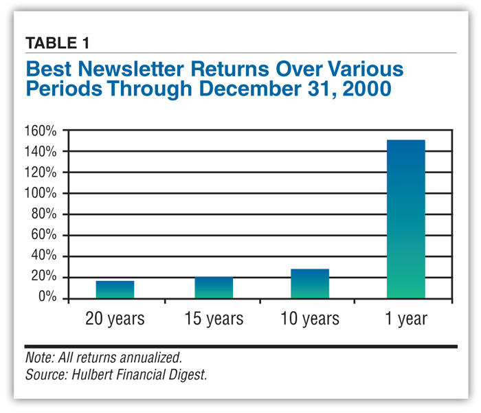
This investment lesson doesn’t mean that rates greater than 25% annualized are unattainable over short time periods. It simply means that those high short-term rates are unsustainable. Another way of putting this is that regression to the mean is a powerful force. Take a look at Table 1, which reports the performances of the best-performing newsletters over various time periods through the end of the year 2000. Notice that the best returns drop dramatically as the time period expands to encompass more and more years.
A related trick that advertisers play is to truthfully report performance that nevertheless is not current. Since even broken clocks are right twice a day, advertisers have no difficulty finding some period in which their clients looked like geniuses.
This trick usually is a last resort, however, to be used when nothing else is available. After all, if a newsletter’s long-term record is good, then its advertiser undoubtedly will point this out, including providing specific dates and performance numbers. If an advertisement doesn’t provide such specificity, it is at least a warning sign to tread carefully.
Consider a recent advertising brochure I received this past June for Stephen Leeb, who edits two newsletters: The Big Picture and Personal Finance. According to the ad, Leeb “was recently rated as the #1 market timer by ... the Hulbert Financial Digest.” Though the brochure did not specify the recent period over which Leeb was so highly ranked, it did say that the HFD has “given him other awards covering periods of five years, which puts him in a different league from advisors who shine in the #1 slot for a single fleeting year.”
This was news to me. Leeb’s market-timing system—an econometric model known as the “Master Key”—is nowhere near to being ranked in first position for recent performance. As of the end of 2000—which, when Leeb’s ad appeared, was the most recent date through which the HFD had published a rating for Leeb—his Master Key over the trailing one-year period was ranked at the 13th percentile. That is, 87% of the timing systems the HFD tracks did better than Leeb’s over this period. His Master Key also ranked well below average over the trailing three-, five- and 10-year periods—at the 10th, 20th and 31st percentiles, respectively.
How far back must we go to find a period over which Leeb’s Master Key ranked first? To the end of 1994, at which point it was in first place for performance over the trailing year. Even so, at that time the Master Key’s rank over longer periods was well down the list.
Walter Pearce, the president of KCI Communications, the company that publishes Leeb’s newsletters, explained that the source of the blunder was an individual at KCI who, when writing this particular advertising brochure, simply lifted language from an old and out-of-date advertisement. Evidently, prior to going to press, no one at KCI had bothered to determine whether the claim was still true.
Another trick that investment advisers often play is to create many different portfolios. This increases the odds that at least one portfolio will perform well. But that does not mean that the adviser is a good bet for future performance.
I’m reminded of this lesson by a recent advertisement for a brand new newsletter edited by Michael Murphy, entitled Biotech Investing. I have not tracked this new service, which Murphy claims has produced a 70% profit in just four months. But I have tracked several other newsletters published by Murphy, and the picture painted by their track records is far less impressive.
The longest track record I have for Murphy comes from his California Technology Stock Letter. According to the HFD’s calculations, from the beginning of 1982 through July 31, 2001, its model portfolios on average lagged the Wilshire 5000 by more than 10 percentage points per year. The second-longest track record I have for a Murphy newsletter is for Overpriced Stock Service. Between the beginning of 1990 until it discontinued publication in mid-2000, according to the HFD, its model portfolio lost more than 99%. Finally, the HFD has a 2.6-year record for a third Murphy publication, Technology Investing. From the beginning of 1999 through July 31, 2001, according to the HFD, it produced a 19.4% annualized return, in contrast to 0.8% for the Wilshire 5000.
Needless to say, the advertisement for Murphy’s new newsletter does not mention the track records of each of these other newsletters.
 The lesson to learn: Because advertisers can be counted on to put their clients’ best feet forward, don’t expect them to give you the full, unvarnished truth. If their clients are tracked by independent monitoring services such as the Hulbert Financial Digest, look to those services to get a fuller picture. If they are not tracked, get the advisers to answer—in writing—questions such as: What was their worst-performing account over various periods such as the last year, five years and 10 years? How many clients left their money management in a loss position?
Money managers are not required to answer such questions. But by the same token, you are not required to utilize the services of those who refuse.
Another advertising sleight-of-hand is to confuse arithmetic averages with geometric ones. The former does not take into account the effect of compounding, and thus overstates the real returns.
To illustrate, assume that 10 years ago you invested $10,000 in a 5% savings account and that you reinvested the interest annually. Your account now would be worth $16,289, for a 10-year gain of 62.89%. If you used an arithmetic average to calculate your annual gain, you would report that you gained 6.29% per year (62.89 divided by 10) instead of the 5% you earned every year (which is the geometric average of 62.89% over 10 years).
The difference between these two returns may seem modest in this case, but it becomes huge when focusing on the higher returns of the equity market over the past two decades. Take the Maverick Advisor (formerly Fabian Premium Investment Research and, before that, Telephone Switch Newsletter). Consider a portfolio that between mid-1980 and this past July 31 used this newsletter’s domestic equity switch signals to trade in and out of hypothetical shares of the Wilshire 5000 and cash. According to the HFD, this portfolio would have made 1,423% over this 21.1-year period. Using an arithmetic average, that is equivalent to a yearly gain of more than 67%. On a geometric average basis, in contrast, this return is equivalent to 13.8% annualized.
I use Maverick Advisor as an illustration of this phenomenon because on occasion over the years its advertisers have been guilty of confusing arithmetic and geometric averages. But I mention this newsletter also because, despite this confusion, its market timing is in first place over this 21.1-year period among all the timing systems the HFD has tracked over this period. This shows that misleading advertising is not the exclusive domain of the poorer-performing newsletters.
Another thing to be on your guard against is backtesting. Statisticians refer to the practice as data snooping or data mining. Regardless of what it is called, the track records produced by the practice are far less reliable than track records produced in real time.
Data mining has become an increasingly prevalent practice in recent years, due to the advent of powerful personal computers and readily accessible historical databases. With thousands of investors mining these databases, more and more spurious patterns are being “discovered.” That is why so many strategies with an apparently great track record seem to stop working the moment you start following them.
My favorite example of this comes from Codexa Corp.’s CEO, David Leinweber. To illustrate the perils of data mining, several years ago he searched through all the data on a United Nations CD-ROM to find the indicator most correlated with the S&P 500. His discovery: butter production in Bangladesh.
One of the best defenses against data mining is to test strategies over a different time frame than that used to discover its existence. A strategy might look good over the last decade, but how did it perform in previous decades, for example?
Advertisers are quite ingenious in how they describe the backtesting done by their clients. For example, a newsletter advertisement I received a few years ago bragged about the impressive performance that emerged from the “system testing” of his client’s strategy. It sounds better than “backtesting” or “data snooping,” but in reality it is the same thing.
You’ve heard it countless times, and it seems trite to repeat it once again. But it remains very good advice nonetheless: If an advertisement makes an investment strategy appear too good to be true, it probably is.

Financial Planning

Portfolio Strategies

Stock Strategies

Wayne from IL posted over 7 years ago:
Jean from AAII posted over 7 years ago:
You need to log in as a registered AAII user before commenting.
Log InCreate an account