


Price stability has become a chief concern of central banks around the world, and anything beyond mild inflation or deflation are considered bad outcomes. Of the two, deflation is considered the greater evil and central banks have chosen to err on the side of inflation when making monetary policy decisions. In the U.S., the Federal Reserve interprets an inflation rate of 2% as consistent with the goal of price stability and the Federal Open Market Committee (FOMC) adopted this rate as an inflation target in January 2012. The target isn’t considered a floor or ceiling, but concerns would arise if price level changes are at a rate that is consistently and significantly higher or lower than the target rate.
The purpose of this study is to demonstrate the importance of price stability to the equity markets. The cyclically adjusted price-earnings ratio (CAPE), developed by Nobel laureate and Yale University economics professor Robert Shiller, is used as a measure of U.S. equity market valuation. Shiller defines the current CAPE ratio as the inflation-adjusted price level of the S&P 500 index divided by the moving average of the preceding 10 years of S&P 500 inflation-adjusted earnings, with the U.S. consumer price index (CPI) used to adjust for inflation. The results of this study show that low equity valuations are most often associated with periods of price instability—i.e., during or immediately after time periods of either high inflation or deflation.
Eras of Price Instability in the U.S.
The solid black line that appears in Figure 1 is the CAPE × 100 and the black dotted line is the geometric average of the CAPE × 100. The geometric average for the CAPE ratio of 15.74 is used as a measure of central tendency due to the significant serial correlation in the CAPE time series. The red line is the CPI. The vertical axis for Figure 1 is in log scale so that equal percentage changes in a time series appear equally distanced apart. The data used is monthly over the time period of January 1881 to May 2020. Shiller kindly provides all the data used in this study at www.econ.yale.edu/~shiller/data.htm.

Figure 1 also identifies six eras of price instability in the U.S. Three high inflation periods (the CPI slopes sharply higher) are identified in grey shaded areas and three deflationary periods (the CPI slopes sharply lower) are identified in blue shaded areas. As Figure 1 shows, most of the time periods where the CAPE ratio has been below its geometric average have occurred either during periods of price instability or immediately thereafter.
The first deflationary period shown in Figure 1 is part of what has been called “The Great Deflation.” Although historians claim this era began in 1865, its appearance in Figure 1 coincides with the start of the CAPE series in 1881. This era corresponds with the beginning of the Second Industrial Revolution and was characterized by a transition in the U.S. from a rural, farm-based economy to a more urban and industrial economy. Agricultural overproduction and dramatic increases in productivity led to consistent price declines in most commodities and goods. However, nominal wages remained relatively steady, resulting in a prolonged rise in consumer purchasing power. The annualized inflation rate from January 1881 through December 1896 was –2.15% and the CAPE ratio fluctuated in a tight range around its geometric average, reaching a low of 12.91 in June 1884.
The first high inflation period shown in Figure 1 began with the onset of World War I in July 1914 and ended in June 1920 (the Treaty of Versailles was signed June 1919). U.S. taxpayers were reluctant to fund the war effort through increased taxes and the deficit spending by the federal government that followed is most often cited as being the catalyst for the resulting inflation. Monetary policy was expansionary and also contributed to the inflation of this era. The 23.7% increase in the CPI from June 1919 to June 1920 is the largest year-over-year increase in the index’s history. The annualized inflation rate during this time period was 13.27% and the CAPE ratio registered a low of 5.04 in June 1920.
The second deflationary period shown in Figure 1 corresponded with a two-year post–World War I recession. Reasons for the economic downturn include large increases in unemployment and wage stagnation due to a large increase in the labor force from returning military personnel, government spending cuts and tight monetary policy designed to combat postwar inflation. Factors contributing to the deflation included a positive supply shock to commodity prices due to the resumption of shipping after the war and an increase in deflationary expectations following World War I inflation. This was the worst deflation era in U.S. history and the annualized inflation rate from July 1920 to August 1922 was –10.26%. The CAPE ratio hit its all-time low of 4.78 in December 1920.
The final deflationary period shown in Figure 1 took place during the Great Depression. A collapsing financial sector and numerous bankruptcies created a frantic demand for money. Rather than accommodating this demand, the Fed contracted the money supply in enforcement of its real bills doctrine. In the four years of 1930–1933 nearly 10,000 banks failed or were suspended, and unemployment peaked at 24.9%. Gross domestic product (GDP) fell from $103.6 billion in 1929 to $56.4 billion in 1933, a decline of almost 46%. The annualized inflation rate was –8.47% from August 1929 to March 1933 and the CAPE ratio hit a low of 5.57 in June 1932.
The second high inflation period identified in Figure 1 ran from September 1939 to August 1948 and is often labeled as “World War II Inflation.” Similar to World War I, the most often cited cause of World War II inflation is deficit spending to fund the war. However, various price and wage controls, goods rationing and the sale of war bonds to the public resulted in inflation remaining well below World War I levels. The annualized inflation rate during this time period was 6.39% and the CAPE ratio registered a low of 8.51 in May 1942.
The final high inflation period identified in Figure 1 is often referred to as “The Great Inflation” and lasted from January 1965 to December 1982. Many economists attribute the Great Inflation to monetary policy mistakes rather than other purported causes, such as oil price shocks and defense spending for the Vietnam War. At the time, policymakers believed in a trade-off between inflation and employment—the Phillips curve—and that unemployment was above its natural rate. Efforts to push the economy to full employment resulted in much higher levels of inflation than were originally anticipated. Inflation began ratcheting upward in the mid-1960s and was over 10% in 1974, 1979 and 1980. The Fed began raising interest rates in 1977 and the U.S. economy fell into a severe recession in the early 1980s, leading to a decline in inflation in the latter half of that decade. The annualized inflation rate was 6.57% during the Great Inflation and the CAPE ratio registered a low of 6.64 in July 1982.
Tabulating the Results
As shown in Table 1, there are 1,673 monthly observations in this study spanning the time period of January 1881 to May 2020. The CAPE ratio was above its geometric average in 896 of the months in the sample (53.6% of the total) and below its geometric average in 777 of the months in the sample (46.4% of the total). Of the 777 months that the CAPE ratio was below its geometric average, 288 of those months occurred during one of the three periods designated as “high inflation” in Figure 1 and 119 of the months occurred during one of the three periods designated as “deflation” in Figure 1. Thus, the six identified periods of price instability account for 52.4% of the time that the CAPE ratio has been below its geometric mean.
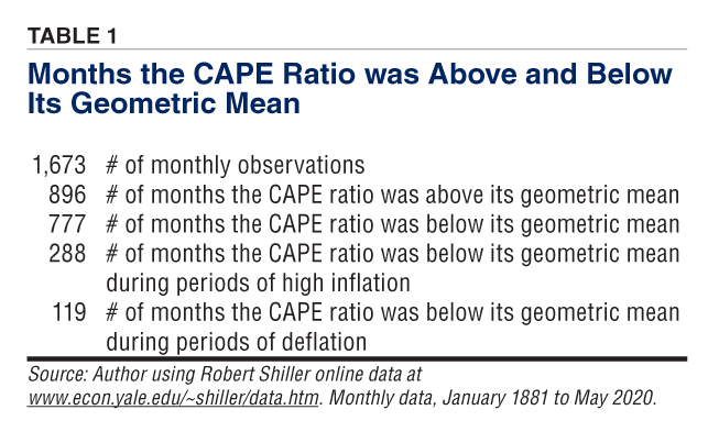
However, while impressive, the results in Table 1 do not fully reflect the detrimental effect that price instability has had on U.S. equity market valuations. This is because the table does not include the amount of time it took the CAPE ratio to recover to its geometric average following one of the high inflation or deflation time periods. For example, the Great Inflation ended in December 1982. The CAPE ratio finally edged back above its geometric average in February 1987, 51 months later. Looking at Figure 1, it is easy to see that most of the time periods that the CAPE ratio was below its geometric average occurred during periods of price instability or in the recovery that immediately followed.
Theory and Evidence From the Finance Literature
The dominant theory regarding the impact that inflation has on stock prices has been money illusion. Money illusion is the name given to the human cognitive bias of thinking of wealth or income in nominal rather than real terms. Thus, the error some make is mistaking the nominal value of money for its purchasing power.
In finance, value is often determined using a discounted cash flow model where the value of an asset is calculated as the present value of its expected cash flows. For stocks, intrinsic value is often determined by discounting some equity-related cash flow such as dividends or free cash flow. The money illusion error made in equity markets is that investors will discount real cash flows using a nominal discount rate. Although market interest rates are nominal because they reflect inflation expectations, investors fail to properly adjust equity cash flows for expected inflation.
Most of the evidence suggests an upside-down U-relationship between inflation and measures of equity performance. Returns and valuation measures are highest when inflation and deflation are low. They are lowest when inflation or deflation is high.
However, valuation measures such as the CAPE ratio have suffered much more in periods of high inflation compared to periods of deflation. As Figure 1 shows, the CAPE ratio tracked close to its geometric mean during the Great Deflation of the late 1800s. Although the CAPE ratio was low during post–World War I deflation, it actually trended higher following the World War I inflation era. The Great Depression is an outlier in the sense that it is the only episode of the three deflation eras where the CAPE ratio fell significantly.
While attributing poor equity performance during periods of high inflation to money illusion fits with the historical data, the theory does not offer a sound explanation for what happens during deflation. Furthermore, deflation can be categorized as either “good” or “bad.” Good deflation follows a positive supply shock, while bad deflation follows a negative demand shock. One plausible reason that the CAPE ratio held up so well during the Great Deflation and recovered during post–World War I deflation is that these two eras were characterized by positive supply shocks. The prices of goods and commodities fell in response to large increases in supply.
Since the end of the Great Inflation in the early 1980s, the U.S. has experienced almost continuously mild inflation. The annualized inflation rate from January 1983 to May 2020 is 2.61%. The benefit of stable inflation is that it makes the future easier to predict, resulting in lower risk premiums and more efficient economic decisions.
What Does the Data Say About the Future?
Many market analysts believe the CAPE ratio is a mean-reverting time series. Discussions of the CAPE ratio in the financial media often dwell on the CAPE ratio being very high relative to its historical values while proposing a negative long-term outlook for U.S. equities. A more productive approach may be to offer an explanation as to why historical values for the CAPE ratio are so low relative to more recent values.
Evidence shows that prices in the U.S. have become much more stable over time. Figure 2 shows a rolling, annualized standard deviation of the CPI inflation rate based on the previous 10 years of monthly data for the time period of January 1881 to May 2020. The table makes use of monthly data that begins in January 1871 and, with a 10-year rolling window, the first observation is for January 1881. Clearly, problems with price instability are largely a part of the distant past. The last major era of price instability was the Great Inflation, which ended over 37 years ago.
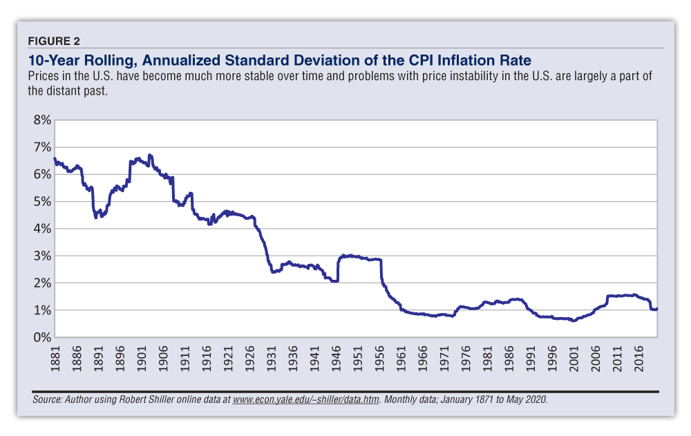
If the FOMC is successful in keeping the inflation rate close to its target of 2%, the results of this study suggest that an expected result would be equity market valuation ratios, such as the CAPE ratio, that are higher than what they have been in the distant past. The FOMC’s signaling of an inflation target as an explicit goal should be viewed as supportive of the Fed’s mandate of price stability and as a positive by equity investors.
One eternal question regarding equity valuation ratios will always be “How high is too high?” and it appears no one can consistently answer that question correctly. It is hoped that AAII Journal readers will understand and remember that this study does not offer a forecast for future U.S. equity returns. Whether the CAPE ratio is currently too high or too low is still open for debate and will eventually be decided by the equity market itself. This study’s sole purpose was to show that price stability is supportive of higher equity valuations. If price stability can be maintained, then values of the CAPE ratio from the distant past are not a relevant comparable to its current value. ?

Related

Related

Stock Strategies
Valuations, Inflation and Real Returns
Discussion
FREE REPORT

Get your free copy of our special
report analyzing the tech stocks
most likely to outperform the
market.
John K from PA posted over 6 years ago:
JEAN H from IL posted over 6 years ago:
JAMES L from TN posted over 3 years ago:
You need to log in as a registered AAII user before commenting.
Log InCreate an account