


Related

Stock Strategies
An eight-point scale based on fundamental factors helps to identify attractive growth stocks and avoid weak growth companies.

Wayne Thorp leads a class in AAII's new Essential Investing Video Course. Go to https://www.aaii.com/ves for more information and to subscribe.
Growth investing refers to buying stocks attached to businesses with attractive characteristics that its rivals lack. These can include measurable factors such as growth rates in sales or earnings. They can also include more qualitative factors such as customer loyalty, a valuable brand or a competitive moat.
Growth stocks tend to hold promising positions in emerging industries or niches that feature long runways for expansion. Because of this desirable potential, and the unusually strong success the business has had in recent years, a growth stock is often priced at a premium that reflects the optimism investors have in the company. As a result, the simplest way to know whether you’re looking at a growth stock is if its valuation—such as the price-to-book-value (P/B) ratio or price-earnings (P/E) ratio—is high relative to the broader market and its industry peers. These high-valuation stocks are often referred to as “glamour stocks.”
However, most academic research suggests that investing in glamour stocks is a losing proposition.
On average, firms with high valuations determined by factors such as the price-earnings ratio or price-to-book ratio underperform the market over the long term. While the market does a good job of valuing securities in the long run, in the short term it can overreact and push prices away from their true value.
Stocks with high share prices compared to their book values tend to be glamour or growth companies that have attracted significant investor attention. As investors pile into a growth stock—because of hype, strong relative price strength or high past or expected growth—its price deviates further from its underlying fundamental value. As with value investing, some growth stocks deserve their high valuations, while many do not.
Partha Mohanram, professor of accounting at the University of Toronto’s Rotman School of Management, developed a scoring system to help separate the winners from the losers among stocks trading with high price-to-book ratios.
The price-to-book-value ratio is determined by dividing market price per share by book value per share. Book value is generally determined by subtracting total liabilities from total assets and then dividing by the number of shares outstanding. It represents the value of the owners’ equity based upon historical accounting decisions. If accounting truly captured the current value of the firm, then one would expect the current stock price to be near the firm’s accounting book value. Over the history of a firm, many events occur that can distort the book value figure. For example, inflation may leave the replacement cost of capital goods within the firm far above their stated book value. Different accounting policies among industries may also come into play when screening for high price-to-book stocks.
AAII has extensively covered the work of Joseph Piotroski, associate professor of accounting at Stanford University’s Graduate School of Business. Piotroski established basic financial criteria that help separate the winners from the losers of stocks trading with low price-to-book ratios.
Mohanram focuses on stocks at the other end of the valuation spectrum, looking for fundamental factors useful when studying growth companies. Investors tend to naively extrapolate the current fundamentals of growth stocks or even ignore the implications of using conservative accounting to project future earnings. Mohanram developed a three-tiered grading system that looks at profitability and cash flow performance, adjusts for likely mistakes due to naive growth projections and considers the impact of conservative accounting policies. He refers to these signals as “growth” fundamental signals since they measure the fundamental strength of these companies in a context appropriate for growth firms. Mohanram feels that stocks with stronger growth fundamentals stand a better chance of expanding earnings and avoiding exchange delisting and are more likely to beat earnings forecasts. Most importantly, Mohanram uses simple measures based solely on financial statement data to separate winners from losers.
Mohanram’s work starts with a universe of high price-to-book stocks. Mohanram warns investors that these stocks do not perform well as a group, but it is possible to use fundamental analysis to help avoid the biggest losers and select the strongest candidates.
Mohanram first limited his universe to the top 20% of stocks according to their price-to-book ratio. As of August 9, 2022, 6,206 stocks have current price-to-book ratios in Stock Investor Pro, AAII’s fundamental stock screening and research database program. In the program, a company must have a positive book value to have a meaningful price-to-book ratio. In contrast, Mohanram considers firms with negative equity. A top 20% cutoff translates into approximately 1,200 stocks, with a maximum price-to-book ratio of 988.26 and minimum ratio of 4.18.
Valuation levels of stocks vary over time, often dramatically from bear market bottoms to bull market tops. During the depths of a bear market, many firms can be found selling for a price-to-book ratio less than 1.00. In the latter stages of a bull market, few companies other than troubled firms sell for less than book value per share. Today, the median (midpoint) price-to-book ratio is 1.50 for the universe of U.S.-listed stocks. If you go back to the bear market in early 2009, the median price-to-book ratio was 0.82.
We then excluded companies that are not exchange-listed. This filter ensures better liquidity (ability to buy and sell shares in a timely and orderly fashion) and higher reporting standards for financial statements. We also excluded companies in any real estate investment trust (REIT) industry and those based in China or Russia. This left us with a universe of a little over 1,000 high price-to-book stocks.
Mohanram’s scoring system is an eight-point scale that helps to identify attractive growth stocks and avoid weak growth companies. Profitability, naive extrapolation and accounting conservatism are examined using popular ratios and basic financial statement data to create a “G-Score.” Mohanram found that high price-to-book stocks with higher G-Scores outperformed growth stocks with lower G-Scores.
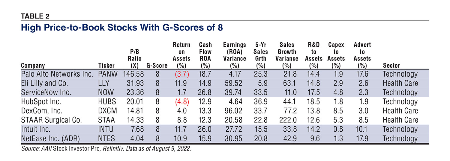
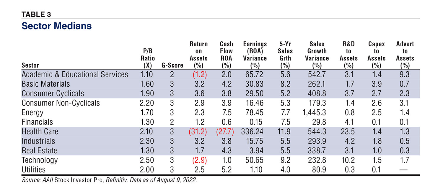
Table 1 presents the 47 high price-to-book companies with a G-Score of 7, and Table 2 shows the eight high price-to-book stocks with a G-Score of 8, based on our interpretation of the G-Score components. The stocks are sorted by price-to-book ratio. Table 3 lists the sector medians that were calculated and used for sector comparisons. Valuation, profitability, growth and investment varies widely by sector and industry, so it makes sense to make industry comparisons when possible.
Mohanram awarded up to three points for profitability: one point for return on assets (ROA) above the industry median, one point for a ratio of cash flow from operations to assets above the industry median and one point if cash flow from operations exceeds net income.
These are simple tests and similar to Piotroski’s profitability scores. One key difference is that Mohanram compares company profitability to industry profitability. He highlights academic research indicating that ratio analysis benefits from industry comparisons.
Mohanram defined return on assets as net income before extraordinary items for the fiscal year preceding the analysis divided by total assets at the beginning of the fiscal year. Our return on assets calculation deviates by using net income after extraordinary items in its calculation. Furthermore, we use trailing four-quarter figures for all of our calculations.
Return on assets examines the return generated by the assets of the firm. A high figure implies the assets are productive and well-managed. If a company has a return on assets greater than the industry median, it is given one point, otherwise it is given a zero.
Mohanram reminds us that earnings may be less meaningful than cash flow for the early-stage growth companies that are likely to be found among the high price-to-book stocks. Operating cash flow is reported on the statement of cash flows and is designed to measure a company’s ability to generate cash from day-to-day operations as it provides goods and services to its customers. Operating cash flows consider factors such as cash from the collection of accounts receivable, the cash incurred to produce any goods or services, payments made to suppliers, labor costs, taxes and interest payments. Positive cash flow from operations implies that a firm was able to generate enough cash from continuing operations without the need for additional funds. Negative cash flow from operations indicates that additional cash inflows were required for day-to-day operations of the firm.
Mohanram also measures profitability by dividing the cash flow from operations by total assets. This is like the return on assets calculation but it is based upon cash flow instead of net income. A stock is awarded one growth point if the cash flow return on assets exceeds the firm’s industry median, otherwise a zero is recorded.
The final profitability variable examines the relationship between the earnings and cash flow. A growth point is awarded if cash from operations exceeds net income. The measure tries to avoid firms making accounting adjustments to boost earnings in the short run that may weaken long-term profitability.
Too often the market simply examines the past growth pattern of a company and expects it to continue into the future. Two companies with the same historical growth might have the same high valuation, but a company with more stable and predictable earnings and sales is more desirable and more likely to continue its growth. Mohanram feels that stability of earnings may help to distinguish between “firms with solid prospects and firms that are overvalued because of hype or glamour.”
Mohanram measures earnings variability as the variance of a firm’s return on assets in the past five years. A company is awarded one growth point if its variance in return on assets is below the industry median. A company must have five years of data to calculate the variance, or it is given a value of zero for this signal.
The second growth signal in this category relates to the stability of year-to-year growth. A firm that has stable growth is less likely to disappoint in terms of future growth. Mohanram examined the stability of sales growth to help overcome the issues of negative earnings, which many high price-to-book stocks may have. Sales growth may also be more persistent and predicable than earnings growth because it is less subject to accounting judgments.
Here again, Mohanram compares the company variance of year-over-year sales growth to that of its industry median. Companies with lower variance than their industry median are awarded a growth point. A company must, again, have five years of growth data to calculate the variance, or it is given a value of zero for this signal. Note that the annual growth in sales over the last five years is presented in Table 1 to show the recent growth trends of this group of companies passing the screen.
The final three growth signals deal with company actions that might depress current earnings and book value but should result in greater growth and profitability down the line. Mohanram identified spending on research and development (R&D), capital expenditures (capex) and advertising as factors that may point to future sales and earnings expansion.
Conservatism in accounting standards forces companies to expense outlays for many R&D and advertising efforts even if they create valuable intangible assets that do not show up in a firm’s book value calculation.
A firm is awarded a growth point for R&D intensity if its ratio of R&D to assets is higher than its industry median.
The same is true for capex. One point is given for capex intensity if the firm’s ratio of capex to assets is higher than its industry median.
Lastly, a point is given if a company’s ratio of advertising expense to assets is higher than the industry median. It’s worth noting that many firms do not break out their advertising costs on their financial statements. This trend has accelerated over the years as more firms withhold this data from their competitors. Instead, they are lumped into their selling, general and administrative (SG&A) spending on the income statement.
Overall, Mohanram found that the higher the financial score, the higher the average portfolio return. High price-to-book companies with stronger G-Scores outperformed stocks with lower G-Scores. Beyond finding winning growth stocks, Mohanram’s work reveals that investors should avoid growth stocks with low G-Scores.
Mohanram’s work consists of creating high price-to-book portfolios and further segmenting them in varying G-Score portfolios. Overall, the higher the G-Score the greater the average portfolio return. Results of individual stocks will vary dramatically.
The individual components of the G-Score represent a useful checklist for investors examining growth stocks. However, even with these additional financial tests, it is important to perform a careful analysis of any passing stock.
Stock Strategies

Financial Statements

Stock Strategies

BARRY J from TX posted over 4 years ago:
DAVE G from TX posted over 4 years ago:
SEAN S from CO posted over 4 years ago:
ALLAN M from GA posted over 4 years ago:
You need to log in as a registered AAII user before commenting.
Log InCreate an account