

Related

Portfolio Strategies
Investors who are willing to learn from nearly a century of data can discover some important takeaways.

Paul Merriman leads a class in AAII's new Essential Investing Video Course. Go to https://www.aaii.com/ves for more information and to subscribe.
Once upon a time, investing for the future was pretty much a gamble, without much meaningful data to give you any clue as to what might be coming down the pike. Now we are blessed with detailed and reasonably accurate data going back 96 years to 1928.
It’s unfortunately (and inconveniently) true that in the next year, next five years or next decade, anything can happen. Making short- and intermediate-term predictions—in spite of Wall Street’s awesome computing power, hard work and sharp minds—is still something of a crapshoot.
But investors who are willing to learn from nearly a century of data can discover some important lessons that have been mostly hidden.
In this article, I show you the data and share 10 lessons based on it. And for readers who make it to the end, I throw in a couple of bonus lessons at no extra charge.
Before we dive into the data (although I have described it as “hidden,” it’s actually pretty colorful), let me tell you what it won’t help you with.
If your goal is to reliably get rich quickly, this article won’t help. If anything, this data will show you how unlikely that is. But if your goal is for your investments to do well enough that you can stay the course during whatever life span you have left, this will point you to a path forward.
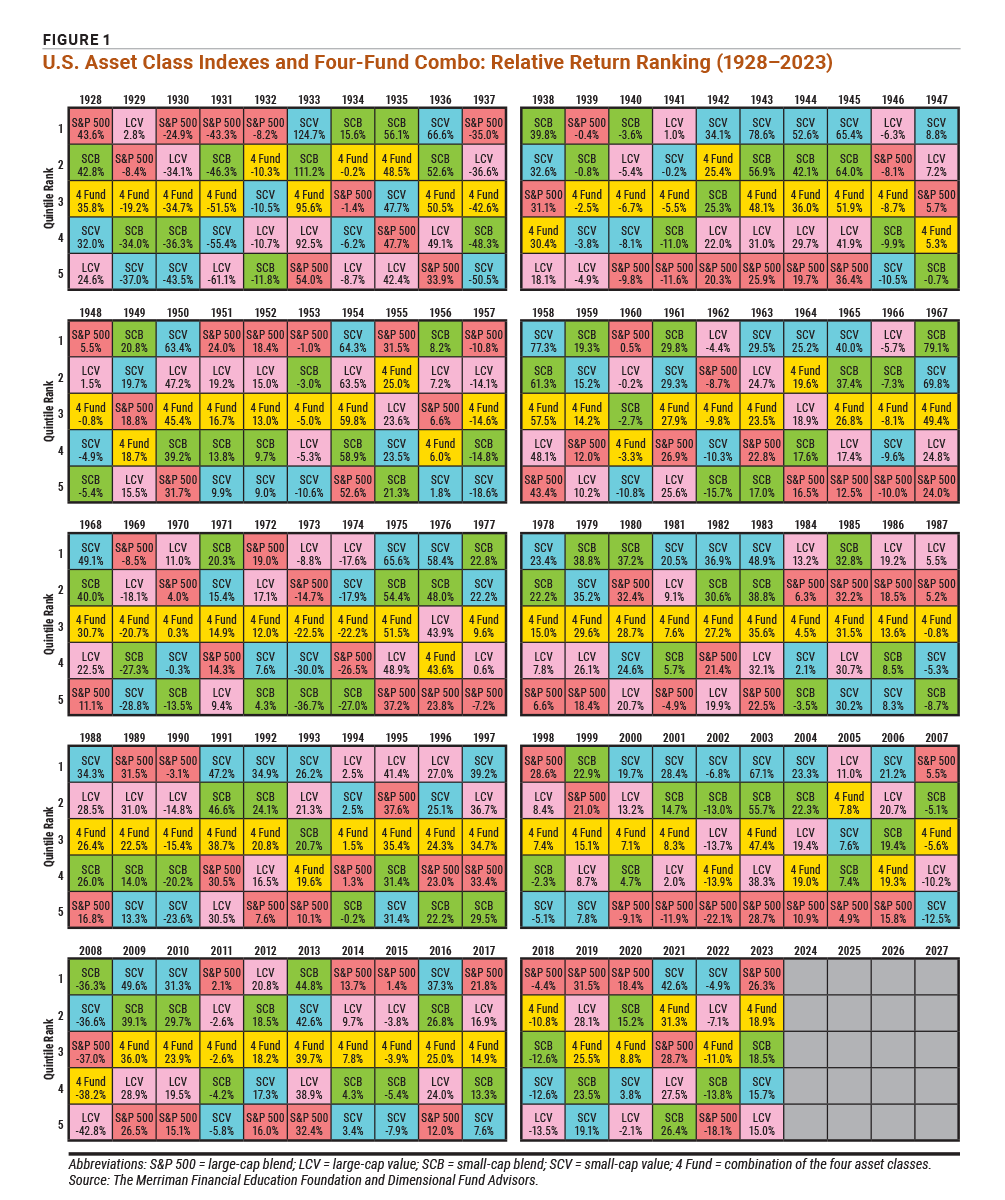
Figure 1 on the next page shows four U.S. equity asset classes (as well as an equally weighted combination of all four) and their relative return rankings each year from 1928 through 2023. Chances are you have never seen anything quite like this.
I’d like to start by telling you where it came from.
A few years ago, I asked Daryl Bahls, the director of analytics at The Merriman Financial Education Foundation, to come up with a visual tool that would let investors quickly and easily see what’s important about nearly a century of investing data. The colorful quilt chart is the result.
The chart tracks year-by-year returns from 1928 through 2023 for the equity asset classes that are owned in one form or another by the great majority of investors. As you probably know, those asset classes are large-cap blend stocks (represented by the S&P 500 index), large-cap value stocks (labeled LCV on the chart), small-cap blend stocks (SCB) and small-cap value stocks (SCV).
Bahls went one step further and delighted me by cleverly adding the combination of those four asset classes. As we shall see, this grouping, which I sometimes refer to as the Four-Fund Strategy, might be the most important lesson of all to emerge from this data.
I call this a strategy because it can be a master plan for investing in U.S. equities. It’s also a portfolio in the sense that, when implemented, it becomes something real: a collection of four funds. In this article, I refer to it as a combination, or combo, which can satisfy either of those meanings.
Each of the 480 colored boxes in Figure 1 shows the one-year return for one of these investments. For each year, they are presented in order of return, from best to worst.
The colors make it easy to follow. For example, you can track the performance of the S&P 500 by looking at the red boxes or that of small-cap blends by looking at the green ones.
The lessons that follow are designed to reinforce a fundamental truth you’ve heard before: Sticking with your plan through thick and thin isn’t necessarily easy, but it is essential. One key is to manage your expectations. That’s much easier if those expectations are based on a good understanding of market history.
At first glance, the quilt chart looks like a mishmash of random colors and numbers. That is one of the key points I hope you remember.
No single asset class was ever “best” most of the time.
As you can easily see, the popular S&P 500, representing large-cap blend stocks, was all over the map. In 27 years, it had the best return; in 39 years, the worst. Only seven times was its performance squarely in the middle of the pack.
Yet, the S&P 500 has had a few “winning streaks” that undoubtedly convinced many investors it was all they needed. The four years of 2017 through 2020 was one such period. On the other hand, the S&P 500 was the worst performer for seven years in a row between 2000 and 2006 and for six straight years in the 1940s.
Bahls produced a second chart, shown in Figure 2. This chart shows how much of the time each asset class (and the Four-Fund Combo) was at the bottom of the pack (rank 5), at the top of the pack (rank 1) and in the broad middle (ranks 2, 3 and 4).
Here’s a hint: For your peace of mind and your ability to stay the course, the broad middle is a much better place to be than switching back and forth between best and worst asset classes. The broad middle is also where the Four-Fund Combo really shines.
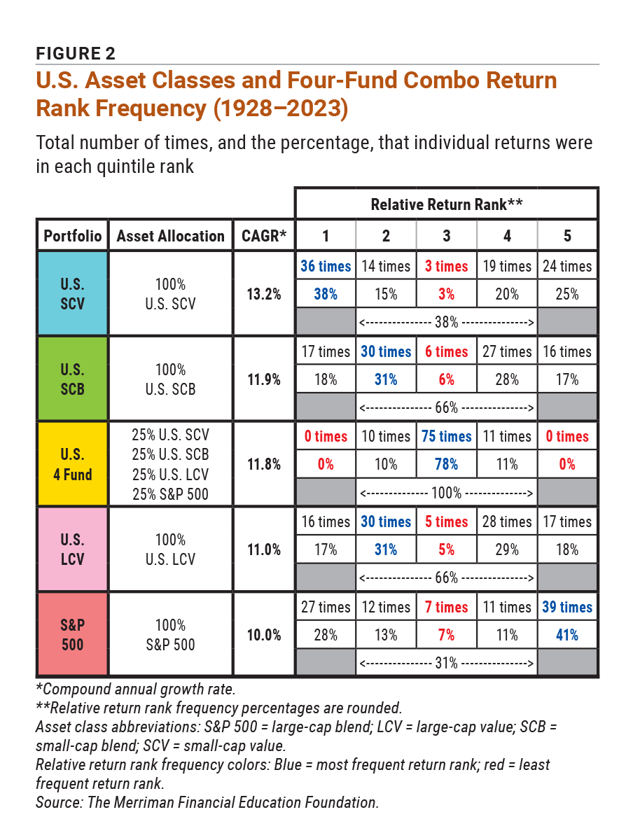
Like the S&P 500, small-cap value stocks spent quite a few years either on the top or bottom of the return rankings. This asset class ranked in the best quintile 38% of the time and in the worst quintile 25% of the time. This gave investors plenty of opportunities to love it (in 36 individual years) or hate it (in 24 years).
The good years for small-cap value weren’t always sprinkled at random through the decades. They came in streaks that gave investors opportunities to be staunch believers in this asset class (see 2000 through 2004 in Figure 1).
Yet, that belief and enthusiasm were shattered nine separate times when small-cap value abruptly fell from the best performer to the worst. The years 1950 and 1951 and the years 1968 and 1969 are stunning examples of these reversals. (The same thing happened to the S&P 500 six times, though nobody was complaining in 1958 when the index gained “only” 43.4% after losing 10.8% in 1957.)
Despite their superior long-term returns, small-cap value stocks are not the place to invest if you’re seeking the comfort of low volatility.
In any particular year or decade, the best and worst performers were essentially random. That stark reality leads directly to the next lesson.
You may find some meaningful patterns in these returns, but they won’t be much help in predicting anything.
In 24 individual years, large-cap stocks were clearly in favor, as the S&P 500 and large-cap value took the top two spots. Yet numerous times, they simply ranked favorably because they lost less than small-cap stocks.
In contrast, small-cap stocks (blue and green boxes) held the top two spots in 32 individual years. In only two of those years (2002 and 2008) were small-cap stocks there because of lower losses than large-cap stocks.
In years when large- and small-cap blend funds outperformed value stocks, it was because growth was in favor with investors. The opposite was true in years when value stocks outshone blend funds. So, which is better:
There’s no right answer to either question. If you trace through the chart in Figure 1 following the color of the boxes, you can see that these winners and losers changed places much too often to conclude that either one was better or worse.
In any single year, the difference between the top and bottom performer can be dramatic.
The spread between the highest and lowest returns was 70.7 percentage points in 1933. In 1943, the spread was 52.7 percentage points; in 1967, it was 55.1 percentage points.
Small-cap value outperformed the S&P 500 by 28.8 percentage points in 2000. In 2001, small-cap value led by 40.3 percentage points. It outperformed by 38.4 percentage points in 2003.
If you really want to find a pattern that is predictable, here’s one: In most years (81 of the 96 in this quilt chart), the best and worst performers moved in the same direction, either up or down.
So, a good year is likely to be good across the board. A bad year is likely to be bad across the board.
This is another bit of good news from 96 years of data: In the majority of cases, the trend was up, not down. In 68 years (about 71% of the time), at least three of the four major U.S. asset classes had positive returns.
We think you’d like this related webinar! Which Is the Best 1-, 2-, 3- and 4-Fund Strategy?
I mentioned earlier that Bahls surprised me by showing our four-fund combination of large-cap blend, large-cap value, small-cap blend and small-cap value asset classes (computed assuming annual rebalancing). You’ll see this in the yellow boxes throughout Figure 1.
Looking at the quilt chart, I immediately noticed how dependable and unexciting—two traits that should be enticing to long-term investors—this combination was. Each individual asset class moved up and down freely, but the Four-Fund Combo spent most of its time in the middle. In fact, it was in the middle 78% of the time.
Although many investors tend to regard the S&P 500 as reliable and comfortable, Figures 1 and 2 show that’s just not true over the long haul. Compared with the Four-Fund Combo, the S&P 500 has been overly dramatic. Plus, among the four major U.S. asset classes, the index representing large-cap blend stocks has given investors the lowest long-term performance.
The numbers tell a powerful story. The S&P 500’s very long-term compound annual growth rate (CAGR) is 10.0%. For the Four-Fund Combo, the number is 11.8%.
That is a huge deal, and here’s why: I have said for years (See “Winning the Battle Against Investment Fees and Biases,” in the May 2024 AAII Journal) that an increase of 0.5 percentage points of return can be worth $1 million over a lifetime. Here, we have a portfolio that provided more than three times that much additional return: 1.8 percentage points.
Here’s something else that’s also appealing about the four-fund combination: Every year, it guarantees that you’ll have 25% of your equity portfolio in whatever happens to be the highest-performing asset class.
With this combination, you don’t have to give up those bragging rights. And no matter what’s happening, you will never be in last place.
This doesn’t come from the tables, but it is important to note. If you hold the four-fund combination inside an individual retirement account (IRA) or a 401(k) plan, the annual rebalancing does not produce any unpleasant side effects. But in a taxable account, the annual sales and purchases will generate taxable events that could affect your annual tax bill.
Without any rebalancing, a lump-sum investment split equally among the four major U.S. asset classes had a slightly lower long-term return advantage over the S&P 500: 1.5 percentage points instead of 1.8. However, 1.5 percentage points is still a huge advantage.
Here’s why all this is so important. The academic research is unanimous on two points. First, diversification is the best way to improve a portfolio of equities. Second, the most effective way to diversify is by adding asset classes (not just more stocks with similar characteristics).
Figure 2 makes it clear that, over the decades, any one of the other major U.S. asset classes (large-cap value, small-cap blend, small-cap value) would have been a worthwhile addition to the S&P 500. The Four-Fund Combo, as I’ve said, provided a higher overall return along with lower interim losses. To my mind, that’s a serious win-win result.
Another point I want to address is the relationship between risk and return.
The charts clearly show that the S&P 500 has the lowest long-term return among the four major asset classes under review here. If it’s true that lower risks go together with lower returns, then you would expect the index to be less risky than the others. And yet, the beloved S&P 500 had the worst return in 39 years.
What of the Four-Fund Combo and its significantly higher returns? It was at the bottom of the pack exactly never. If there’s any bottom-line “magic” that results from putting the four funds together, it’s the combination of higher long-term returns and lower year-by-year volatility.
Finally, there is the question of what (if anything) you should do about all this. While there’s no guarantee about the outcome of any choice you make, these lessons certainly give us some guidance.
Lesson #1 underscores what you already knew: Diversification in equity investments is a good deal, providing reliable benefits at little extra cost in time or money.
Lessons #6 and #7 teach us three encouraging things regarding these four major asset classes. In most years, the stock market moves up, not down. There’s usually nowhere to hide in a bad market year. Finally, in a good market year, any choice is likely to be profitable.
So, if you limit your equity investments to these asset classes and faithfully stay the course over many years, you’ll probably do at least okay—as long as you can avoid the temptation to chase recent performance by jumping from one asset class to another.
Lessons #8 and #9 point to a four-part combination strategy that’s relatively boring, making it easier to stay the course and delivering lots more money in the long run. For any serious investor, that outcome should certainly be worth studying a bit of colorful history.
Portfolio Strategies

Portfolio Strategies


JAMES L from TN posted over 2 years ago:
BOBBY M from NJ posted over 2 years ago:
BARRY J from TX posted over 2 years ago:
ROBERT A from NC posted over 2 years ago:
JIM L from MI posted over 2 years ago:
EDWIN W from PA posted almost 2 years ago:
SCOTT B from NC posted almost 2 years ago:
Hugh P from WA posted almost 2 years ago:
MICHAEL B from WI posted almost 2 years ago:
RICHARD M from AZ posted almost 2 years ago:
Peter N from TN posted almost 2 years ago:
WARREN L from GA posted almost 2 years ago:
LISANNE P from OR posted almost 2 years ago:
MARTIN S from OH posted almost 2 years ago:
MARTIN S from OH posted almost 2 years ago:
MIODRAG D from IA posted almost 2 years ago:
MICHAEL C from MI posted almost 2 years ago:
You need to log in as a registered AAII user before commenting.
Log InCreate an account