



Listen to Michael Kahn’s presentation at the 2013 AAII Investor Conference!
Most investment sites, courses and gurus offer all sorts of ways to find stocks to buy. Whether they are fundamental, technical or dart throwing, there is no shortage of experts telling you where to put your money.
The problem is that buying is only half the job. Unless you plan to leave your portfolio to your children, at some point it will be time to sell some stocks and turn paper profits into actual cash.
Aside from analyzing high valuations and dwindling business prospects, the market itself can be very forthcoming with clues on when to ring the register. By spotting changes in the price trend or even just changes from market-leading to market-lagging performance, individual investors can do just as well as the pros when it comes time to sell.
All that is needed is a chart with one or more of the readily available tools found on most free financial websites. The goal is to spot stocks that have stopped going up or are about to stop going up. To paraphrase humorist Will Rogers, “Buy stocks that go up; if they don’t go up, don’t buy them.” Our goal is to determine when the stocks we already own have moved into the latter half of that dictum.
What Signals Are We Looking For?
There are two reasons stocks stop going up. The first is that they are tired and need to rest. Perhaps price action got too far ahead of the fundamentals. The second is that the bull trend is about to end and a new bear trend is about to begin.
This article is not concerned with the first reason, as the focus is not to trade around any short-term wiggles. Any stock that is just resting before its next push higher is clearly good to own and can be separated from stocks that are resting before turning lower with the methods outlined here.
Rather, I am talking about stocks and not companies. Companies produce value, but stocks are supposed to reflect that value. As we know, value and stock price are rarely the same on any given day, and there is a whole industry built around finding stocks that are undervalued based on the fundamentals. But stock prices swing from theoretically undervalued to overvalued and back again. A good company with a good product may not have a good stock because the market has already priced the stock well above where the stock “should” be.
Typically, overvaluation comes from too much excitement over the “next big thing.” Stocks such as rare earth minerals miner Molycorp Inc. (MCP) in 2011 and Tesla Motors Inc.  (TSLA) earlier this year come to mind. Apple Inc. (AAPL) also generated far too much enthusiasm given its sales and innovation pipeline just before it peaked in 2012, and countless investors wished they had some sort of method for spotting the pending bear market before it really got under way.
Watch the Trend
Charts do not tell us if a stock is fundamentally overvalued or undervalued. However, charts reflect the actions of all market participants, who each have their own view on valuation. It is the sum of their actions—buying, selling or doing nothing—that we use to make our determinations.
Remember, charts are tools used to gauge what market participants are doing with their money. They do not predict the future any more than reading tea leaves or chicken entrails do. Charts do show when investors are behaving in a way similar to what they have done before, however. History shows what tends to happen next.
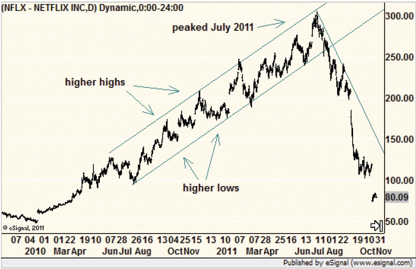
The simplest way to spot a stock that is tired and ready to pull back, if not reverse course altogether, is to measure the trend. Even without any gadgets or computer drawing ability, a trend can be eyeballed as the stock price moves from a low in the past to a high in the present. We want to know when the series of higher highs and higher lows—the natural ebb and flow of a stock—changes to a series of lower highs and lower lows. Netflix Inc. (NFLX) provided a great example in 2011, as Figure 1 shows.
 (NFLX)" border="0" src="https://www.aaii.com/files/images/articles/8925-fig1.jpg" width="250" />
If a straight line connecting the lows that looks like it follows the trend is drawn and prices move below that line, then we have our first indication that something has changed. When a stock moves below its most recent low, confirmation is given. All else being equal, the change in trend signals time to sell.
How do you know the difference between a correction and a true end of the road for a stock? There are no guarantees, but when the trend changes from up to down and prices make a lower low, the odds that it is more than just a bump in the road are rather good.
How do I know that? History is on my side. Even though outside actions in recent years, such as the Federal Reserve’s bond buying program (quantitative easing) made chart analysis more difficult, the principles still worked.
And they even worked ahead of non-market events such as scandals. In 1999, the chart of the now-defunct Enron yielded many clues near the top that something was not quite right. And just before the scandal broke wide open in 2000, the charts offered trend and technical pattern breaks to give investors a chance to save at least some of their holdings.
Spotting the End of an Upward Run
In early 2012, Apple could do no wrong. Every time it looked as if the stock was starting to stumble, it quickly came back to life and soon outrageous upside targets were being published by respected analysts. But in October 2012, the stock made a rather significant move to the downside and a plethora of technical sell signals fired, as Figure 2 shows. Something was different, even from the last time the stock seemingly fell apart just a few months earlier in April 2012.
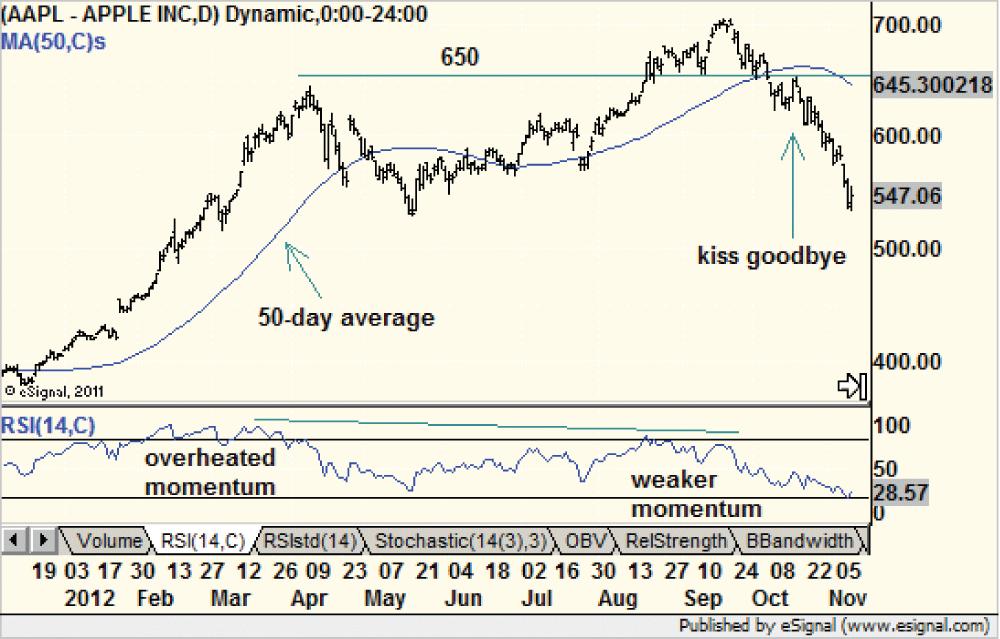
Back then, the stock enjoyed a steep run-up from $400 to $600 in a little more than two months. Technical indicators measuring momentum were at very high levels, and it seemed time for a correction. Keep in mind, the broad market was also setting up for a significant pullback, so Apple had plenty of company. But did the stock show signs that it had rallied all it was going to rally? Not really. Apple was simply an overheated stock with a cult status and had moved too far above reasonable technical trendlines and moving averages. A cooling off period seemed to be in order.
But in September 2012, shares of Apple were back in record-high territory despite momentum indicators that were much more sedate. And even though the financial media at the time were watching trade by trade as the stock crossed the $700 level, the market was much more hesitant. The trend was choppy, too, as Apple came down to touch the $650 level on several occasions to set up an important price floor. If the bulls stopped jumping in at that seemingly low price, then the stock would be in trouble.
That is exactly what happened in October 2012, as demand could no longer soak up all the supply of shares offered for sale. The decline also broke the key 50-day moving average to the downside and we knew something was wrong.
In the following several days, shares of Apple managed to rally back to $650 one last time in what traders dub as “a kiss goodbye.” It was the final chance for the bulls to reverse the trend and they failed. The rest, as they say, is history. Apple’s new bear trend was very clear even as the broad market moved to record high ground.
New Lows After a New High Is Not Reached
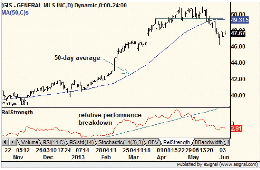
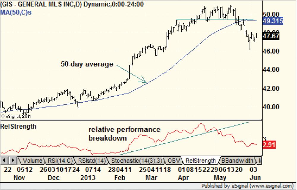
The consumer staples sector provided many good examples this year of the market giving abundant clues that it was time to sell. For example, cereal maker General Mills Inc. (GIS) outperformed the market as it moved from roughly $41 to $51, a 24% gain in less than four months.
 (GIS)" border="0" src="https://www.aaii.com/files/images/articles/8925-fig3.jpg" width="250" />
Figure 3 shows the price action. The first clue that the stock was cooling off occurred in May 2013, when it failed to make a new high. Behind the scenes, the relative performance chart, which is simply the ratio of General Mills to the S&P 500 index, broke down. The stock moved from market leader to market laggard, which, of course, is not a positive development.
Market pundits were quick to exclaim that money was leaving consumer staples and moving into more aggressive areas such as technology. They called it a healthy rotation in leadership.
Such rotation does not mean General Mills was about to fall. The stock could have continued higher, but at a slower pace. The outlook changed when shares of General Mills moved to a new one-month low and broke its 50-day average to the downside. Within three weeks, the stock gave back nearly half of its gains to date and left investors scratching their heads. After all, the S&P 500 was still about 4% below all-time highs. Clearly, General Mills’ generous dividend yield and relatively stable business (consumer staples) was not enough to protect investors from losses.
Relative Performance and Fading Momentum
Relative performance and relative strength charts are very simple tools that can tell investors when a stock or sector is moving into and out of favor. I wrote about this in more detail in the June 2011 AAII Journal (“Picking the Right Stocks Using Charts”).
Spotting these shorter-term tops allows more active investors to outperform the market, but for most investors spotting “the big one” is far more important. How can you determine if the market is about to form a major top such as the one seen in 2007?
The principles are the same: Look for fading momentum, more urgent sell-offs and failed attempts to recover. Let’s look at Figure 4, which shows the performance of the S&P 500, and this will become clear.

In 2006 and early 2007, the market seemed to be firing on all cylinders. Housing was leading the way and all sectors were fully engaged in the rally. But over the course of 14 months, the market stopped going up and eventually rolled over. Wall Street wisdom points out that bottoms, such as the end of the bear market in 2009, are usually “events,” while tops are usually “processes.” Evidence that a bull market is ending builds gradually as more stocks and sectors start to change for the worse.
The first blow for the bulls was the initial news of the sub-prime mortgage crisis in August 2007. The stock market plunged and, although it recovered quickly, broke the string of higher highs and higher lows that mark a bull trend. Something had changed, although at the time the fundamentals, aside from the mortgage market, were still good.
The market moved back to new high ground but it did not last. Prices once again dipped back to the previous low—now called support—to signify more aggressive behavior by the bears. The balance of power, and supply and demand, shifted.
When the index sliced through its previous lows one more time, the technical sell signal was given. As I’ve come to expect, signals are never this clean and easy. After a 10% drop from support and a similar-sized recovery, the index touched that former support level one more time. It was the same kiss goodbye that occurred with Apple above but on a large, market-wide scale. The bear market raged for months thereafter.
An important point to remember is that the kiss goodbye occurred at the same price level for the S&P 500 that was seen in late 2006. The same price but with a different trend. One place was a buy signal, the other was a sell signal and it paid, quite literally, to know the difference.
Combine Charts and Fundamentals
Many investors use charts exclusively to make sell decisions, but most are likely more comfortable letting changing fundamentals tell them when it is time.
However, using charts in conjunction with other analyses can provide early warning for market changes so you can take profits and move either to other stocks or into cash to sit out market turmoil that may be on the way.
Discussion
FREE REPORT

Paul Hervey from IA posted over 13 years ago:
William Hutchinson from AZ posted over 13 years ago:
Toan Nguyen from CA posted over 13 years ago:
Werner Emmerich from PA posted over 13 years ago:
Harish Jethwa from MD posted over 13 years ago:
Norton Waterman from KY posted over 13 years ago:
James Grant from OH posted over 13 years ago:
Steven Greenfield from NY posted over 13 years ago:
Robert Talambiras from NJ posted over 13 years ago:
Raymond Gundersen from CA posted over 13 years ago:
Ken from CA posted over 13 years ago:
Anthony Babich from MA posted over 13 years ago:
Bob Samson from MD posted over 13 years ago:
David E. from Washington, Not D.C. - Vancouver, Not B.C. posted over 13 years ago:
Enock Mwila from WA posted over 13 years ago:
You need to log in as a registered AAII user before commenting.
Log InCreate an account