
Stock Market Volatility

Large-company stocks can experience big price swings on a 12-month basis, but become less risky when looked at over longer periods.

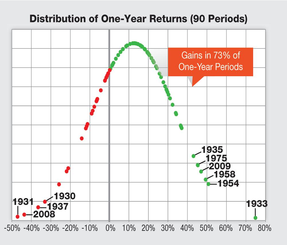
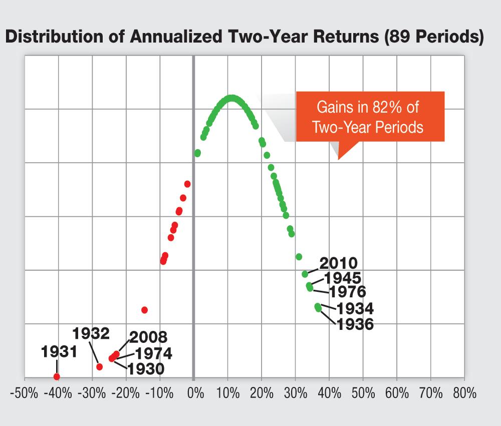
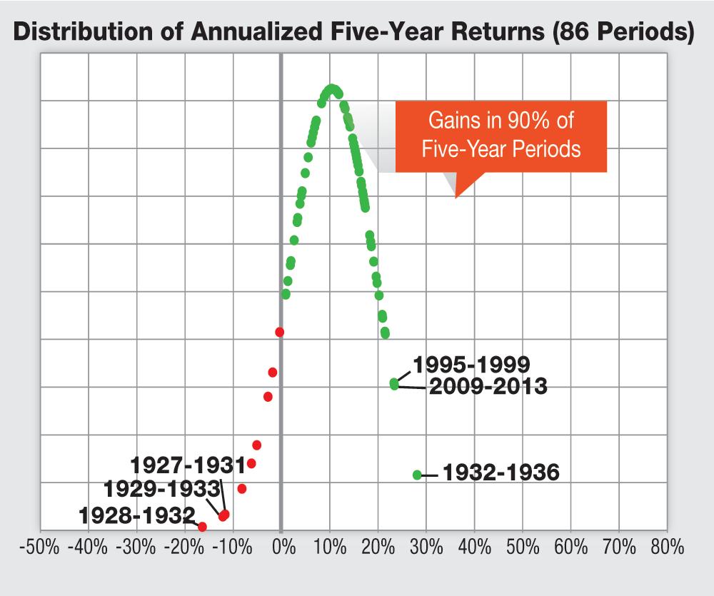
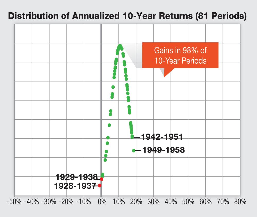
It’s often said that the market rewards long-term investors. The following four charts of large-company stock returns support this claim. As you can see, the longer your investing time horizon is, the less volatile and the less risky the stock market appears to be.

The Bell Curve: For those of you unfamiliar with statistical analysis, a bell curve plots the normal distribution of a set of data. The highest point of the curve represents the midpoint of the range of values. In our examples here, the highest point on each chart indicates the most probable return based on market history. These curves cannot tell you what will happen, only what counted as typical and extraordinary in the past.

One Year

During any single calendar year, stocks can incur price swings. Since 1927, large-company stocks have experienced single-year calendar returns as low as –47.1% (1931) to as high as 74.9% (1933). At both ends of the curve, the years with the largest negative (left side) and positive returns (right side) are notated. The location of 2008 and 2009 along the left and right tails, respectively, show just how unusual they were.
1

 
Data source: Kenneth French Data Library.


Two Years

The scale of the chart is unchanged from the one-year chart, but the bell curve is narrower. This is because even increasing one’s time horizon to just two years decreases the variance in returns. The worst annualized return over two calendar years since 1927 was –40.5% (1930–1931), while the best annualized two-year return was 37.0% (1937–1938). Also, pay attention to the alignment of the bell curve. It has shifted toward the right as the occurrences of positive outcomes increased.
2

 
Data source: Kenneth French Data Library.


Five Years

The bell curve is noticeably narrower and further to the right now. The longer holding period smooths out the volatility of year-by-year gains and losses, leading to less extreme returns. There are also fewer negative returns. Notably, six of the nine periods when stocks did drop on a five-year basis occurred during the Great Depression and during the early part of World War II.
3

 
Data source: Kenneth French Data Library.


10 Years

This final chart shows the reward for sticking with a long-term investment strategy. Large-company stocks have realized annualized gains during nearly all 10-year rolling periods. The two times they didn’t (1928–1937 and 1929–1938), the annualized losses were less than 1.0%. Even the so-called “lost decade” of 2000–2009 realized a positive total return (capital gains plus dividends) on an absolute basis.
4

 
Data source: Kenneth French Data Library.

Discussion

Bhaskar Bhattacharya from BC posted over 8 years ago:

Extremely informative presentation. As the saying goes - a picture is worth a thousand words.


Doug Litke from VA posted over 8 years ago:

Not clear to me what the vertical axis represents. I would have expected the number of times that return was achieved. But in the 1 year chart, that would mean 2009 shows the third time we hit that return. Is that correct???


Charles Rotblut from IL posted over 8 years ago:

Doug, In simplistic terms, the Y-axis on a bell curve chart measures the density of data points within a certain range of values. As you go up towards the peak of a bell curve, there will be more data points with similar values. I would encourage you to focus on how range of returns gets narrow and occurrence of positive returns becomes more likely with longer time horizons. -Charles


Sergey from NY posted over 8 years ago:

Thank you for very interesting illustration of long term benefits. Did you use total return data or just price volatility?


Joe Investor from CA posted over 8 years ago:

As an engineer use to looking at data and graphs I also found it highly annoying that there was no vertical axis. I am also extremely suspicious of the data as the "bell shaped curves" are much too perfect. Looks like the curve was drawn and the points were put on it to look pretty. Does not look like real data to me. While most data falls into a Gaussian distribution (bell curve) it almost never exactly fits it. It is like flipping 1000 coins and getting exactly 500 heads. It rarely happens in real life. To get 90 periods of one, two, five and ten year returns to exactly fit on 4 bells curves is not believable to me. What needs to be shown to accurately represent the data is a histogram. For instance if the 50% return happened once in 1954 and the 75% return happened once in 1933 the points should have the same y-axis (1 occurrence). This is how a histogram works and what should be shown to be accurate. I am very disappointed that the first "InvestoGraphic" would be such a disappointment


Dean Deeds from CA posted over 8 years ago:

Joe Investor is right; the data are too perfect. Perhaps the authors of this article could tell us which data from the Kenneth French data library were used, so we can plot it for ourselves. In the meantime, I used S&P 500 annual return data from http://pages.stern.nyu.edu/~adamodar/New_Home_Page/datafile/histretSP.html to generate one, two, five, and ten year annualized returns and plot their distributions (histograms). Key observations: (1) The spread of the distribution decreases as the holding period increases from one to ten years. This is to be expected, and is a key point of this InvestoGraphic. And, because the mean is positive, the decreasing spread means the likelihood of positive returns increases as holding period increases. (2) The mean of the distribution does not necessarily increase as the holding period increases, contrary to what is implied in the article. (3) The data are not necessarily symmetric about the mean, nor should they be expected to be. Nor should they be expected to be Gaussian (normal, or "bell curve"), although that's an assumption/approximation often made for convenience. (4) There's an implicit assumption in plotting distributions of time-series data such as market returns that the underlying process is stable, i.e., that the randomness doesn't fundamentally change over time. This is probably reasonable in large-strokes analysis of market data, but all such assumptions need to be validated. Bottom line: This InvestoGraphic makes some important points, but fudges the truth to do so.


Charles Rotblut from IL posted over 8 years ago:

A few members have asked about the data. The chart uses the annual returns for the largest 30% of exchange listed companies weighted equally. The data can be downloaded, for free, from Kenneth French's website. (See "Portfolios Formed on Size.") The Y-axis values were purposely left off to avoid confusion among those without a strong background in statistical analysis. I felt it was more important to emphasize the point that historically, there has been a benefit to taking a long-term view towards stocks as opposed to focusing on the year-by-year gyrations. -Charles


Matthew Crouse from UT posted over 8 years ago:

Just to make sure I understand what the graphs are. You are not plotting a histogram, but are instead fitting a normal distribution for the curve and then placing data green or red data points on the curve corresponding to sample time periods that had that return. Is this correct? It would also be interesting to see what the histograms look like as another point of reference. Thanks, Matt


Thomas Donohue from VA posted over 8 years ago:

I’d be interested in seeing the some analysis applied to a diversified portfolio including small caps and international stocks.


Dean Deeds from CA posted over 8 years ago:

Matthew Crouse seems to have it. The plotted points represent actual returns, projected from the X-axis onto an artificially constructed normal curve. That curve may be a normal fit to the data; it's certainly not a histogram of the actual data. The actual histogram deviates quite a lot from this curve, even using wide bins. So the graphic is misleading. But the central message of the InvestoGraphic is a good one. For Thomas Donohue: With some key assumptions (the components of the portfolio are independent and normal, and the markets are stable): (1) the mean return will be a weighted average of the component returns, and (2) the standard deviation will be the weighted RSS (root sum square) of the component standard deviations. The result will be qualitatively the same: the spread in expected returns decreases as the holding period increases. (Subject to the assumptions, just as for the original case.) Then why diversify? To reduce the spread in expected returns over a given holding period. In other words, both diversification and time work to your advantage.


Frank Wentz from Washington posted over 8 years ago:

I appreciate this article and all the astute comments. It's all very helpful. I especially like the idea of using both diversification and time.


Richard Vroman from CA posted over 8 years ago:

Has anyone read Benoit Mandelbrot's "Misbehavior of Markets"? If I recall correctly, the central conclusion was that a power series rather than a normal distribution was a more appropriate model because it more accurately predicted the number of extreme events (Taleb's black swans) on either end of the curve which he claimed are more common than expected using the normal distribution. Maybe that explains some of the unease of the more mathematically inclined commenters. Can anyone with more mathematical chops than me comment?


Walter Curtis from IN posted over 8 years ago:

Now that we have established that longer term holding is best to do - what does that mean for us octogenarians? Thanks for the charts. They have helped my wife understand why I haven't put our money in a tin can in the back yard.


Ray Meadows from CA posted over 8 years ago:

I was also disappointed to realize that these were essentially made up graphics unrelated to real data. I used S&P 500 data with annualized returns from Shiller's website. No matter what you do, it is nowhere close to these pretty pictures.


You need to log in as a registered AAII user before commenting.
Create an account

Log In

Get your free copy of our special report analyzing the tech stocks most likely to outperform the market.

Download the FREE Report Here: