


Wayne Thorp leads a class in AAII's new Essential Investing Video Course. Go to https://www.aaii.com/ves for more information and to subscribe.
Breadth indicators help investors and traders gain a feel for how widely a broad universe of stocks is participating in the movement in the market. These indicators are the aggregate data of a grouping of stocks—usually those that make up a given exchange or index—and are often used to determine whether the market is in an uptrend or downtrend as well as to identify market tops or bottoms.
In this installment of Technically Speaking, we look at one breadth indicator in particular: net new 52-week highs.
Introduction
Net new 52-week highs is the difference between the number of stocks hitting new 52-week highs and those hitting new 52-week lows. This indicator conveys the internal strength or weakness in the market. When there are more stocks hitting new highs than there are those hitting new lows, the indicator is positive, which is bullish. Likewise, when there are more stocks hitting new lows than new highs, the indicator is negative, or bearish.
Technicians can use net new highs in a variety of ways, from analyzing the daily movements in the reading to applying a moving average to the indicator to create an oscillator. A running total of net new highs, called cumulative net new highs, can also be used like the advance/decline line.
Calculation
As we mentioned previously, net new highs is the difference between the number of stocks hitting new 52-week highs and those hitting a new 52-week low, such that:
Net New Highs = New Highs – New Lows
Cumulative net new highs is a running total of each periodic net new high value. The starting point for the calculation dictates the value and the first calculation is the net new highs value for the first period. Each subsequent value is the sum of the previous period’s cumulative net new highs and the current period’s net new highs value. In other words, cumulative net new highs is the running total of net new highs.
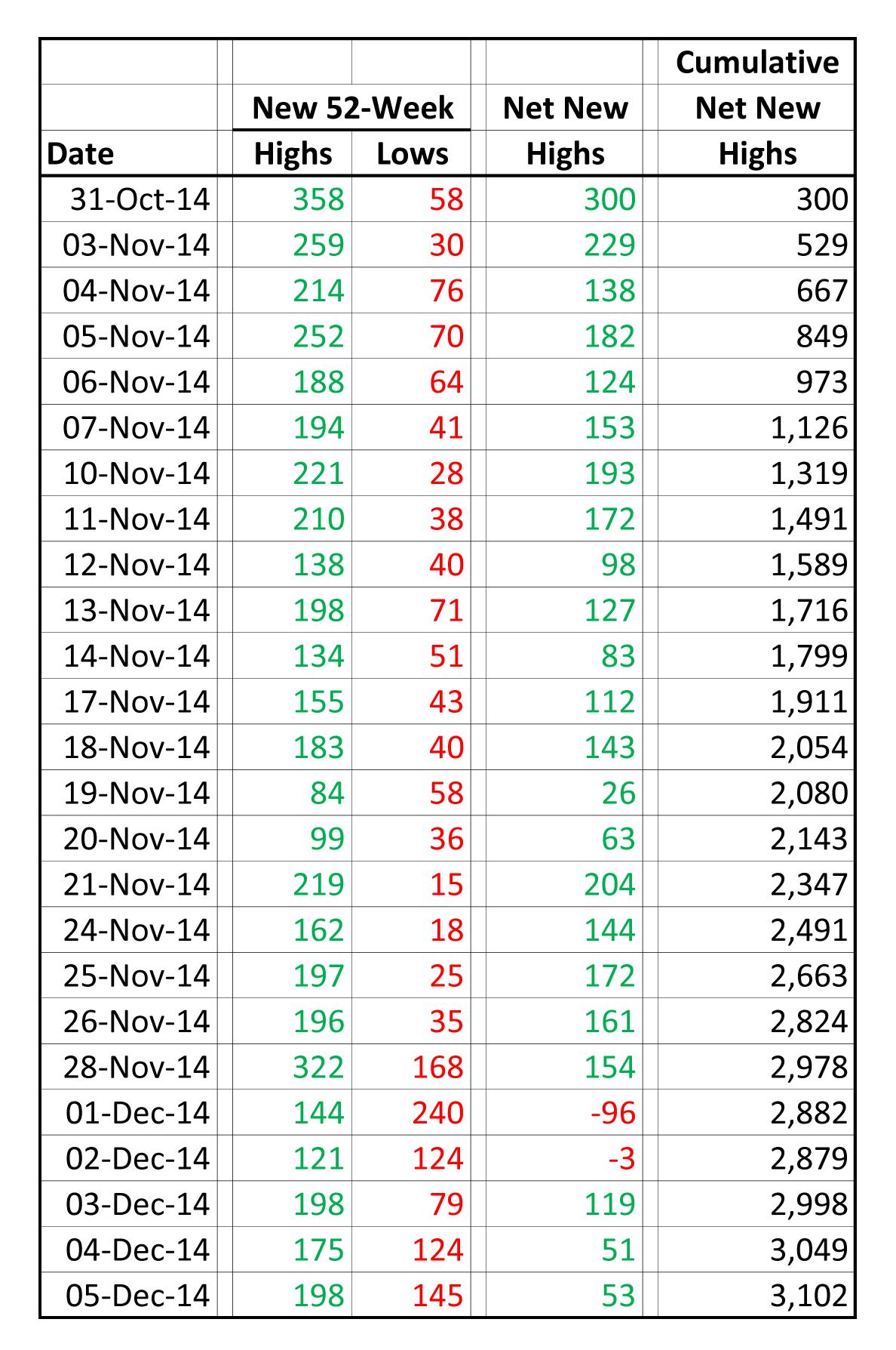
Table 1 shows the calculation of the cumulative net new highs for the NYSE composite index for the period October 31, 2014, through December 5, 2014. The starting value of cumulative net new highs on October 31 is the net new highs value for that day (+300). The cumulative net new highs for November 3 is higher than the previous value (+529 versus +300) because the net new highs value for that day is positive (+229). The cumulative net new highs for that day is the sum of the previous day’s cumulative net new highs and the current day’s net new highs (300 + 229 = 529). Cumulative net new highs continues to increase until December 1. On that day, the net new highs value is negative (-96).
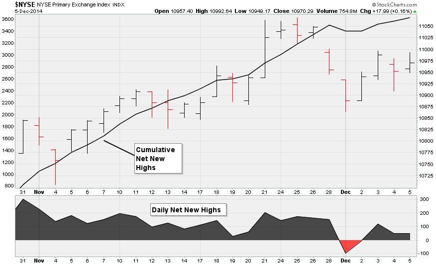
Figure 1 is a chart of the NYSE Composite index, showing the daily net new highs and the cumulative net new highs for the period from October 31, 2014, through December 5, 2014. Although the value of cumulative net new days is dependent on the day we start the calculation, the shape of the line would be the same no matter when we started it. The cumulative net new highs figure rises and falls in conjunction with the change in net new highs. What is most important when analyzing cumulative net new highs is the shape and direction of the line, not the value of the indicator.
Interpretation
Generally speaking, a stock index is bullish when net new highs is positive. This means that there are more stocks reaching new 52-week highs than there are hitting new 52-week lows. In contrast, a stock index is bearish when net new highs is negative. The degree of bullishness or bearishness rests with the level of net new highs as well as the number of stocks in the index. The value of net new highs for the Dow Jones industrial average, with 30 stocks, will more than likely differ greatly from that of the NYSE composite, which is composed of the 2,100-plus stocks listed on the New York Stock Exchange. The NASDAQ and NYSE Composite indexes are usually in strong uptrends when their respective net new highs measure is consistently above +100. Strong downtrends in these composites usually take place when net new highs is consistently below -100.
Net new highs is a lagging indicator, as are the underlying new 52-week high and 52-wek low figures. This means that the market will have changed direction before there is a corresponding shift in new highs and new lows. New 52-week highs and lows take time to develop—actually at least 52 weeks. An extended move is required to push a stock to a 52-week extreme. Following a prolonged advance in an index, you will find a large number of new 52-week highs. There are also plenty of new lows after an extended downturn. When a stock index makes a rebound after a prolonged downward trend, the number of new highs drops significantly, as is the case with new highs when an index makes a correction after a prolonged uptrend.
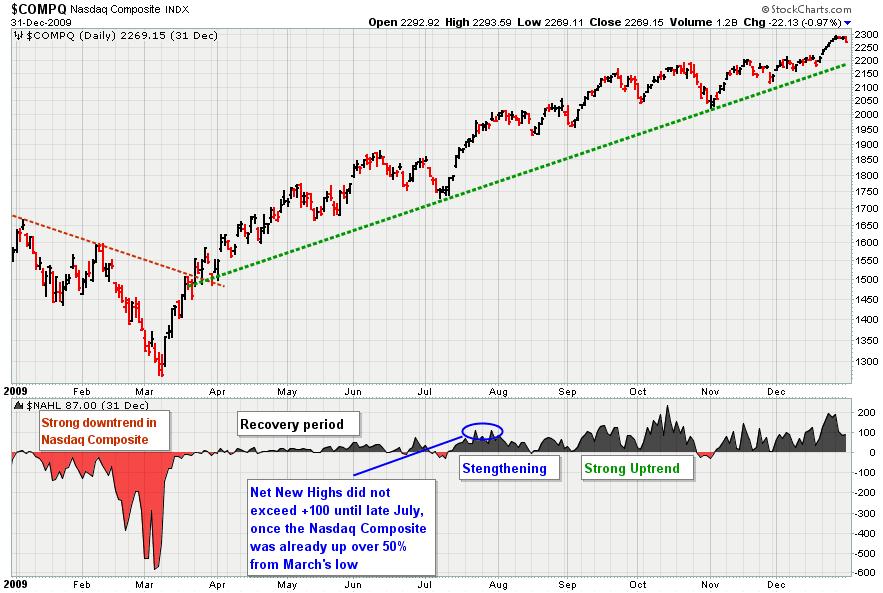
Figure 2 shows the NASDAQ Composite index ($COMPQ) along with the NASDAQ Net New Highs indicator ($NAHL) in the lower window for 2009. March 2009 marked the market bottom follow the financial crisis of 2007-2008. The market bottomed out that March and started a strong retracement. The left side of the chart shows the final stages of the market downturn, with net new highs strongly negative. In early March, right at the end of the market downturn, net new highs reached their lowest levels. On March 9, the NASDAQ Composite reached its bottom and transitioned immediately into a strong uptrend that lasted until early June. Almost immediately, net new highs rose sharply but stayed near the centerline for the next couple of months, even as the index was rising rapidly. This illustrates the lagging nature of net new highs. It was June before the net new highs really started to rise above the centerline, but it still was not until July that the reading exceeded +100.
Moving Average of Net New Highs
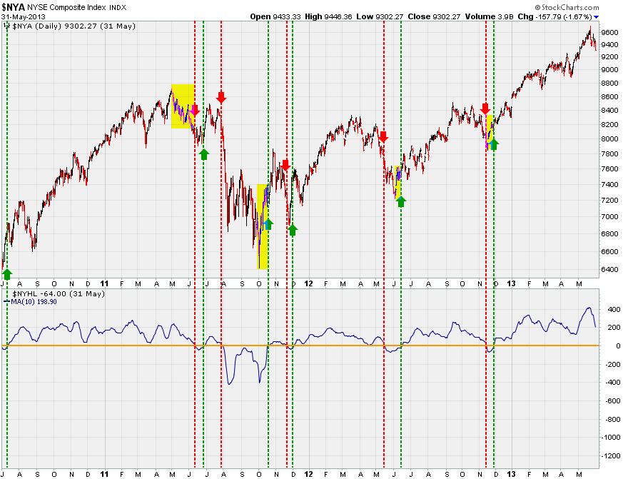
From Figure 2 we can see that net new highs can move rapidly in either direction. Using moving averages to smooth its behavior can reduce centerline crossovers and whipsaws: short-term “head fakes” in the opposite direction of the overall market trend. Figure 3 shows the NYSE Composite (upper window) along with the 10-day moving average of its net new highs (lower window). A bullish signal occurs when the moving average of net new highs moves over the centerline (moves from negative to positive), and these situations are indicated by the green dotted vertical lines. The red dotted lines indicate when the moving average of net new highs moves into negative territory, a bearish signal. Of the five sets of bullish and bearish signals on this chart, three lasted roughly four months or longer. There was only one whipsaw, in October/November of 2011.
In addition, on Figure 3 you see four yellow boxes that illustrate the lag from an intermediate market top or bottom to when the new highs moving average crossed the centerline in the same direction. It took nearly a month for the moving average to turn bearish following the market top at the start of May 2011.
Cumulative Line
Shifting our attention to cumulative net new highs, technicians use this indicator in a similar manner as the net advance/decline (A/D) line. However, net new highs are not as volatile as net advancing/declining values: Since it takes longer for a stock to reach a 52-week high, the cumulative net new highs line will not fluctuate as much as the A/D line. Even so, it is common to apply a moving average to the cumulative net new highs to identify upturns and downturns in the overall trend.
Figure 4 shows the NASDAQ Composite bar chart, along with the cumulative net new highs line and a 10-day simple moving average of the indicator in blue. The cumulative net new highs line will rise as long as there are more stocks hitting new 52-week highs than there are those hitting new 52-week lows, and the market shows strength when new highs exceed new lows for an extended period. A move below the 10-day simple moving average means cumulative net new highs is falling, with new lows outpacing new highs. The green arrows and green dotted lines indicate when the cumulative net new highs line crosses above the moving average, while red arrows and dotted lines show downturns in cumulative net new highs.
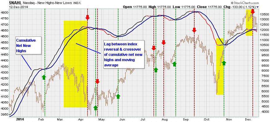
Once again, we also highlighted in yellow the lags between a market top or bottom and the corresponding signal from a crossover of the cumulative net new highs line and the moving average. The most glaring example occurred in March/April 2014, when the NASDAQ Composite peaked in early March, but it was not until mid-April that the cumulative net new high lines crossed below the 10-day moving average.
CI Market Dashboard
The Computerized Investing Market Dashboard includes two indicators that track the level of new highs on a week-to-week basis. Both are adapted from Leslie Masonson’s own set of market indicators, which we have outlined previously in two CI articles: Staying in Front of the Market With the “Stock Market Dashboard” and Masonson’s Stock Market Dashboard, Version 2.
Net New Highs
Masonson tracks the net number of highs for stocks trading on the NYSE. He believes that when the net new highs reading becomes extremely negative and begins to rebound to the upside, the market is likely to reverse course to the upside (a low has been reached).
For the CI Market Dashboard, a bullish signal is generated when the NYSE net new highs indicator falls to -750 or lower and then begins to rise. Alternatively, if net new highs declines by 750 points or more from a reading above zero and then begins to rise, this too is a bullish signal. Otherwise, the indicator is neutral. The indicator will also move from a bullish signal to a neutral signal if no new bullish signals are generated in the six months following an initial bullish signal.
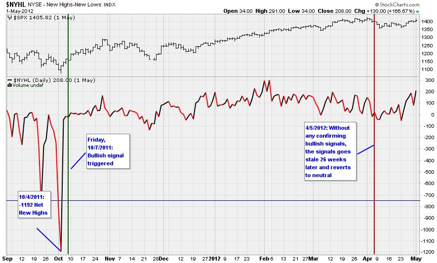
Figure 5 shows the last time the NYSE net new highs registered a value of -750 or lower: On October 4, 2011, the reading fell to -1,192. Therefore, on the Friday of that week (we only update the dashboard indicators at the end of each trading week), the indicator triggered a bullish signal. Over the next six months, net new highs did not revisit those extreme lows, so on April 5, 2012, the signal went “stale” and reverted to a neutral signal. Between the close on October 7, 2011, and April 5, 2012, the S&P 500 index gained 5.1%.
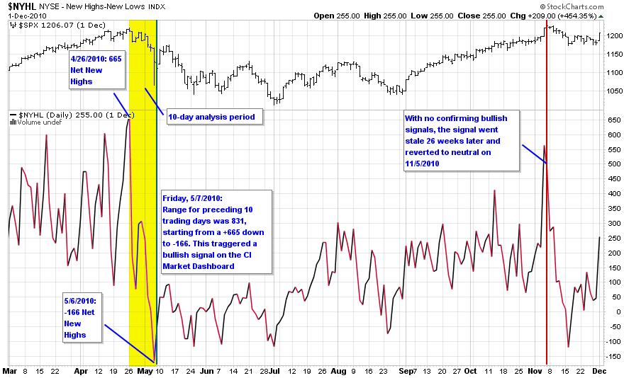
However, dating back to the start of 1990, we have not observed a week in which net new highs fell by at least 750 points without also registering a value of -750 or lower. So we extended the analysis period to cover the 10 trading days leading up to the close of each week, such that if net new highs has fallen by 750 points or more from a positive reading in the preceding 10 trading days, the indicator triggers a bullish signal. Figure 6 illustrates the last time this happened, in April 2010. On April 26, 2010, net new highs spiked to +665, an uncommonly high reading. Nine trading days later, net new highs had fallen to -166. Therefore, on Friday, May 7, 2010, the range of net new highs for the preceding 10 trading days was 831 (-166 to +665). Therefore, the indicator triggered a bullish signal that day that latest for six months; it went stale and reverted to neutral on November 5, 2010. Over that six-month period, the S&P 500 gained 21%.
New Highs as a Percentage of Total Issues Traded
Masonson points out that a large positive number (new highs outnumbering new lows) in and of itself does not offer a usable signal of a coming market reversal to the downside. That is why he instead looks for a significant decline in net new highs. He also looks at the percentage of NYSE stocks reaching weekly new highs: the number of weekly new highs divided by the total number of issues traded that week. When this percentage reaches extreme levels and then begins to fall, this is a good sign that a market has reached a top, a bearish signal.
On the CI Market Dashboard, this indicator is bearish when the percentage of NYSE stocks reaching new highs is 25% or greater but is declining. When the indicator is below 25% or above 25% and still rising, it is neutral. Once a bearish signal is triggered, that signal will remain in effect for six months, unless a confirming signal in the same direction is generated, at which point the date will be reset (or if a signal in the opposite direction is generated). If no confirming bearish signal is generated over the following six months after an initial bearish signal is generated, the indicator will revert to neutral.
Each week, we collect data provided at the WSJ.com Markets Diary. Here you can find the number of issues traded for the latest full trading week as well as the number of advancing and declining issues for the week and the number of new 52-week highs and lows. Figure 7 is the plot of the percentage of NYSE stocks hitting a new 52-week high.
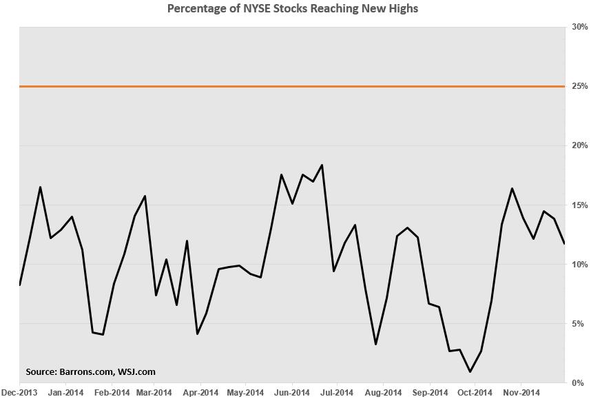
The last time the percentage of NYSE stocks hitting a new 52-week high exceeded 25% was the week ended May 24, 2013. The following week, May 31, the reading fell below 25% to 12.67%, thereby triggering a bearish signal. The indicator remained bearish for 26 weeks and, because there were no confirming bearish signals over the proceeding period, the indicator went stale and reverted to neutral on November 29, 2013. However, over the six months from May 31 to November 29, the S&P 500 gained 10.7%, whereas the large-cap index had gained 15.2% in the six month ended May 31, 2013.
Lastly, you can also use the percentage of issues hitting new highs to compare indexes. Those indexes with the greatest percentage of issues hitting new highs have more underlying strength compared to those indexes with a relatively small number of stocks hitting new 52-week highs.
Conclusion
Here we have shown how you can use net new highs as a means of identifying the overall trend in the market. By smoothing the data using moving averages, you are able to reduce the “noise” generated by inconsequential movements to better focus on the trend at hand. Generally speaking, this indicator is bullish when the number of net new highs is positive, and is it bearish when the net new highs is negative. Tracking the cumulative net new highs can help you identify changes in momentum as possible market reversals.
We also showed how we use new highs in our CI Market Dashboard. Extreme declines in net new highs may be a signal that the market has topped out, a bearish signal. Furthermore, following the percentage of new highs relative to the overall market also may help determine market momentum. When this percentage reaches extreme levels, this too may indicate that the market is overbought and that a reversal is imminent.
Discussion
FREE REPORT

charter the profits from south carolina posted over 11 years ago:
You need to log in as a registered AAII user before commenting.
Log InCreate an account