


Wayne Thorp leads a class in AAII's new Essential Investing Video Course. Go to https://www.aaii.com/ves for more information and to subscribe.

Article Highlights:
-
Point & figure charts use X’s and O’s to filter out “insignificant” price movements, focus on important price movements and make it easier to identify resistance and support levels.
-
The use of boxes to represent specific price ranges (e.g., $70.00 to $70.99) sets clear parameters to determine how much a stock needs to move in the opposite direction to incur trend reversal.
-
Either a period’s closing price or its high-low price can be used for creating a point & figure chart. Step-by-step directions for building a chart using a stock’s high or low price are provided.
One of the first regular columns I wrote when I started at AAII over 20 years ago was on technical analysis.
Since then, I have come to appreciate the benefits of examining price charts and analyzing technical indicators. Over time, I have come to rely on a few specific “technical” tools, one of which is the point & figure (P&F) chart.
While you may be familiar with line, bar and candlestick charts, point & figure charts have not achieved the same following as these others. Part of that, I believe, is due to a lack of knowledge or understanding. However, I personally think point & figure charts offer benefits that far exceed more traditional chart types. For this reason, I think investors will benefit from learning about them. The purpose of this article is to introduce you to point & figure charts, including how to create them. In subsequent articles, we will show you how to use them in your investing and trading.
Introduction to Point & Figure Charts
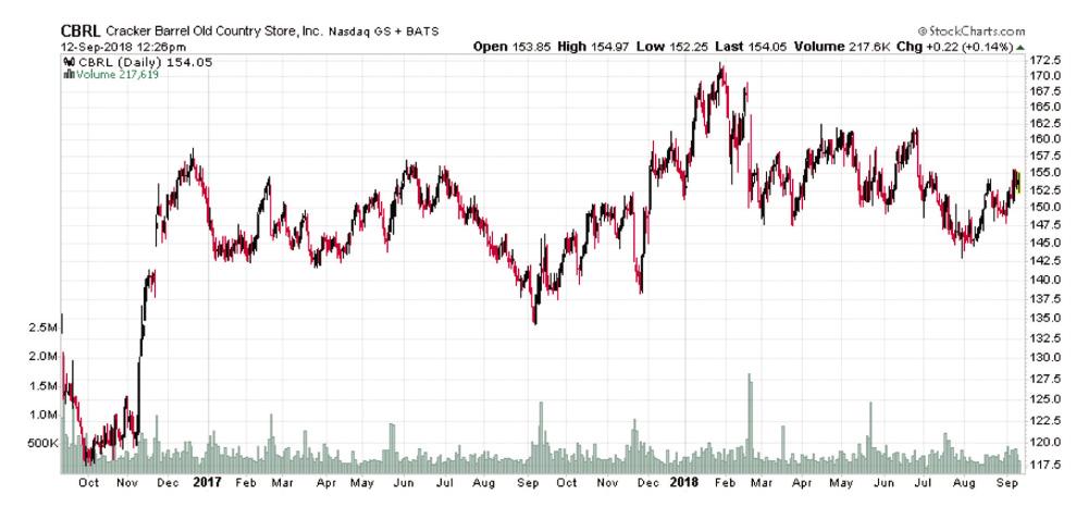
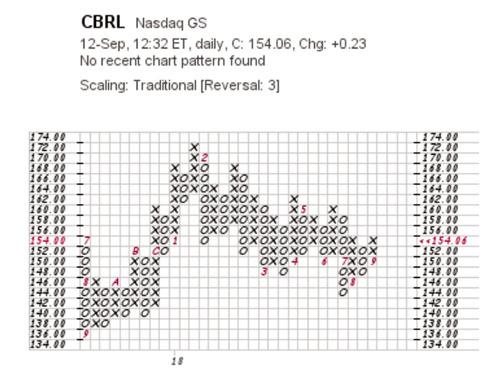
Figure 1 shows a bar chart for Cracker Barrel Old Country Store Inc.  (CBRL) and Figure 2 shows a point & figure chart for the same stock. Both charts cover basically the last two years of daily trading for the company, but as you can see the charts are quite different.
Point & figure charts consist of columns of X’s and O’s that represent “filtered” price movements. Unlike the bar chart in Figure 1, with each bar representing a trading day’s open-high-low-close prices, time is not a factor in point & figure charting. No movement in price means no change in the point & figure chart. Each X and O of a point & figure chart is a price box representing a specific value that the price must reach to warrant an X or an O. In classic 3-box reversal charts, column reversals from a column of X’s to a column of O’s, or vice versa, require a minimum of three boxes. The 3-box reversal method is the more popular point & figure charting method, which I will discuss later.
Among the elements that I find most appealing about point & figure charts are:
-
They filter out “insignificant” price movements and noise,
-
They focus on “important” price movements,
-
They make support and resistance levels much easier to identify,
-
They provide automatic trendlines and
-
They allow for easier chart pattern identification.
Background
Even though point & figure charts aren’t used as much as other charts, it doesn’t mean they are a new, unproven fad. Instead, point & figure charting has a rather long history, dating back to at least 1898, according to StockCharts.com (www.stockcharts.com). Because of the way point & figure charts are drawn, long before computers revolutionized technical analysis, technicians could easily update dozens of point & figure charts a day by hand in very little time.
 (CBRL)" border="0" src="https://www.aaii.com/files/images/articles/10269-figure-1.jpg" width="250" />
Creating a Point & Figure Chart
Today, there are websites that offer point & figure charting, and the two best are described in the accompanying Computerized Investing column. My favorite place for point & figure charts as well as charting in general is StockCharts.com. The site offers point & figure charting as well as technical scans that will identify specific point & figure patterns from a universe of several thousand stocks.
On a point & figure chart, price movements are represented by rising X-columns and declining O-columns. A column of X’s in effect represents an uptrend, while a column of O’s indicates a downtrend of sorts. Each X or O occupies a “box” on a chart, and the box size, which defines the price range for a box, is dictated by the price of the security.
 (CBRL)" border="0" src="https://www.aaii.com/files/images/articles/10269-figure-2.jpg" width="250" />
In addition to the box size, a point & figure chart has a “reversal amount” that determines how many boxes the price needs to move in the opposite direction of the current trend to warrant a column reversal. Whenever the reversal amount is reached, a new column is started next to the previous one, but in the opposite direction (from X to O, or O to X).
The “reversal distance” is the box size multiplied by the reversal amount. A box size of 1 and a 3-box reversal amount would require a three-point move to warrant a reversal and a new column (1 (CBRL) 3). A point & figure chart would remain in an upward X-column as long as the price does not move down by more than the reversal amount (a decline in price greater than the sum represented by three boxes). Alternatively, a downward O-column would remain in effect until the price changes direction by more than the reversal amount (an increase in price greater than the sum represented by three boxes), at which point a new X-column would be added to the chart.
Depending on the service you are using to generate point & figure charts, you may have options as to the scaling of box sizes. If you are creating a point & figure chart by hand or using a service with “traditional” box scales, see Table 1, which shows the scaling most commonly used. This scaling was originally created by ChartCraft and popularized by Tom Dorsey, considered by many to be the modern-day father of point & figure charting.
If you wish to use your own scaling, keep in mind that larger box sizes require bigger price movements to add additional X’s or O’s to a column and would have fewer reversals. In effect, larger box sizes filter out more price movements. A smaller box size will result in less filtered price movements and more reversals. Depending on the security you are following, it may be useful to modify the box scale.
Table 1. Point & Figure Box Sizes for Price Ranges
| Each box on a point & figure chart reflects a specific price range. A stock with a price of $70, for example, will be plotted on a chart with each box representing a $1 change in price. | |
| Price Range | Box Size |
|---|---|
| Under $0.25 | 0.0625 |
| $0.25 to $0.99 | 0.125 |
| $1.00 to $4.99 | 0.25 |
| $5.00 to $19.99 | 0.5 |
| $20.00 to $99.99 | 1 |
| $100.00 to $199.99 | 2 |
| $200.00 to $499.99 | 4 |
| $500.00 to $999.99 | 5 |
| $1,000.00 to $24,999.99 | 50 |
| $25,000.00 and up | 500 |
Plotting Time
As mentioned earlier, point & figure charts do not show time linearly like standard bar or candlestick charts. Point & figure charts only evolve when there is a price change big enough to warrant a new O, a new X or a new column brought on by a reversal.
One way to mark the passage of time with point & figure charts is by marking months. Numbers and letters on a point & figure chart indicate when a new month has begun. For example, the number “6” shows when June started. For months 10, 11 and 12—October, November and December—the letters “A,” “B” and “C” are used.
High-Low Method
When creating point & figure charts, there are two pricing methods you can use: the high-low method and the close method. Each method uses only one price point. The close method, as the name suggests, uses only the closing price. The high-low method uses the high or the low price for the period, but not both. Sometimes, you ignore both. The choice of which method to use is a matter of personal preference. There was a time when it was difficult to obtain high and low prices, but today most free data sources provide these prices. Most charting services offering point & figure charts use the high-low method.
Here are the rules for the high-low method:
When in a rising X-column:
-
Use the high price when another X can be drawn and ignore the low price;
-
Use the low price when another X cannot be drawn, and the low price triggers a 3-box reversal; and
-
Ignore both the high and low prices when the high does not warrant another X and the low does not trigger a 3-box reversal.
When in a falling O-column:
-
Use the low price when another O can be drawn and ignore the high price;
-
Use the high price when another O cannot be drawn, and the high price triggers a 3-box reversal; and
-
Ignore both the low and high prices when the low does not warrant another O and the high does not trigger a 3-box reversal.
Interpreting Box Ranges
One element of point & figure charts that creates some confusion is the fact that a box (X or O) does not represent a single price. Rather, a box represents a price range that depends on whether you are in an X- or O-column. The range of an X box rises when in an X-column and the range of an O box falls when in an O-column.
As an example, if you were in a rising X-column, a box marked with a 26 would range from $26.00 to $26.99 and a box with 27 would range from $27.00 to $27.99. Prices would remain in the 26 box as long as they ranged from $26.00 to $26.99. If the price moved to $27, a new X would be drawn at 27. Specifically, any price between $27.00 and $27.99 would warrant another X in the same column.
Things are a bit different when you are in a falling O-column. A move to 26 would warrant an O in the 26 box. This O would remain as long as prices range from $25.01 to $26.00. Be sure to take note that this range is different from the range for a rising X-column. A price of $25.00 would then warrant a new O in the 25 box. Anything between $24.01 and $25.00 would warrant an O in the 25 box.
Putting It Together: Building a Point & Figure Chart
Now that I have covered the key elements of point & figure charts, it is time to tie it all together and walk you through constructing a point & figure chart. Before beginning, though, remember these points:
-
X-columns represent rising prices (demand);
-
O-columns represent falling prices (supply);
-
Columns only contain X’s or O’s, never both at the same time; and
-
Shifting to a new column requires a price move equal to or greater than the reversal distance.
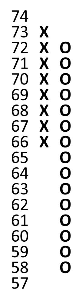
The price data in Table 2 will be used to create a point & figure chart. Figure 3 illustrates the plotting as described below.
| Daily Prices ($) | ||
|---|---|---|
| High | Low | |
| Day 1 | 68.66 | 67.57 |
| Day 2 | 69.13 | 67.31 |
| Day 3 | 71.94 | 68.4 |
| Day 4 | 73.99 | 70.81 |
| Day 5 | 73.22 | 67.74 |
| Day 6 | 62.92 | 60.42 |
| Day 7 | 60.53 | 58.12 |
| Day 8 | 60.42 | 59.29 |
| Day 9 | 59.43 | 58.05 |
| Day 10 | 59.48 | 57.56 |
Day 1: High = $68.66; Low = $67.57
Point & figure charts have to start somewhere, meaning you have to decide whether the chart will begin with a column of X’s or O’s. For this example, we assume that prices have been rising and plot X’s in the 66, 67 and 68 boxes. Since this is the first day we are plotting, there is nothing else to do.
Day 2: High = $69.13; Low = $67.31
For this example, we are using the high-low method, so we have to choose one number. The current column is a rising X-column, so we first check the high price for the day. Is it high enough to warrant another X? Yes, since the range of the current X box is $68.00 to $68.99 and the high price of the day is above $68.99 ($69.13). We add an X in the 69 box. Since we drew another X, we ignore the low price for the day.
Day 3: High = $71.94; Low = $68.40
Again, since we are in an X-column, we first check the day’s high. Is it above the range of the current 69 box ($69.00 to $69.99)? Yes, so we draw additional X’s in the 70 and 71 boxes. We can also ignore the low price for the day since we added more X’s.
Day 4: High = $73.99; Low = $70.81
Being in an X-column, we first look to the day’s high price. Is it above the range of the current 71 box ($71.00 to $71.99)? Yes. We draw two additional X’s in the 72 and 73 boxes and ignore the low price for the day.
Day 5: High = $73.22; Low = $67.74
We are still in an X-column, so we begin by looking at the high price for the day. Is it above the range of the current 73 box ($73.00 to $73.99)? No, it does not move to 74 or higher and therefore does not warrant a new X in the 74 box. We then check whether the low price is lower than or equal to the current box value (73) minus the reversal distance (3, defined as a box value of 1 multiplied by 3). The low is $67.74, which is below the current box value less the reversal distance (73 – 3 = 70). This means a 3-box reversal has occurred, and we add O’s starting one box below the highest X in the previous column down to the 68 box ($67.01 to $68.00). Remember, the range for a falling O-column is different than it is for a rising X-column.
Day 6: High = $62.92; Low = $60.42
We are now in an O-column, so with the high-low method, we first look at the low price for the day. Is it below the range of the 68 box ($67.01 to $68.00)? Yes, so we draw additional O’s down to the 61 box ($60.01 to $61.00). Since we plotted O’s for the day, we ignore the high price for the day.
Day 7: High = $60.53; Low = $58.12
The current column is an O-column and the price is in the 61 box ($60.01 to $61.00). Since we are still in an O-column, we check the low price first. It moves to 60 or lower so it warrants new O’s in the 60 and 59 boxes. Once we plot an O, the high for the day is ignored.
Day 8: High = $60.42; Low = $59.29
Again, we look to see if the low moves lower by at least the box amount. It does not move to 58 or lower and therefore does not warrant a new O in the 58 box. We then see if the high for the day is greater than or equal to the current box value (59) plus the reversal distance (3). The high is $60.42, which is not greater than the current box value plus the reversal distance (59 + 3 = 62). A 3-box reversal did not occur, so we do nothing for the day.
Day 9: High = $59.43; Low = $58.05
The current column is a falling O-column and the price is in the 59 box ($58.01 to $59.00). Since we are in an O-column, we check the low price for the day first. Anything below 58 would warrant a new O. The low is $58.05 so this does not warrant a new O. So, we then look to the high. We see whether the high is equal to or more than the current box value (59) plus the reversal distance (3). The high is 59, which is less than the current box value plus the reversal distance (59 + 3 = 62). Once again, a 3-box reversal did not occur, so we do nothing for the day.
Day 10: High = $59.48; Low = $57.56
We are still in a falling O-column with the price in the 59 box ($58.01 to $59.00). We first check the low price for the day. The low of $57.56 warrants a new O in the 58 box ($57.01 to $58.00). Because we drew a new O, the high is completely ignored.
Conclusion
Point & figure charts are a unique way to illustrate price movements of a security. Point & figure charts do not show time in a linear fashion. A single column of X’s and O’s that make up a point & figure chart can represent one day, or many days, even months or years, depending on the price movement. Because point & figure charts filter out the noise associated with more traditional charting methods, such as bar or candlestick charts, every box on the chart carries greater significance.
This article laid the foundation for additional point & figure chart analysis. Now that you understand what the boxes and columns that make up a point & figure chart represent, we can move onto using and interpreting point & figure charts. In a future article, I will discuss how to use point & figure charts to identify support and resistance levels as well as upward and downward trendlines.
Discussion
FREE REPORT

No comments have been added yet. Add your thoughts to the discussion!
You need to log in as a registered AAII user before commenting.
Log InCreate an account