


Raymond Rondeau leads a class in AAII's new Essential Investing Video Course. Go to https://www.aaii.com/ves for more information and to subscribe.


It is obvious that markets change and markets evolve. Investors who accept this as reality and adjust their approaches accordingly put themselves in a better position to succeed.
Like seemingly everything today, markets and their characteristics are changing at an ever-increasing pace. One of the more apparent changes is that we seem to be in an endless series of boom/bust cycles. These “bubbles” are being formed by a continuous revolving series of overextended price trends.
An investor may attribute these changes to multiple factors, including globalization, technological advances, the Internet, constant media coverage, increases in automated high frequency trading or the growing amount of hedge fund assets. New investment vehicles designed to allow individual investors to short and/or leverage (while staying long) is also a likely contributor. Add in ultra-low commissions and the fact that an investor can change his entire portfolio with a few clicks of a button, and it is easy to see why markets seem to be trending longer and wider than at any point in history.
Regardless of the reasons why, the fact is that our markets are trending. Popular or not, an elementary understanding of trend analysis theory in today’s market environment is no longer a complementary addition, but rather a necessity to maximize the chances of success.
This is the focus of this article as I explore where an investor should turn to in evaluating trends and probable future price action. Specifically, I discuss three primary areas to help you differentiate between a normal retracement of a strong continuing trend and the early warning signs of a major trend reversal. In other words, the primary question is “to trend (continue) or not to trend (reverse)”?
Price Action and Trend Changes
For the purposes of this article, I define a trend simply as the general direction of a market or the price of an asset. With today’s extensive financial news coverage, investors are often well aware of the overall direction and trends of the major indexes and their respective components. Unfortunately, simply knowing the direction of the trend isn’t enough for evaluating potential directional changes. For this, an investor needs to get some deeper insight into the characteristics of the established trend, such as the longevity, intensity and developing changes in momentum. This leads us to an obvious starting point, charting and technical analysis, where a picture is truly worth a thousand words.
To illustrate, I have chosen the popular investment/trading vehicle gold. From the beginning of 2000, gold had been on a decade-plus upward climb from a price of $280 per ounce in January 2000 to over $1,950 per ounce in September 2011. This rise of nearly 600% certainly qualifies as an established long-term uptrend. Figure 1 shows that, using only basic support and resistance levels, the charts did an excellent job of not only forecasting future price movements for shorter trading profits, but also identifying the overall end to the primary upward trend, which is our primary goal.
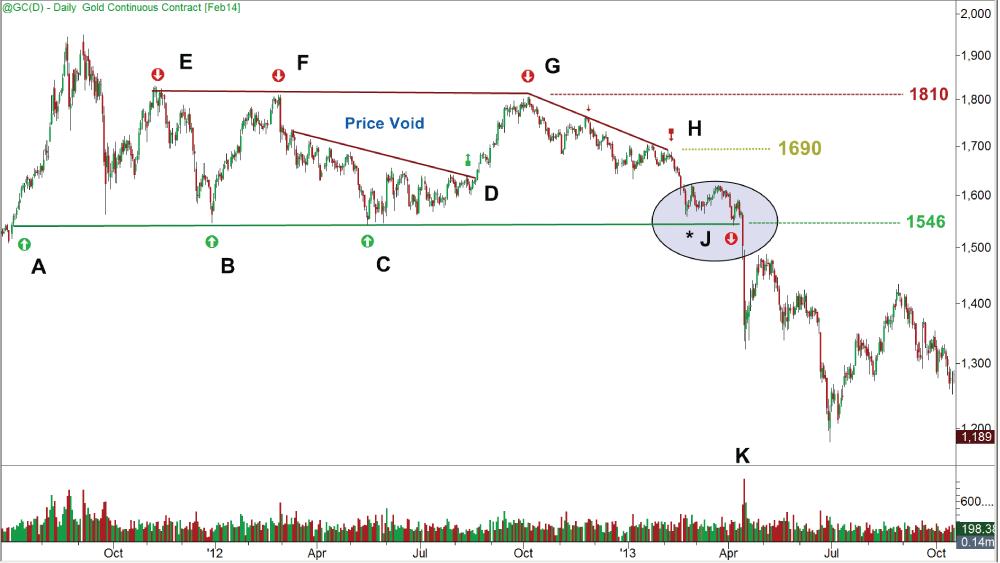
If an investor was bullish on gold and looking to establish a long position, point C on Figure 1 would have been a fairly obvious first choice. Here, there is a level of support, extended from points A and B, where buyers showed a previous interest in accumulating shares around the price of $1,546. At point D, there was more evidence supporting the bullish position, with the breach of the intermediate downward sloping trendline (green block arrow). With gold having moved into a huge “price void,” the next logical stop would have been at the next area of resistance around the $1,810 level. This was an area of clear resistance, where sellers had shown a previous desire to distribute shares. (Points E and F on Figure 1 established this resistance.) At point G, bullish investors would have looked to take profits, while bearish investors might have looked to establish new short positions. Both of these actions created downward pricing pressure, simply because of the technical landscape of the charts, essentially causing a self-fulfilling prophecy of price movement.
At point H on Figure 1, there was the third touch of the now-confirmed short-term downward sloping trend line, extending from point G. This was an excellent short opportunity, forcing the price into another price void, and it would not have taken much technical expertise to deduce that the next logical battle area would have been back at the $1,546 price level. This, of course, was not only self-fulfilling, but also logical and where active traders make their money. At this point, future bullish investors would have been hesitant to purchase shares at higher price levels when they felt that they may have been able to get a better price at $1,546, so they waited. Bearish investors were not going to close their short positions at a higher price, and hence they were prone to also wait for prices to fall back to the $1,546 level. Both parties were reluctant to transact, in hopes that they could get better prices. The hesitation by the bulls and the bears completed the technical formation and led to the major key price area on Figure 1: point J.
Point J was an obvious and key inflection point for the long-term trend and the world was watching. What happened there likely determined the intermediate-term price direction for gold going forward from that point. After a two-month battle, the bulls abandoned the $1,546 level and prices collapsed $200 (12.7%) in two days. Here, both experienced bullish and bearish technical traders would have transacted correctly once the market had finally showed its hand. The bulls would have been stopped out below the $1,546 level and retreated to fight another day, and the bears would have profited by establishing or adding to their short positions. The huge volume spike at point K is noteworthy and was further evidence of the importance associated with this technical event.
This example highlights three key points. First, popular or not, price action is related to and influenced by the technical landscape of the charts, and technicals can be used to assist one in the timing of executions. Second, the failure of the price to hold support at point J reaffirms that technical analysis doesn’t tell us necessarily if a price trend is going to continue, but only indicates where and when the trend is likely to resume its path. Third, price action at these key inflection points has significant value in determining the probable continuation or change in an established trend—our main goal. In this example, once the price of gold breached the $1,546 level at point J, the charts signaled that the intermediate and possibly the long-term uptrend was over.
Combining Technical and Fundamental Indicators
Rightfully so, longer-term-oriented investors love to look at fundamentals for making their investment selections. Thus, incorporating these valuations into analysis for probable continuation or reversal for long-term trends is not only reasonable, but also effective.
One measure of fundamental valuation that can be useful to consider is the relative price-earnings (P/E) ratio. The relative price-earnings ratio is a comparison of stock’s current price-earnings ratio to that of its history. For the purposes of this article, I include a graphed example of relative price-earnings ratios in conjunction with support and resistance.
Figure 2 shows the price action of Lockheed Martin Corp. (LMT) coupled with its price-earnings ratio (lower pane). The interpretation here is that a low numerical reading would be viewed as a potentially bullish reading, indicating a “relative” historical-based low and perceived attractive valuation. In Figure 2, we can see that whenever the price-earnings ratio approached a level of 9.0—the lower band of fundamental support—buyers stepped in. At the opposite side, when Lockheed’s price-earnings ratio approached 11.0—the upper band of fundamental resistance—the price seemed to roll over as the sellers seemed to take control.
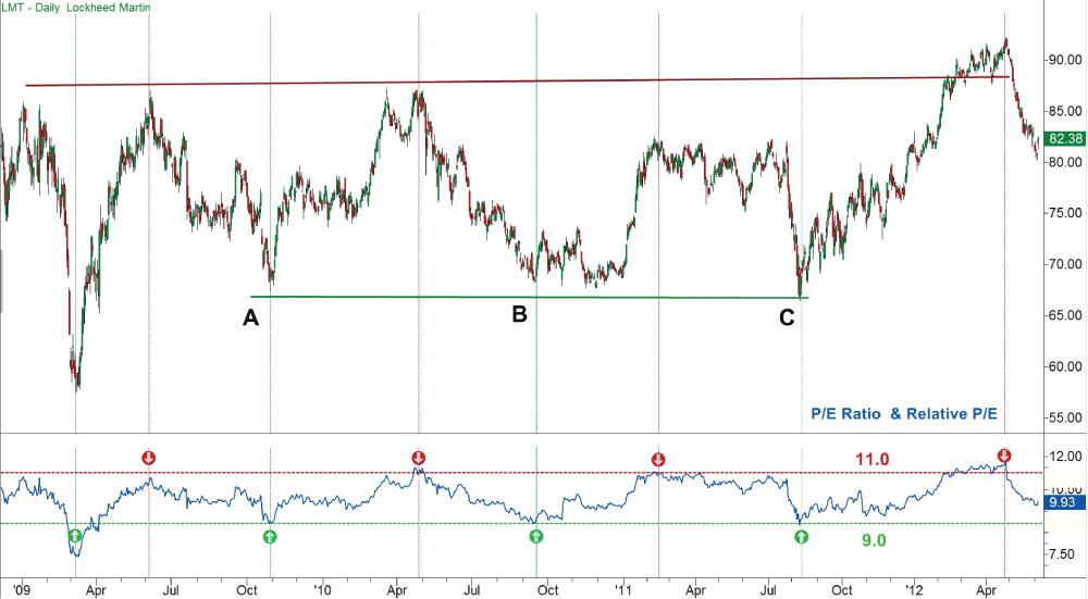
Coupling these fundamental support and resistance areas with the price action (points A, B and C on Figure 2) is where we get our insight into the likelihood of the technical trend continuing or breaking, again our primary purpose. If the price has been ranging and is currently at the lower edge of price support, we would want to see a fundamental indication that the stock is undervalued. A low relative price-earnings ratio would be bullish and would confirm the likelihood of the trend continuing.
Conversely, if the stock approached support (lower prices) and was still trading with a high relative price-earnings ratio, then this could be a interpreted bearishly with an increase in the probability of a breach of the existing trend. Often this can lead to a scenario where fundamental-oriented investors begin to liquidate their positions. This liquidation then causes a drop in price that prints a bearish technical pattern on the charts (a breach of major support), which further exacerbates the selling, now by the technical traders. The additional pricing pressure begins to trigger protective stops on established long positions. Automated trading programs designed to recognize such activity then jump in, adding to the building of momentum and the subsequent forming of a new trend in the opposite direction.
The use of technicals and fundamental studies for trend analysis are obviously and widely used, but for additional insights we will now look at one example in our third area of study—derivatives.
What Investors Might Be Thinking
By looking at the implied volatility (IV) of optionable issues, the investor has the ability to gain some additional insights (that are not only shown in price) into what market participants might be thinking. This measurement has potential forecasting value when issues approach extreme relative historical implied volatility levels or when it creates divergences with price that cannot be directly associated with other known factors.
To illustrate, Figure 3 shows the S&P 500 index and the widely used “fear index,” the Chicago Board Options Exchange (CBOE) Volatility Index (VIX). The classic interpretation in action at points A, B and C of “when high, it’s time to buy, and when it’s low, look out below” appear on this chart. How high is high and how low is low? For this example, I will use the VIX levels as the reference and the bottom of a linear regression price channel (lower green line) as support for the established trend.
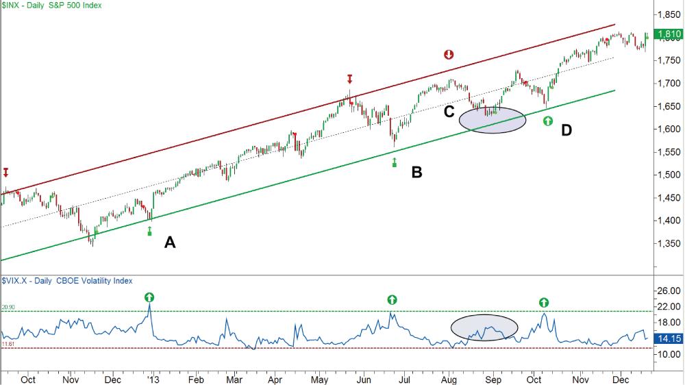
To get a benchmark, I first do some quick calculations starting at point A. Point A marks a 4.9% price pullback within the channel and a VIX peak of 23.23. Point B marks a 5.3% price pullback within the channel and a corresponding VIX peak of 21.3. Using these as the reference levels, look at point C to observe a similar size pullback of 4.7% to support, but with a subsequent rise in the VIX to only 17.8. An interpretation here could be that there was less demand for protection in relation to other recent pullbacks and that the overall market had less concern with this retracement and a major trend change. In hindsight, we can see that this is what happened, as support did hold and the price continued to reach a higher high.
Moving forward at point D, a similar “high” VIX reading of 20.34 can be seen. This new “high” reading, though, occurred in the toxic environment of a partial government shutdown, with the threat of a possible U.S. government debt default. Considering the amount of uncertainty, when an investor compared this reading to the average VIX reading of 20.32 (from January 2004), he could theorize that the big money and those who were “in the know” did not seem overly concerned. In other words, based on this one indicator, an investor could have surmised that the market had a relatively bullish stance and that there would be a satisfactory resolution and future upward price activity. Again in hindsight, we now know that this was indeed the case, even though only a short-term solution to the concerns was reached.
Conversely, let’s say the VIX instead jumped to a hypothetical level of 45 at point C. In this scenario, one interpretation might have been that there was a high degree of fear with this similar measured price pullback and that the current trend and support was less likely to hold. Here, an investor could have theorized that the market’s larger players were more pessimistic or concerned about the eventual outcome.
A Synergistic Viewpoint
After decades of working with individual and groups of traders and investors, I have often noticed that novice or unsuccessful investors are the ones who seem to question little and seem sure of a lot, while the proficient and successful investors are the ones who question a lot and seem sure of little. As Oscar Wilde once stated, “the pure and simple truth is rarely pure and never simple.” In the investment world, the truth is, despite what someone may try to “tell you or sell you,” the markets are not stupid. Attaining a true edge on longer-term-oriented positions takes good resources, hard work and research. Our markets are more sophisticated than ever. Simple get-quick-rich schemes don’t work here. All of this leads us to a few final thoughts in regard to trend analysis and price forecasting.
First, the good news. After researching, when these observations are combined they can give an investor valuable insights into the health of a current trend. In addition, it is important to note that these measurements are more effective when used together, as they work synergistically. Single observations or the use of a single indicator is generally less effective. A professional investor will consider researching many factors, and not just those that are quantitative, before making an informed “decision.”
George Bernard Shaw once stated that “the [only] golden rule is that there are no golden rules” and this the bad news investors must face. You can have a stock that technically has been in a sustainable uptrend that has just broken out of a major continuation pattern, off of multiple key converging moving averages on high volume with a gap into a huge price void. The stock could also be showing continued but sustainable relative strength and leadership to the market and its industry. It could have true insider (non-stock option related) buying, positive price movements to seemingly negative news and be entering a favorable seasonable cycle for its industry, all while being at the very top of your favorite stock adviser’s lists and newsletters. Yet, we still would not know what the stock price is going to do.
In this one-sided scenario, it would be natural for one to assume that with all the overlapping and reinforcing positive signs that we would know what the stock price is going to do, right? No, no one really knows (barring inside information or manipulation). Even if everything that you know is complete (impossible) and totally true (unlikely), it is important to remind ourselves of the famous quote attributed to John Maynard Keynes, “The market can stay irrational longer than you can stay solvent.” Unfortunately, price and trend analysis is about probabilities and never guarantees. This is the reason that experienced investors look to protect assets with diversification and hedging strategies.
Now the unpopular truth: If something on initial analysis looks too good to be true, it probably is. So look further and then, if necessary, even further. There are no free rides on Wall Street. Yes, an argument can be made for the “analysis paralysis” side of the debate. But scanning the entire field for hidden sinkholes before sprinting to pick up your pot of gold at the end of that rainbow (that you assume no one else sees) just makes more sense.
One could argue that the markets may not be totally efficient, but market participants are not totally incompetent either. As anything changes—either real or perceived—the markets and prices adjust immediately to reflect that new information. Put another way, everything that has happened, is expected to happen and that could happen is already factored into prices. The markets discount everything.
Lastly, when performing trend analysis it’s important to always be cognizant of one of the main tenets of Dow Theory, “trends exist until a definitive signal proves that they have ended.” Dow Theory advises us to always assume that the trend is likely to continue until the weight of evidence dictates otherwise. The final question, of course, is: How much weight is enough to make an early but accurate call of a continuation or reversal of an established trend? This is where the relevancy and weighting of the evidence comes into play, and these are ultimately dependent on the experience and abilities of each individual investor.
Tony Hausner from MD posted over 12 years ago:
Dione Bunnao from CA posted over 12 years ago:
Frederick Mc Kay from MA posted over 12 years ago:
Mark Sheingold from MA posted over 12 years ago:
John Chamberlain from MA posted over 12 years ago:
Robert Zakon from MA posted over 12 years ago:
Stephen Percoco from MA posted over 12 years ago:
Serene Lee from Massachusetts posted over 12 years ago:
Barbara Karten from MA posted over 12 years ago:
vincent mitchell from rhode island posted over 12 years ago:
Emilio Iannuccillo from RI posted over 12 years ago:
Dan Varon from MA posted over 12 years ago:
Robert Williams from MA posted over 12 years ago:
Ivan Orozco from CA posted over 12 years ago:
Scott Soulman from CA posted over 12 years ago:
Mark Goldberg from RI posted over 12 years ago:
Helen Lambaise from RI posted over 12 years ago:
J C Kramer from MA posted over 12 years ago:
Robert Miller, President AAII Portland Chapter from OR posted over 12 years ago:
Phil Edwards from FL posted over 12 years ago:
John Cartella from NY posted over 12 years ago:
Tim Higgins from MA posted over 12 years ago:
Josh from IL posted over 10 years ago:
You need to log in as a registered AAII user before commenting.
Log InCreate an account