


Related

Portfolio Strategies
Until recently, a portfolio allocation that evolved over time (meaning followed a “glide path”) to become more conservative after retirement was the widely accepted standard approach.
However, recent studies by Michael Kitces and Wade Pfau (“Reduce Stock Exposure in Retirement, or Gradually Increase It?,” AAII Journal, April 2014) and Luke Delorme (“Mathematical Support for Rising Equity Glide Paths,” AAII Journal, September 2015) suggest the opposite: that retirees should increase their equity allocations over time. These relatively novel findings have left many investors and advisers unsure about how to build optimal retirement portfolios.
My recent optimal glide path research suggests that too much effort has been put into making a general rule about the glide path (systematically increasing or decreasing exposure to equities) in retirement. In reality, the optimal glide path varies based on the unique situation and preferences of the retiree, along with the key parameters in the model used to create the glide path. Also, the relative differences in glide path shapes are usually quite minor and not robust across different sets of assumptions. For example, a common assumption in retirement glide path research is to use historical U.S. returns, which is likely a simplifying assumption; however, it is unrealistic today given current market valuations and expected returns.
Here, I explore the impact of varied assumptions on the optimal glide path shape (i.e., increasing, decreasing, keeping equity allocations static, etc.), both in terms of underlying assumptions used to determine the optimal glide path as well as the actual underlying model (one based on usefulness metrics, commonly referred to as “utility” metrics; the other using the probability of success, defined as not outliving one’s savings). I find that a declining glide path is likely best for most retirees, especially for retirees facing both low bond yields and a high market valuation today.
In a 2007 paper titled “Dynamic Allocation Strategies for Distribution Portfolios: Determining the Optimal Distribution Glide Path” for the Journal of Financial Planning, I considered only constant and decreasing glide paths. Testing an increasing glide path, where the portfolio becomes more aggressive throughout retirement (allocations to equities increase), seemed so counterintuitive that I never considered it. Recently, a number of papers by Kitces and Pfau and Delorme, and likely others, have started to question whether it makes sense for a glide path to fall—or potentially rise—in retirement.
In 2015, I’ve published two papers in the Journal of Financial Planning exploring the optimal glide path shape. I summarize the key aspects of the analysis and findings of these papers below.
Most retirement research studies are based on a relatively small number of case studies or scenarios. In “Revisiting the Optimal Distribution Glide Path” (Journal of Financial Planning, 2015), I attempted to limit the impact of a single assumption, or set of assumptions, by testing across 6,561 retiree scenarios. I determined the optimal glide path shape using a preference model based on the constant relative risk aversion (CRRA) utility function designed to determine what retirees would prefer in terms of risk-adjusted usefulness. In the analysis, I considered eight different sets of assumptions or preferences: initial withdrawal rate, portfolio base equity allocation, percentage of total retirement income need covered by Social Security, nominal returns, inflation, life expectancy, shortfall risk aversion (the aversion to outliving one’s savings) and bequest preference. For each assumption or preference there were three possible values—low, moderate, or high—as noted in Table 1. A model was used for the analysis that explicitly incorporated today’s low bond yields and assumed that they would randomly drift back toward a higher value that is more consistent with the long-term average as the simulation progressed. (Specifically, I used an autoregressive return model to calculate returns.)
Five glide path shapes were considered: four that change over time and one that remains constant. The selection of these shapes was arbitrary, but meant to capture the different potential shapes that may be considered by a retiree. The four shapes with changing glide paths were (linear) increasing, where the allocation to equities rises over time; (linear) decreasing, where the allocation to equities decreases over time; V-shaped, where the allocation to equities falls as the retirement approaches and then increases in retirement, and Λ-shaped, where the allocation to equities rises as the retirement date approaches and then declines in retirement. For each of the four changing glide paths, the change was either “Fast” or “Slow,” where the Fast glide path’s relative change was twice the pace of the Slow glide path.
Table 1. Retirement Allocation Scenario Variations
|
|
Low | Moderate | High |
|---|---|---|---|
| Base Equity Allocation | 20% | 40% | 60% |
| Social Security (% of Total Income) | 20% | 50% | 80% |
| Initial Withdrawal Rate | 3% | 4% | 5% |
| Nominal Returns | ~–2% | no change | ~+2% |
| Inflation | ~–0.5% | no change | ~+1% |
| Shortfall Risk Aversion | γ = 2 | γ = 4 | γ = 6 |
| Bequest Preference | p* = 0% | p* = 50% | p* = 100% |
| Subjective Life Expectancy | m – 4 | no change | m + 4 |
|
The “High” assumptions and preferences include:
|
|||
The most important takeaway from the analysis came from reviewing the relative rank of the different glide paths across the 6,561 scenarios. For the rank comparison, each glide path was ranked from 1 to 8 for each scenario, where the glide path with the highest potential benefit received a rank of 1 and the glide path with the lowest potential benefit was 8. This provided some insight into the distribution of the quality of the glide path type—i.e., was one shape consistently better than another? The percentage of time each glide path received each ranking across the 6,561 total scenarios is included in Table 2. Table 2 also includes information on the weighted average rank, which is just the probability-weighted ranking, and well as the average increase in utility-adjusted benefit (when compared to the constant glide path) across all scenarios. Positive values in the average utility increase column imply that the specific glide path is more preferable than the constant glide path; negative values imply that it is less preferable. Higher levels of standard deviation show that the level of preference (aversion) for a specific glide path relative to the constant glide path has greater variability.
Table 2. Glide Path Ranks Across Scenarios
|
Each glide path was ranked from 1 to 8 for each scenario, where the glide path with the highest potential benefit received a rank of 1 and the glide path with the lowest potential benefit was 8. The percentage of the times each glide path received each ranking across each scenario as well as the probability-weighted rankings (weighted average rank) are shown. The utility-adjusted benefit shows whether the specific glide path is more preferable (positive values) than a constant glide path where the equity allocation stays unchanged or less preferable (negative values). Higher levels of standard deviation indicate that the level of preference (aversion) for a specific glide path is more variable. |
||||||||||||||||
| Overall Rank |
Weighted Average Rank |
|
Utility-Adjusted Benefit | |||||||||||||
| 1 | 2 | 3 | 4 | 5 | 6 | 7 | 8 |
Average (%) |
Std Dev (%) |
|||||||
| % of Total Scenarios | ||||||||||||||||
| D_F | 75.2 | 3.5 | 1.1 | 0.6 | 1.6 | 2.2 | 1.7 | 14.0 | 2.33 | D_F | 2.68 | 1.11 | ||||
| D_S | 5.2 | 76.5 | 2.1 | 2.0 | 1.2 | 12.6 | 0.3 | 0.0 | 2.57 | D_S | 1.44 | 0.57 | ||||
| I_F | 9.3 | 0.7 | 0.5 | 3.1 | 0.1 | 1.3 | 0.5 | 84.5 | 6.19 | I_F | -1.74 | 0.63 | ||||
| I_S | 0.1 | 6.6 | 9.0 | 1.0 | 2.0 | 3.7 | 77.5 | 0.0 | 7.12 | I_S | -3.74 | 1.29 | ||||
| V_F | 0.0 | 0.1 | 48.7 | 16.7 | 7.1 | 7.2 | 18.8 | 1.4 | 4.35 | V_F | 0.00 | 0.27 | ||||
| V_S | 0.1 | 0.2 | 23.4 | 56.9 | 18 | 1.3 | 0.1 | 0.0 | 3.97 | V_S | 0.10 | 0.12 | ||||
| Λ_F | 6.0 | 5.8 | 8.2 | 2.7 | 4.9 | 71.4 | 1.0 | 0.0 | 5.13 | Λ_F | -0.84 | 0.31 | ||||
| Λ_S | 4.1 | 6.5 | 7.0 | 16.9 | 65.2 | 0.3 | 0.0 | 0.0 | 4.34 | Λ_S | -0.34 | 0.15 | ||||
|
||||||||||||||||
Table 2 reveals a number of interesting takeaways. First, the Decreasing Fast glide path (D_F) was optimal for the majority of scenarios (75.2%), while the Increasing Fast (I_F) glide path was the least optimal glide path shape for the majority of scenarios (84.5%). The weighted average ranking of the Decreasing glide path shapes was the best, with the Fast and Slow changing paths having ranks of 2.33 and 2.57, respectively. Not surprisingly, given these weighted average ranks, the Decreasing glide path shape also had the greatest improvement in stable cash flows and wealth (referred to as utility-adjusted potential wealth, since many retirees would forgo some additional wealth in exchange for avoiding large declines in wealth) when compared to the constant glide path shape. For example, the Decreasing glide path had an average utility increase (it would be perceived as being more desirable) between Fast and Slow, while the Increasing glide paths resulted in a reduction of utility-adjusted potential wealth (it would be perceived as being less desirable). The V-shaped and Λ-shaped glide paths were between the increasing and decreasing glide paths, and generally consistent with the initial change in shape (i.e., “V” was superior to “Λ”). Overall, these findings suggest that a Decreasing glide path is generally the most optimal shape for a retiree, while an Increasing shape is the least optimal.
I also performed an analysis to determine the relative importance of each preference or assumption on each glide path shape. I found that certain assumptions—such as the percentage of retirement income goal covered by Social Security retirement benefits, nominal returns, and bequest risk preference—had a much larger impact on the results than other assumptions, such as inflation, life expectancy, and shortfall risk preference (which were relatively insignificant overall).
The Increasing Fast glide path shape appears to be the most sensitive to the assumptions used for any type of analysis. For example, the Increasing Fast glide path was considerably more attractive for retirees or scenarios in particular where there was a large Social Security benefit, a higher initial withdrawal rate, and a higher initial equity allocation, while it was considerably less attractive for retirees or scenarios where there were lower nominal returns or a bequest preference. The bequest risk preference is especially important because an analysis that focuses on metrics like the probability of success and ignores bequests entirely is likely to find the Increasing Fast glide path more optimal (especially on a relative basis). Also, just because the Increasing Fast glide path performs relatively poorly in high-return scenarios does not mean it performs relatively well in low-return scenarios; in fact, the only scenarios it does well in are dominated by assumptions of no bequest preference and low withdrawal rates (i.e., those where failure is unlikely).
In my first paper, I noticed the relative importance of return assumptions on the results of any kind of analysis discussing the optimal glide path shape. As a follow-up, I focused exclusively on how the initial return conditions (upon retirement) affect the results of an analysis exploring the optimal glide path shape.
This analysis was especially worthwhile given current market conditions and return expectations. Two common indicators used to forecast the future returns for bonds and stocks are the yield on 10-year U.S. government bonds and the cyclically adjusted price-earnings (CAPE) ratio, respectively. Bond yields reliably predict the future returns of bonds because a majority of the return is the coupon (periodic interest payment), which is known at the time of purchase. The CAPE ratio was introduced by John Campbell and Robert Shiller (“Valuation Ratios and the Long Run Stock Market Outlook,” Journal of Portfolio Management, 1998) and is calculated by dividing the price of the S&P 500 index by the average real (inflation-adjusted) earnings over the previous 10 years. Neither metric is favorable for retirees today, especially when compared to the figures’ long-term averages, as noted in Figure 1.
The correlation between bond yields and the CAPE ratio has been low (–0.13) historically, and not significant, meaning the measures mostly move independent of each other. Lower bond yields have generally been associated with higher CAPE ratios, but that relation is very weak.
As of October 15, 2015, the yield on 10-year Treasury bonds was about 2.0% and the CAPE ratio was approximately 25. To provide some perspective on how extreme the current values are, only in four of the last 135 years (as of January 1) were yields lower than 2.0%, and only in six of the last 135 years was the CAPE ratio above 27. There has never been a time when yields have been this low and the CAPE ratio has been this high. Understanding where things are today is very important, since today’s conditions will have a significant impact on retiree outcomes.
Retirement researchers commonly use long-term historical return averages for safe-withdrawal-rate analysis. The most popular data is the Ibbotson time series data on stocks, bonds, bills, and inflation (SBBI) data going back to 1926. While this historical series is extensive, its usefulness in the current market environment is limited. For example, the average historical yield on 10-year Treasury bonds since 1881 has been 4.5%. However, the yield on 10-year Treasury bonds was only 2.2% as of October 2, 2015, which is less than half the long-term average. An analysis based on long-term averages makes the implicit assumption that an investor can purchase a 10-year government bond yielding 4.5%, despite the fact that this is impossible today.
In a world of abundant and accurate data, it would not be necessary to create a model. However, there is relatively limited data that matches today’s unique environment. For example, this is the only time since 1881 that the yield on 10-year government bonds is below 3.0% and the CAPE ratio is greater than 25. Therefore, the past is unlikely to provide us a large enough sample of return series for forecasts today.
Instead, I used a returns model that is an updated version of the approach I introduced with Michael Finke and Wade Pfau (“Low Bond Yields and Sustainable Withdrawal Rates,” Journal of Wealth Management, 2013) that we also updated recently for an Advisor Perspectives article (“Retiring in a Low-Return Environment,” January 20, 2015). The returns model is based on the general relations noted in Figure 1, whereby lower bond yields correlate to lower bond returns and higher CAPE ratios correlate to lower stock returns. The model begins with two separate assumptions: the interest rate and the CAPE ratio at retirement.
My base assumption was that the 10-year Treasury yield would revert to its long-term average of 5% over time. Therefore, if retirement begins in a low-yield environment (like today), the yield will increase each year. The low starting yield has a dual effect on the bond returns. The income return is lower, and the price return (i.e., change in value of the portfolio) may be negative since the return on bonds is inversely correlated to changes in bond yields.
The average CAPE ratio was assumed to be 17, which is close to the long-term average. With a CAPE value of 17, the arithmetic average return on stocks in the model was approximately 9%. The expected return on stocks was lower than the actual historical long-term return on stocks, to be more consistent with equity returns in international markets. The long-term compounded average annual return of U.S. equities has been about two percentage points higher than the other 20 countries in the Dimson, Marsh and Staunton dataset (which goes back to 1900), and an adjustment was included to reflect that.
For the first 15 years of retirement, I assumed an inverse relationship between CAPE values and subsequent returns. For example, if the CAPE ratio is higher than average (i.e., above 17), then the returns on equities will be lower than average, and vice versa. I assumed there was no relation between the initial CAPE ratio and future equity returns after 15 years based on historical evidence (i.e., the relation has almost entirely dissipated after 15 years).
Additionally, I included an investment fee of 50 basis points (0.5%) in the simulations to reflect the fact that it is impossible to invest for free. While it is possible to build a portfolio of index mutual funds or exchange-traded funds (ETFs) at a relatively low cost (e.g., 20 basis points or less), the average investor pays far more than this, either through actively managed investments, advisory fees, or both. (One basis point equals 0.01 percentage points.)
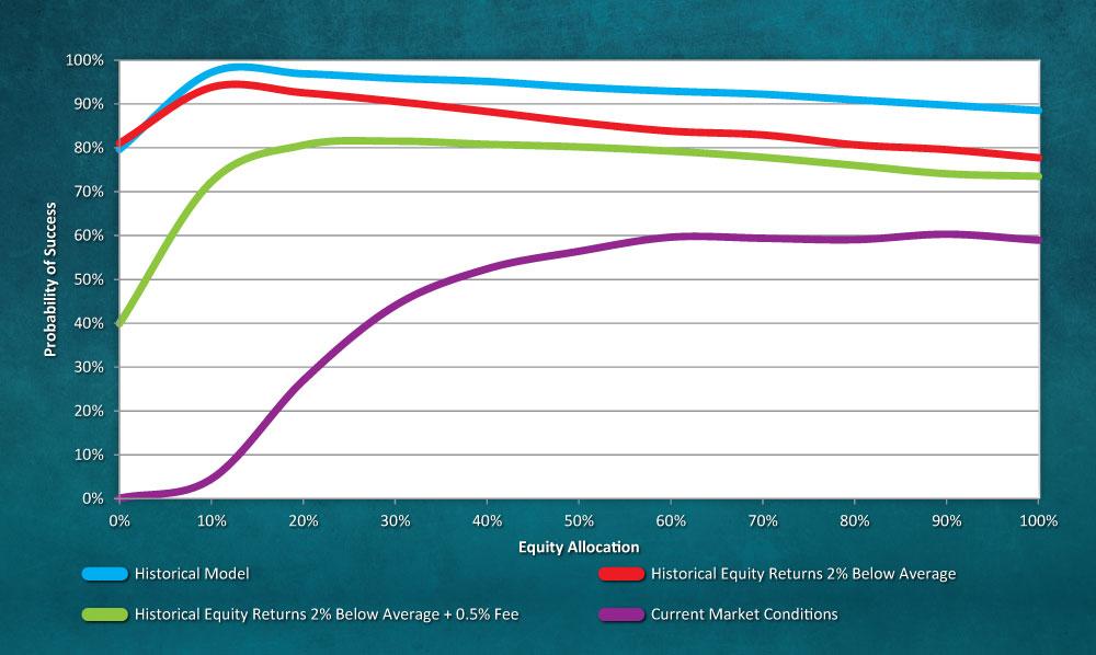
Figure 2 provides some perspective on how key assumptions affect the probability of a portfolio being able to successfully fund a 4% initial withdrawal rate over a 30-year retirement period for varying equity allocations (from 0% to 100% equities in 10% increments). The initial withdrawal amount, which is 4% of the initial balance of the portfolio (e.g., $40,000 from a $1 million portfolio), is assumed to increase annually by inflation. The results in Figure 2 are based on a 10,000-scenario (Monte Carlo) simulation.
I made three key adjustments to the historical returns model represented by the top blue line in Figure 2: First, I reduced the rate of return for equities by 2% to better reflect the average historical return in equities internationally. Second, I included a 50-basis-point fee for the portfolio. Third, I assumed an environment similar to today, where the initial yield on bonds is 2.5% and the CAPE ratio is 27 (slightly higher than the current CAPE ratio, which is approximately 25).
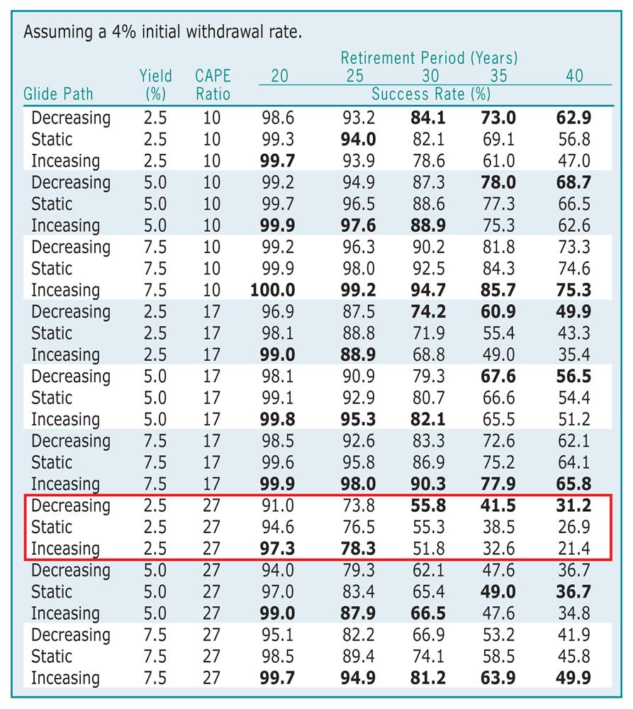
For the analysis, I considered three primary glide paths: decreasing, constant and increasing. The decreasing glide path had an initial equity allocation of 60% that decreased by one percentage point each year during retirement (i.e., the equity allocation changed to 59% at the end of the first year in retirement, 58% at the end of the second year, etc.). The static glide path maintained a constant 45% equity allocation throughout retirement. The increasing glide path’s initial equity allocation of 30% increased one percentage point per year in retirement.
The fixed-income portion of the portfolio was assumed to be 75% bonds and 25% T-bills. The results were not sensitive to this assumption and were effectively the same when these weights are reversed (25% bonds and 75% T-bills). I tested three initial CAPE ratios (10, 17 and 27) and three bond yields (2.5%, 5.0% and 7.5%). The initial withdrawal rate was assumed to be 4.0%, and subsequent portfolio withdrawals were assumed to increase annually by inflation (i.e., the 4% rule).
The results in Table 3 demonstrate a few things. The optimal glide path shape changes considerably based on potential length of retirement. The Increasing glide path (allocations to equities increase over time) is generally optimal for the simulations with higher probabilities of success (e.g., the 20-year simulations), but the relative level of optimality changes based on the assumed base assumptions.
The Increasing glide path was optimal for moderate or high initial yields, while the Decreasing glide path (allocations to equities decrease over time) was optimal for the low-yield scenarios. If you focus on both “moderate” scenarios (yield of 5.0% and initial CAPE ratio of 17), the increasing glide path is best (with an 82% success rate for a 30-year retirement period), while the decreasing glide path is worst (79%). The return assumptions really matter. Whether you assume initial bond yields are low or high significantly impacts which glide path is optimal. Finally, the initial yield impacts the results more than the initial CAPE ratio.
One important variable not considered in this analysis, or most analyses assessing the optimal glide path shape, is risk tolerance (or risk preference). A retiree’s risk tolerance tends to decrease with age (i.e., older individuals prefer more conservative portfolios).
It is difficult to incorporate risk tolerance into common retirement income planning models because these models are largely focused on accomplishing a goal. However, if risk preference were directly incorporated into the models, it would likely push the results across all scenarios to show glide paths with decreasing equity allocations being more optimal than their more aggressive alternatives. This would be especially true if taking additional risk can’t be shown to produce more secure outcomes.
While this article by no means settles the retirement glide path debate, I hope it provides some perspective. The results of both of my tests suggest that equity allocations should decrease (or stay constant) during retirement, although the differences among glide paths with similar lifetime risk levels aren’t that different.
The results of the analysis are also heavily dependent on the model assumptions and parameters, such as how long the retiree is going to live as well as the returns during retirement. These, of course, will always be unknowns.
Portfolio Strategies

Portfolio Strategies

Financial Planning

Robert Greving from TN posted over 10 years ago:
Joseph Sochor from NY posted over 10 years ago:
George Pettiford from IL posted over 10 years ago:
Luther Mcfarlane from FL posted over 10 years ago:
Helen from NY posted over 10 years ago:
Tom George from WV posted over 9 years ago:
Luther Mcfarlane from CA posted over 9 years ago:
Betty Hardison from CA posted over 9 years ago:
Daniel Wickenhauser from IL posted over 9 years ago:
Donald Myers from AZ posted over 9 years ago:
Donald Myers from AZ posted over 9 years ago:
Richard Cronenwett from FL posted over 9 years ago:
Gordon Spellman from AZ posted over 9 years ago:
Peter Wright from MA posted over 9 years ago:
Joseph Castagliola from NJ posted over 9 years ago:
You need to log in as a registered AAII user before commenting.
Log InCreate an account