



Investors are always searching for ways to “beat the market,” and while naysayers abound, studies have shown that individuals can indeed produce superior returns in their portfolios. The best part is that it does not take advanced degrees and high-powered computers to do it.
If half the battle in the stock market is recognizing whether a bull or bear market is in place, then the other half is choosing the right sectors and the right stocks. This is the basis for relative strength or relative performance investing. Find the sectors and stocks that are outperforming the market, ride them until they stop outperforming and then find the next leading area. Indeed, relative performance is represented by not one but two letters in William O’Neil’s CAN SLIM stock selection methodology. “L” stands for leader or laggard versus other stocks, and “M” stands for leader or laggard versus the market.
They Keep Going and Going…
It is not difficult to uncover the leaders in the market, but that tells us what has already happened. Fortunately, the stock market has inertia, a term borrowed from physics stating that bodies in motion tend to stay in motion. Leaders tend to keep leading and laggards tend to keep lagging. Charles Kirkpatrick, a certified market technician, has shown that this simple concept, combined with relative earnings growth, beat the market for a period of over 17 years. His research served as the basis for a stock screen highlighted in the November 2009 AAII Journal (“Building Stock Screens Using the Kirkpatrick ‘Relative’ Approach,” by Wayne A. Thorp, CFA).
There are two basic methods of finding the current leaders. The first is to rank the individual performances of all stocks over a specified period of time. Of course, we can weed out undesirable stocks using such criteria as earnings growth, trading volume, market capitalization and price, but the goal is to produce a manageable list of strong candidates for further analysis. The second method, which I will discuss momentarily, is to look for good sectors first.
AAII provides the ability to rank stocks based on price momentum and other criteria in its Stock Investor Pro fundamental screening and research database program, so I won’t spend time describing how to rank stocks here. What is most important is that one ranking list can alert you to any stock that is strong regardless of its sector: Whether a stock is in healthcare, mining or technology, a ranking does not discriminate.
Bottom Up Versus Top Down
I want to step back from stock selection for a moment to add some context. You may have heard the term “bottom-up investing.” This is part of the process where you find good stocks, determine whether they cluster in any sector and then apply what you have learned in forming an overall market opinion. Are you finding an above-average number of retail stocks? That tells you a bit about the overall market health. How about gold stocks? Perhaps that is a precursor to inflation, but I don’t mean to stir the pot on one of the more hotly debated arguments of the day.
Of course, there is more to it, but it starts at the individual stock level—at the bottom of the market pyramid, to invoke a visual representation.
Conversely, a “top-down” approach starts with a market opinion and then moves down to the sector and stock levels. While rankings are also appropriate, I find that graphical comparisons using charting software can quickly hone in on the strongest sectors and stocks. They also add a good deal of flexibility in that they are not locked into a fixed look-back period. The user need not determine a precise period in advance and can just let his or her eye assess the appropriate span. One look can quickly determine if one sector is outperforming another over a variable period of time.
In other words, a chart displaying three months of data for Google  (GOOG) versus the Standard & Poor’s 500 index could show the stock lagging the market for many weeks and only recently starting to emerge as a leader. This would not show up on a three-month ranking list, for example, when a stock such as Priceline.com (PCLN) has been beating the market for months on end.
But looking at a chart, your eye would see the change immediately. And the sooner you see it, the more time you have to do further research to back up what the chart indicates. Did the company just report good earnings news or a new product? The market reacts quickly to such events, even if they do not flash across your favorite investing website’s news feed.
The drawback, of course, is that we cannot analyze more than a few stocks at a time. This is why charts are better suited to hone in on winners like bloodhounds, rather than finding “the” next big winner. Using charts to find the next big winner is akin to looking for a needle in a haystack.
It also becomes an issue of style. Are you more comfortable with numbers or pictures? Do you prefer knowing the market’s mood first or do you believe that good stocks will perform no matter what else is happening, extreme events such as war and nuclear meltdown excluded?
What It All Means
Let’s dive a bit more deeply into the graphical representation of relative strength. The formula is a simple ratio of one stock or sector divided by another stock or sector, and the result is plotted on a chart. Standard technical analysis tools can be applied, but the most important indicator is the trendline. When the trend of the relative strength ratio is rising, we know that the first stock or sector is outperforming the other. Conversely, when the trend is falling, the opposite is true.
Figure 1.
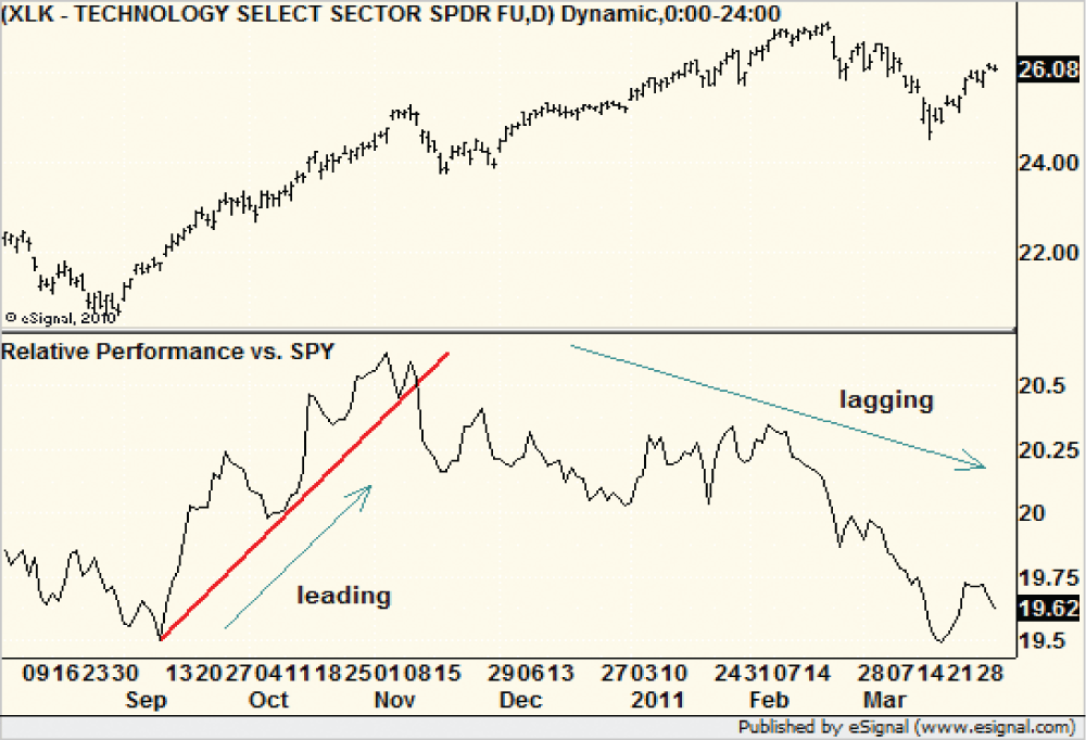
Graphical relative strength analysis starts with determining which sectors are strong relative the market and which are weak. Since there are only a limited number of sectors, such as consumer discretionary and financial, it does not take long to create ratios of each to the S&P 500, or whatever benchmark index you prefer. I like to start with something easy—say, the nine Standard & Poor’s sector exchange-traded funds (ETFs).
For example, a chart of the Technology Select Sector SPDR (XLK) divided by the SPDR S&P 500 (SPY) from August 2010 through March 2011 shows two distinct phases of relative performance (see Figure 1).
From September to early November, the technology sector outperformed the market by 6%. Investors owning the tech ETF beat the market over that period of time.
However, it is clear that the relationship changed in November and technology lagged the market by the same percentage through March. Where did the money flee? Relative strength charts of industrials and energy began to rise at just that time.
Wouldn’t it be worthwhile to know when this sector rotation was happening in its early stages? Of course, the answer is yes.
At the time this chart was produced, the trend for technology performance was still down. Inertia, as mentioned, suggested that technology was still not the place to be.
Figure 2.

One sector that began to outperform when this article was originally written in late March 2011 was gold and silver mining. It is no surprise to anyone with even a remote interest in investing that gold and silver prices have been soaring. In such an environment, mining shares tend to outperform. But don’t take my word for it. Let’s look at the relative strength chart of the Market Vectors Gold Miners ETF (GDX) relative to the SPDR S&P 500 (SPY) (see Figure 2).
In December of 2010, gold was still trading above $1,400 per ounce, yet the relative strength of the gold miners ETF started to fall. It moved below the short-term rising trendline that had guided it higher for most of the year and it signaled that investors were moving money out of gold stocks. But in January 2011, even though gold itself had not yet found a bottom, the relative strength of gold stocks began to climb. Investors were back.
Sure enough, gold turned higher and gold stocks started to climb. We cannot say that investors cleaned up on gold stocks, but those who went back into the metal rode it to a fresh new high. However, even though the absolute gains were muted for the stocks, they still beat the market for the first quarter of 2011 and continued their outperformance into early April. Relative strength for the Market Vectors Gold Miners ETF broke down on May 2, 2011. This was an early warning for investors, as the ETF declined in price the following day.
Step by Step
I recommend that investors form a major market opinion first. Is it a long-term bull market or bear market? Bear markets should not deter investment, but being aware of them is important in order to determine how aggressive you should in order be and how much leeway you should allow for stocks with less than ideal characteristics. Bull markets can hide the flaws of many stocks, but bear markets are merciless.
Next, look at major sector indexes or ETFs versus the S&P 500; you can easily get by with just a dozen or so comparisons. Further, if you set the securities and indexes up and save them in your favorite software package, you will be able to quickly page through the figures once a month to see if anything has changed.
If you are curious to learn more, compare the Russell 2000 to the S&P 500 as well to get a feel for which market capitalization group is leading. Knowing that small-cap technology is leading and big-cap consumer staples are lagging, for example, can quickly point you to the strongest corners of the market.
Finally, when you have found the one or two leading sectors, drill down into their respective industry groups. Most have dedicated indexes, if not ETFs, to make this relatively easy—semiconductors and software in the technology sector, for example, or pharmaceuticals in the healthcare sector, or retail in the consumer discretionary sector.
Many investors will find this level to be deep enough, as they prefer to use ETFs in their strategies. Others will want to drill down to the company level to find the best hotel company in the travel and leisure industry, or to find the best railroad firm in the transportation sector.
Once you have found your candidates, and they have passed all the fundamental and technical screens you wish to use, save their relative strength charts so you can look at them weekly or even daily to know when it is time hold or time to move on.

Related

AAII Stock Ideas
Building Stock Screens Using the Kirkpatrick "Relative" Approach
Discussion
FREE REPORT

Get your free copy of our special
report analyzing the tech stocks
most likely to outperform the
market.
Bruce from CO posted over 15 years ago:
Charles Rotblut from IL posted over 15 years ago:
Walter from TX posted over 15 years ago:
David from PA posted over 15 years ago:
James from OH posted over 15 years ago:
Russell from MO posted over 14 years ago:
Gil from LA posted over 14 years ago:
Richard l. Huitema from IL posted over 14 years ago:
You need to log in as a registered AAII user before commenting.
Log InCreate an account