

Related

Technical Analysis
Point & figure charts offer a unique perspective on price activity, leading to more apparent trendlines, support and resistance levels and chart formations.
by Wayne A. Thorp | April 2019

Wayne Thorp leads a class in AAII's new Essential Investing Video Course. Go to https://www.aaii.com/ves for more information and to subscribe.
In the November 2018 AAII Journal, I introduced point & figure (P&F) charts, my favorite chart type. While open-high-low-close bar charts and candlestick charts may be more widely recognized among chart users, the unique nature of point & figure charts makes them very useful. Point & figure charts are one-dimensional, meaning they do not take into account time or volume. Instead, they only measure price movement, more specifically, “meaningful” price movements. By comparison, traditional bar and candlestick charts are two- or even three-dimensional, measuring the passage of time and, possibly, volume. The lack of time constraint gives point & figure charts an advantage of being able to reveal the nature of price movements over an extended period.
Those familiar with technical analysis know that some of its most common tools are technical indicators. Indicators are mathematical manipulations of price and/or volume data that identify whether a security or the market is potentially overbought or oversold or what the future path of prices may be. However, the linear nature of point & figure charts does not lend itself to many technical indicators, which rely on the passage of time, and perhaps volume, along with prices.
With this article, I am taking a step forward to discuss how you can use point & figure charts. Specifically, using point & figure charts to identify formations—distinguishable patterns that occur regularly in a chart. Some of the formations I cover include:
 Trend analysis is perhaps the most important concept in technical analysis and is simply the general direction in which a security or the market is moving. In its simplest form, a trendline is a straight line that connects lower lows or higher highs to show the general trend direction. Trendlines are useful because they allow you to determine those price levels where buyers are willing to support a security, as well as those price levels where sellers prevent the price from rising further.
Trendlines are used to filter out the the noise and show us where the price is headed, as well as identify areas of support and resistance, which we will discuss more in depth shortly. With point & figure charts, drawing trendlines is easier than with other chart types because most of the subjectivity is eliminated.
There are four different types of trendlines common with point & figure charts:
The bullish support line is used to identify an uptrend in prices and to alert you to possible reversals in an uptrend.
At a minimum, you need to have a column of O’s to begin drawing a bullish support line. Ideally, you will have successive columns where the highest X in one column is higher than the highest O of the preceding column, and the lowest X of one column is higher than the lowest O of the preceding column. A succession of higher highs and higher lows is the classic definition of an uptrend.
The bullish support line starts in the box below the lowest O and is extended right at a 45-degree angle. This trendline does not connect points. It is a line drawn from the lowest point made after the completion of a significant downward move. The bullish support line intersects successive ascending corners of the boxes on the point & figure chart. The bullish support line is a predictive line because it can be drawn immediately when an uptrend begins instead of waiting to connect successive higher lows.
The bullish support line rarely changes. As long as prices remain above the bullish support line, the bullish uptrend is intact. If prices penetrate this line to the downside, this signals an end of the current uptrend.
As a rule, you shouldn’t buy or go long on securities that are trading below their bullish support line.
The bullish resistance line is drawn in the same manner as the bullish support line. It is considered bullish because it is upward sloping, indicating an upward trend, and it is a resistance line because prices tend to reverse, at least temporarily, when they approach this line.
The bearish resistance line is the reciprocal of the bullish support line and is used to identify a downtrend in prices and possible reversals in a downtrend.
At a minimum, you need to have a column of X’s to begin drawing a bearish resistance line. Ideally, you will have successive columns where the highest O in one column is lower than the highest X of the preceding column, and the lowest O of one column is lower than the lowest X of the preceding column. A procession of lower highs and lower lows is the classic definition of a downtrend.
The bearish resistance line starts in the box above the highest X and is extended right at a downward 135-degree angle.
As long as prices remain below the bearish resistance line, the bearish downtrend is intact. If prices penetrate the bearish resistance line to the upside, this signals an end of the current downtrend.
The bearish support line is the converse of the bearish resistance line. This line provides an indication of where the downward trend may meet with temporary support.
Figure 1 illustrates support and resistance levels on a sample point & figure chart.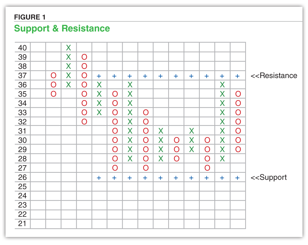
Support is the price level at which demand for a security is believed to be strong enough to prevent the price from falling any further.
Support levels are easy to spot with point & figure charts. Specifically, a series of O-columns with equal lows indicate a clear support level.
The more times that prices fall to test a support level and then rebound off it, the stronger that support level becomes.
Price movements below support levels, especially ones that have withstood multiple tests and are accompanied by a spike in trading volume, are significant.
Resistance is the price level at which supply (selling) for a security is thought to be strong enough to prevent the price from moving any higher.
A series of X-columns with equal highs indicates a clear resistance level.
The more times that prices rise to test a resistance level and then bounce off it, the stronger that resistance level becomes.
Price movements above resistance levels, especially ones that have withstood multiple tests and take place on above-average trading volume, are significant.
One of the main objectives of chart analysis and technical analysis is to identify trends and patterns in price and/or volume that may be used to predict future price movements and the potential magnitude of those movements.
Chart formations are distinguishable patterns that occur regularly in a chart. Some of the more commonly occurring chart formations are:
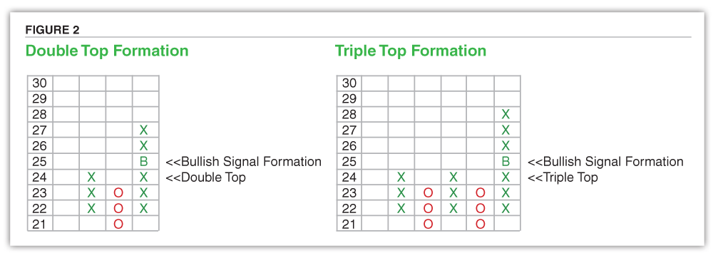
The double top formation is a basic chart pattern in a bull market, while the triple top formation is a less-frequently occurring sibling. Figure 2 shows an example of each.
The double top formation consists of two X-columns separated by one O-column. It is worth pointing out that it is impossible to have a chart formation consisting of less than three columns. The two X-columns top out at the same level, thus creating the double top and indicating resistance at that point.
The triple top formation consists of three X-columns, each of which has the highest X at the same level, and two O-columns. The more time a price tests a resistance level, the more meaningful it becomes.
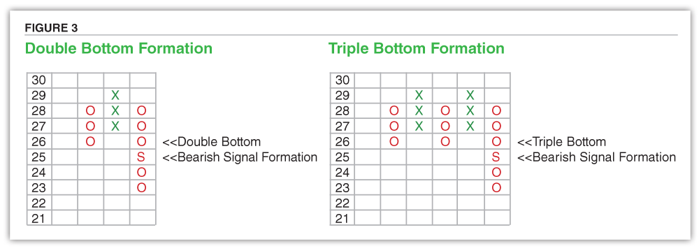
Like the double top formation, the double bottom is one of the more common formations you find on charts. The triple bottom formation occurs less frequently but carries greater weight as a pattern, similar to the triple top formation. Both generally occur in a bear or downward-moving market. Double and triple bottoms are merely double, or triple tops turned upside down. Figure 3 shows examples.
The double bottom formation consists of three vertical columns—two O-columns separated by an X-column. The triple bottom formation is made up of five columns—three O-columns and two X-columns. For both bottom formations, the lowest O in each O-column is at the same level, forming a support level. Each time the price falls to the same level and rebounds, the more meaningful the support level becomes.
In the case of both the double top and triple top, a breakout occurs when the price moves above the resistance level formed by the highest X of the previous X-column. This is considered a bullish breakout formation and is shown in Figure 4.
Other times, after testing the resistance level multiple times, demand dries up and the price moves strongly away, forming a long O-column. This is usually indicative of a market top.
If and when the price falls below the lowest O established by a double or triple bottom, this is a bearish breakout formation, also shown in Figure 4.
There are also times that, after testing a low O multiple times, the price will ignite, leading to a long X-column. This is often a signal of a market bottom.
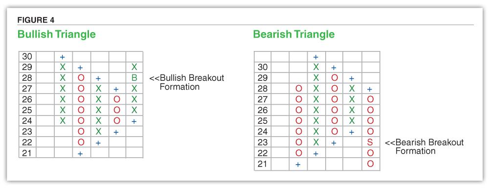
Bullish and bearish symmetrical triangle formations are variations on the bullish and bearish signal formations.
In both instances, there need to be at least five vertical columns, two each of X-columns and O-columns and then a final X-column for a bullish symmetrical triangle formation and an O-column for the bearish.
For both the bullish and bearish symmetrical triangle formations, there is a pattern of higher bottoms and lower tops. The bullish breakout occurs when the latest X-column rises above the highest O of the previous O-column, whereas the bearish breakout takes place when the latest O-column falls below the lowest X of the previous X-column.
The bearish symmetrical triangle formation consists of a series of lower bottoms and higher tops. The bullish breakout occurs when the latest X-column rises above the highest O of the previous O-column.
Point & figure charts are some of my favorite technical analysis tools because of the unique perspective they provide when I’m viewing price activity. When it comes to using point & figure charts, the focus on “meaningful” price movements leads to more apparent trendlines, support and resistance levels and chart formations. These analysis methods allow you to filter out the market noise that often generates false information regarding trend reversals, as well as gauge entry and exit points.
Technical Analysis

Technical Analysis

Trading Strategies

Charlie from California posted over 6 years ago:
You need to log in as a registered AAII user before commenting.
Log InCreate an account