The S&P 500 at 5,000: Don't Be Fooled by Point Hype

There is an obvious difference between point moves and percentage changes.

Charles Rotblut leads a class in AAII's new Essential Investing Video Course. Go to https://www.aaii.com/ves for more information and to subscribe.

The S&P 500 index closed above the 5,000 mark for the first time in February 2024. It took the large-cap index almost three years (34 months) to rise 1,000 points from its prior milestone of 4,000.

There is an obvious difference between point moves and percentage changes. The 1,000-point milestones attract headlines. They are also psychologically notable, as each new one feels high. While the point difference between each thousand milestone stays steady, the percentage change continues to shrink. Breaking the 5,000-point mark only required the S&P 500 to rise by 25% from 4,000. In contrast, the index needed a 50% increase to go from 2,000 to 3,000.

The point and percentage changes are only one part of the story. The other is the length of time it has taken the large-cap index to reach each milestone. This has varied considerably.

The chart below plots the S&P 500’s ascent from 100 to 5,000. The index spent the same number of months rising from 500 to 1,000 (a 100% increase) as it did rising from 4,000 to 5,000. (Given the randomness of market movements, it is surprising that both ascents took the same number of calendar days: 1,046 days.)
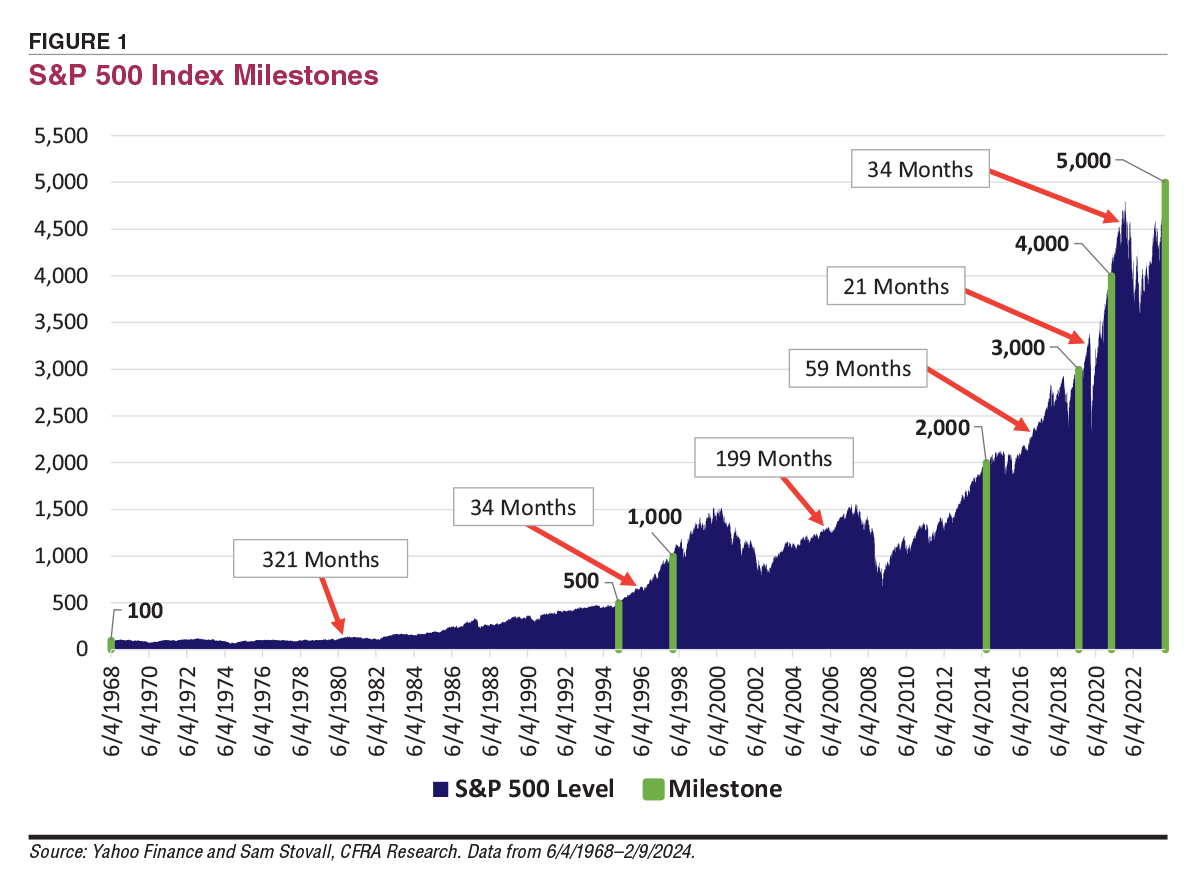
FIGURE 1  S&P 500 Index Milestones

The 100% rise from 1,000 to 2,000 took 199 months. The long period in between these milestones was caused by the so-called lost decade. The S&P 500 fell in value on a price basis between December 31, 1999, and December 31, 2009. The impact of this decline can be seen in our latest analysis of portfolio rebalancing in this issue.

The shortest period between 1,000-point milestones was just 21 months: July 12, 2019, to April 1, 2021. The comparatively small 33% move required to make the ascent helped. Also helping were the strong returns of the large, technology-related stocks that drove the index’s returns.

While 6,000 is just a 20% gain away for the S&P 500, the historical record should serve as a reminder that the stock market does not move in a straight line.

Discussion

JIM L from MI posted over 2 years ago:

ok, but why are you perpetuating the point hype by using a linear scale instead of a log/percentage scale. And even worse, the usual index ignores dividends, which has typically been a significant part of its returns.


WILLIAM G from GA posted over 2 years ago:

As exciting as the graph on page 3 appears, the article correctly points out the “difference between point moves and percentage changes.” Plotting the data on a log scale for comparison would give a more useful picture of the average over time. I plot the value of my own portfolio every six months, and it looks great – until I adjust the values for inflation, then plot it on a log scale. I should also adjust the data for future capital gains taxes in my taxable accounts and for my incremental tax rate for my tax-differed accounts to see how I’m really doing. Then, I don’t look quite so good. I bought my first mutual fund on 4/3/1978 when the Dow was at 751.04 and haven’t touched it and reinvested the dividends. The value over time looks just like the graph in your article. Before I bought the mutual fund, I started a new job with a big increase in salary. My new boss assumed I would buy a Corvette. Instead, I bought a used VW bug and invested the rest in the mutual fund. When I look at the charts like the one in your article, I flatter myself on how smart I was to invest. However, when I adjust my data for inflation, plot it on a log scale, and consider the taxes I have yet to pay on my investments before I can spend them, I sometimes wonder if it may have been better to buy the Corvette.


DAVE G from TX posted over 2 years ago:

Jim & William, both good points as to why a log scale should be used on long-term trend charts. Here is what the S&P500 (VFINX) looks like using a logarithmic scale: https://www.portfoliovisualizer.com/backtest-portfolio?s=y&sl=6nAL1KwyrpFxLBIZCFdeEH


DAVE G from TX posted over 2 years ago:

Also, if you study the long-term logarithmic chart of VFINX as listed above you will see that it does not appear to "grow to the sky" like the typical point chart but climbs in a fairly steady fashion from the lower left to upper right with a compounded growth rate of over 11% for the 39 or so years.


You need to log in as a registered AAII user before commenting.
Create an account

Log In

Get your free copy of our special report analyzing the tech stocks most likely to outperform the market.

Download the FREE Report Here: