
The Relationship Between Stock Market Volatility and Returns

Less volatility isn’t always a good thing, especially when considering the returns that follow periods of high volatility.

Investment markets always experience some degree of volatility. The important issue is developing a sense of what represents high and low volatility. With an accurate historical understanding of “normal” volatility, we will likely be more emotionally durable as investors and far less likely to react poorly when markets seem crazy.

For this analysis, we’ll be focusing on the volatility of monthly returns of the S&P 500 index over the past 53 1/2 years (from January 1, 1970, through June 30, 2023) as shown in Figure 1. Since 1970, the annualized volatility of the S&P 500 (i.e., the standard deviation of 12 monthly returns multiplied by the square root of 12) has been as low as 5% and as high as 30%. The average has been roughly 14.3% over the 631 rolling 12-month periods.

FIGURE 1 Historical Market Volatility Market volatility is illustrated by the rolling 12-month standard deviation of S&P 500 monthly returns over the period of January 1970 through June 2023.

Unlike returns, standard deviation cannot ever be negative. As a result, the lower boundary of volatility is always a positive number. Returns, of course, can be significantly negative over rolling 12-month periods.

Past Periods of Very High Stock Market Volatility

Three periods of very high volatility are highlighted in Figure 1 and Table 1. The first particularly volatile 12-month period was from July 1, 1974, through June 30, 1975. During this period, the standard deviation of monthly returns for the S&P 500 was 29.93%.

TABLE 1 Past Periods of High Market Volatility

The second period was from January to December 1987. The standard deviation of monthly returns was 30.60% during this period. The third period was September 2008 to August 2009. It experienced volatility of 30.42% as measured by the standard deviation of monthly returns.

Periods of high annual volatility have a common characteristic: a combination of large positive and large negative monthly returns within a 12-month time frame. Wide swings in monthly returns are the natural cause of high volatility. Such swings do not necessarily produce negative 12-month returns. There is, however, a tendency for rolling 12-month returns to head into negative territory as volatility begins to increase.

Take a look at Figure 2. As the purple line begins to move upward, the downward-pointing red bars—which represent negative 12-month rolling returns—begin to appear. Positive rolling 12-month returns show up as upward-pointing green bars.

FIGURE 2 Market Volatility and 12-Month Market Returns Positive rolling 12-month returns for the S&P 500 are represented by the green bars, while negative returns are shown in red.

In fact, over this period of 531/2 years, the correlation between rolling 12-month returns and rolling 12-month standard deviation was –0.29. In other words, there is a modest negative correlation indicating an inverse relationship between the two. Put more simply, as volatility rose, the other variable—meaning return—often went down.

How Stock Market Volatility and Returns Have Interacted

The story of how volatility and returns have interacted is best told by talking you through Figures 3, 4 and 5.

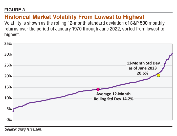
Figure 3 shows all 619 rolling 12-month standard deviations for the S&P 500 from January 1, 1970, through June 30, 2022. The reason the period ends in 2022 and not 2023 (as in Figures 1 and 2) will be explained in the “Stock Market Performance Following Periods of High Volatility” section.

FIGURE 3 Historical Market Volatility From Lowest to Highest Volatility is shown as the rolling 12-month standard deviation of S&P 500 monthly returns over the period of January 1970 through June 2022, sorted from lowest to highest.

The purple “line” in Figure 3 is actually made up of 619 dots. Each individual dot represents a 12-month standard deviation arranged from low to high regardless of when they occurred. In other words, the dots representing 12-month standard deviations are not chronologically arranged. There are so many dots that they appear to be a line.

The pink-colored dot near the middle of the graph represents the average 12-month standard deviation of 14.2%. The yellow dot near the right side of the graph is the 12-month standard deviation of monthly returns from July 1, 2022, through June 30, 2023. This period had the most recent 12-month standard deviation as I was preparing this article. A current standard deviation of 20.6% indicates that recent volatility in the S&P 500 has been higher than average, but not all that close to the high-water mark of around 30%.

Rising Volatility’s Impact on the Market’s Returns

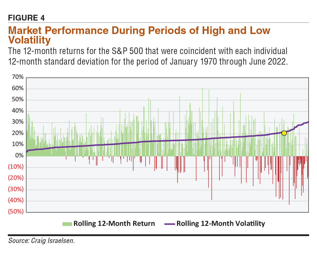
Now consider Figure 4. Here we introduce the 12-month returns that were coincident with each individual 12-month standard deviation. As the purple line of dots heads upward (indicating higher volatility), the frequency and severity of negative 12-month returns of the S&P 500 has increased. These negative returns are shown by downward-pointing red bars.

FIGURE 4 Market Performance During Periods of High and Low Volatility The 12-month returns for the S&P 500 that were coincident with each individual 12-month standard deviation for the period of January 1970 through June 2022.

The green upward-pointing bars indicate positive 12-month returns. As the 12-month standard deviation (i.e., volatility) has increased, historically the 12-month returns have tended to decrease during the same 12-month time frame. The yellow dot indicates the 12-month standard deviation as of June 30, 2023, which was 20.6%.

Stock Market Performance Following Periods of High Volatility

We now turn our attention to Figure 5. As in Figures 3 and 4, the purple line of dots represents 12-month volatility arranged from low to high. In Figure 5, the green upward bars and red downward bars represent the 12-month return over the forward 12-month period associated with each 12-month standard deviation. In other words, if the standard deviation measurement was January 1, 1990, through December 31, 1990, the associated return displayed in Figure 5 (either a green or red bar) is for the 12-month return from January 1, 1991, through December 31, 1991—the “forward” 12-month return. Figure 5 displays the relationship between historical volatility and the returns realized over the subsequent 12 months.

FIGURE 5 Volatility and the Stock Market’s Returns 12 Months Later The relationship between 12-month rolling standard deviation and the S&P 500’s forward 12-month rolling returns starting from January 1970 through June 2022.

The reason the time frames in Figures 3, 4 and 5 end in June 2022 (rather than June 2023) is because Figure 5 involves a forward 12-month return, which forced the last period in Figure 5 to end in June 2022. The forward 12-month return in this case ended in June 2023. As noted previously, June 2023 was the last 12-month return I had access to while preparing this article.

Figure 5 is segmented into quartiles, which are shown by the vertical black lines. The first quartile represents the smallest 25% of rolling 12-month standard deviations (meaning the lowest level of volatility). These are shown by the purple line of dots. The first quartile represents 155 rolling 12-month periods. The average 12-month standard deviation was 7.78%. The average forward 12-month return was 9.59% for this quartile. The frequency of positive 12-month forward returns was 82%.

In the second quartile, the average volatility was 12.01%. The average forward 12-month return was 12.96%. The frequency of positive forward 12-month returns was 80%.

In the third quartile, the average volatility was 15.36%. The average forward return was 10.20%. The frequency of positive forward returns was 75%. The third quartile is when the rolling 12-month volatility ranged between 13.85% and 17.23%. This level of volatility was associated with a forward 12-month return that was only slightly higher than the forward return in the first quartile. It also represented a material decline in forward return compared to the second quartile. Thus, the “danger zone” of volatility for the S&P 500 appears to be when the 12-month standard deviation is between roughly 14% and 17%.

The fourth quartile, which is the right-most section in Figure 5, illustrates the highest 25% of rolling 12-month standard deviations. The average 12-month volatility was 21.38%. The average forward return was 15.06%. The frequency of positive forward 12-month returns was 82%—the same frequency as in the first quartile.

It appears that within 12 months after periods of high volatility, the S&P 500 tends to produce positive returns. Often these are large returns. Another interesting observation in Figure 5 is the yellow dot, which represents the 12-month standard deviation as of June 30, 2023. Since 1970, there has never been a forward 12-month negative return after a 12-month period with a standard deviation of around 20.6%.

Said differently, there are no red bars (negative 12-month returns) to the right of the yellow dot in Figure 5—only green bars. Should the standard deviation of the S&P 500 continue to increase into late 2023, history would suggest that the forward 12-month return would be positive and likely large. Conversely, if standard deviation declines as we progress toward 2024, the likelihood of a negative return in the S&P 500 over the subsequent 12 months actually increases based on what has historically occurred.

Odd, isn’t it? We generally suppose that less volatility is a good thing. Not necessarily, at least when considering the returns that follow periods of high volatility. 

Discussion

Kenneth G from CA posted over 2 years ago:

Interesting article, but how can one know where the market is during a period of high volatility? Beginning, middle, or end? I would like to see the average duration of high volatility along with the standard deviation. Also, what factors are correlated with high volatility?


JOHN L from NJ posted over 2 years ago:

Another data mining based article that found a small negative correlation between volatility and returns. The observation that higher returns follow periods of high volatility isn't helpful for a long term investor. Obviously after all the volatility during the bottoming period of a bear market; returns are higher as high return early bull markets follow bear markets. This whole article is less useful than Warren Buffet's "Be fearful when everyone is greedy and be greedy when everyone is fearful".


BARRY J from TX posted over 2 years ago:

The length of this comment should warn you to skip it. Please forgive me, but I needed some mental activity to take my mind off the potentially apocalyptic events since October 6. Oddly, both sides share the same shibboleth, “Peace” and share a common fatal flaw, generationally ingrained fear of each other. I wrote this as a sorbet for my brain. Back to the article. Every day from 9:30 AM to 4;00 PM EST hundreds of millions of stocks are bought and sold instantaneously. If we aggregate these millions of mini-micro dots, they begin to look like a pattern, with hills and valleys, and as Mr. Israelsen does in his graphs, these dots can be ‘smoothed” out into lines using standard statistical techniques which our brains are conditioned to interpret in the context of an article as data or information. That’s the curse of backtesting. It can "prove" anything you want to if you torture the data long enough so you can present it in some form so our “lying eyes” can tell our brain to convert it into the first coherent story you want to believe. As a small boy, I was taught this small blessing, Always consider the source of what you think you know what you know. This is what my brain tells me I think I know I know. Different people see stock prices differently for many reasons. Prices move up or down for these real-world and “mysterious” reasons. Over time, some prophets/demagogues have stepped forward and claimed they know what the factors that move markets are. For example, in 1901, Charles Dow, of Dow Jones and WSJ fame, said it was “wave” patterns. In 1934, Ben Graham said it was accounting patterns he called “value.” In 1952, Harry Markowitz said it was “variation” patterns, and, contemporaneously, Paul Samuelson discovered that a Frenchman named Bachelier had described variation as “random” motion back in 1900. In 1963, Benoit Mandelbrot argued that daily price changes might be better explained and predicted using the math of power laws rather than Markowitz’s normal distributions because the statistics of normal distributions is not the appropriate tool for analyzing “fractal” events. In 1968, this became the Holy Grail of the institutional investor industry. Mr. Israelsen takes up this “un-Holy” Quest using data oddly enough beginning just two years after this event. We can characterize the modern era from 1970 as an “evangelistic” period where many new ersatz John The Baptist’ arose from the financial desert. Mr. Israelsen is an acolyte tending the alter in this long procession of academic wonderment about what “periodic” rhythms of price movements portend that can be statistically reduced into a possibly predictive ”formula” … and acted upon for profit by “unsuspicious” brains. In 2023, 53.5 years (or 619 months) later, in this article, Mr. Israelsen tells us the “Big IT” you may want to bet on is the degree of variation in variation SPX SD trends, kind of a second derivative variation of the SD of the variation of the SD argument. Mr. Israelsen’s conceit relies on chopping up a 53.5 year stream of trillions upon trillions of instantaneous data into 619 rolling 12-month chunks with the adroitness of a master Benihana sushi chef and runs these arbitrary chunked servings through a high-end Cuisinart statistical blender to produce homogenized smooth “standardized” frequency distributions that are pleasing to our lazy brains. The best metaphor for understanding what this process of torturing the data through all these mathematical gymnastics produces as “evidence” is the lesson from the denouement of “Raiders of the Lost Ark.” After reviewing all the “waves,” “random variations,” and “rolling 12-month periods,” the best personal lesson I derived is to remember that every time I buy or sell a stock, there is a counterparty who does the same, but, for reasons unknown to me, disagrees on what direction future price of this stock will take – for reason they feel is equally prescient and “informed” as mine, be they “fundamentalist” from “value,” “quality,” and “growth” sects) and “technicals” from “waves,” “chartist,” and “momentum” sects. Every time, we BOTH have a 50%/50% chance of being right. This cycle repeats itself millions of times every second, every day from 9:30 AM to 4 PM EST, and TRILLIONS of times in every “12-month rolling period.” The only Disciples that get rich are the ones selling “the Dream” of finding Salvation in the market by partaking of the latest Tree of Knowledge that they see as an “elixir” that can make you smarter than the other guy who thinks he is smarter than you are. In “Thinking, Fast and Slow (2011`) Nobelist Daniel Kahneman calls this “WYSIATI” (“what you see is all there is”), a term he popularized to describe the cognitive process that our brains are wired to believe that the information we have is all the relevant information there is. This becomes a problem because we tend to not look for what we don't see (evidence that would “falsify” our convictions). Our mental closets are full of get-rich fast and slow theories. “Taint so, Magee.” We are all welcome to follow the received wisdom of our choosing, but we must always be humble before the sacrificial altar of Mr. Market. This isn’t Kansas anymore, Dorothy. It isn’t Eden either. The denouement of Israelsen’s graphic dot saga is: If the SPX SD continues up in 4Q23, the forward 12-month (2024) SPX returns will likely be positive and likely large. If SPX SD goes down in 4Q23, the likelihood of a negative SPX return INCREASES. That sounds like 6-to-5 and pick ‘em bet on Wild Casino. Our consolation for taking on this 50/50 coin flip is we learned that “less volatility is not necessarily a good thing when considering the returns that follow periods of high volatility.” Less is more. More is less. Nothing confusing about that.


ROBERT A from NC posted over 2 years ago:

Calm down, Barry =). You do make some excellent points (as do Kenneth G and John L), but I like this article because it throws cold water on the flames of the myth that past volatility is a measure of risk. It also confirms what I already know: buying stocks in a bear market is a profitable undertaking. The more severe the bear, the greater the opportunity for profit in the following years.


BARRY J from TX posted over 2 years ago:

Thanks for the counseling, Dr. Robert. For therapy, I think I will go out and pound a 1.68-inch ball through time and space and try to bend it to my will. Based on a model from tracking past performance similar to Israelsen's, I estimate I will be as successful at that task as I am here. I am fairly certain that variations in my swing greatly influence the variations in my scoring outcomes. I actually liked Israelsen's optimistic message. Bilaterally, Israelsen concludes, *** "Should the [monthly] standard deviation of the S&P 500 continue to increase into late 2023, history would suggest that the forward 12-month return [for the SPX index ONLY since other indexes also exhibit variation] would be positive and likely large. Conversely, if standard deviation declines as we progress toward 2024, the likelihood of a negative return in the S&P 500 over the subsequent 12 months actually increases based on what has historically occurred." *** But as you said, it was the logic of his model that was problematic. Israelsen suggests that historical trends measured by the MONTHLY (an arbitrary time period) standard deviations in market INDEX variation (an arbitrary measure) are RELIABLE predictors of future market returns. Thus, it is volatility, not the health of the overall economy, nor the soundness of exchange-listed company business models, that we should look to predict market performance. Notice that Israelsen did NOT graph how daily periods of volatility foretell tomorrow's market performance, nor how the machinations of the Cboe VIX Volatility Index (VPCR), the Open Interest Participation, Open Interest Put/Call Ratios (OIPCR), Cboe Volume Put/Call Ratios (VPCR), or any of the many other measures of volatility the market generates daily, weekly, or annually. Thus, by process of elimination, it appears that the predictive powers of monthly volatility are based solely on some metaphysical covariance with the gravitational forces of a monthly lunar-based calendar cycle that make monthly variations movements the force that moves market index performance. This model is eerily similar to the tenets of Charles Dow's 1901 Wave Theory. I concede to Israelsen that his argument parallels Galileo Galilei’s argument to the Holy See when he defended his “heretical” theory that the Sun, not the Earth, is the center of the universe in 1633, "E pur si muove" ("And yet it moves.").


KENNETH R from WA posted over 2 years ago:

May I please have the contract to sell Barry printer ink and paper? :) Backward looking analysis to this degree is of limited use for an individual investor. While I appreciate the data salad for discussion, I’m not seeing actionable findings that might add enhanced utility to personal investment management. Impressive academic paper though.


You need to log in as a registered AAII user before commenting.
Create an account

Log In

Get your free copy of our special report analyzing the tech stocks most likely to outperform the market.

Download the FREE Report Here: