


I suspect most of us measure the performance of our investment portfolio too often. Doing so is sort of like pulling up the flower to see how the roots are doing. Or waking up a person to ask how well they were sleeping. You get the idea. We know that investing, by its very nature, is a long-term (multi-year) proposal. Think slow cooker, not microwave.
With this slow cooker versus microwave contrast in mind, the analysis in this article reviews the rolling 10-year performance of four key individual asset classes (large-cap U.S. stocks, small-cap U.S. stocks, U.S. bonds and U.S. cash) as well as three multi-asset portfolios comprising these four asset classes. Ten years is not a magic length of time. Rather, it represents a time frame that is sufficiently long enough to get a sense of performance rather than noise.
The performance of large-cap U.S. stocks is represented by the S&P 500 index, whereas the performance of small-cap U.S. stocks is represented by the Ibbotson Small Company Stock index from 1926–1978 and the Russell 2000 index from 1979–2022. U.S. bond returns are represented by Ibbotson U.S. intermediate government bonds from 1926–1975 and the Bloomberg Aggregate Bond index from 1976–2022. Cash is represented by the annual returns of the three-month U.S. Treasury bill from 1926–2022.
Figure 1 shows the rolling 10-year returns of the three multi-asset portfolios. There is a 40% equity/60% fixed-income model, a 60% equity/40% fixed-income model and an 80% equity/20% fixed-income model. The 40%/60% model specifically comprises 25% large stocks, 15% small stocks, 45% bonds and 15% cash. The 60%/40% model is 40% large stocks, 20% small stocks, 30% bonds and 10% cash. The 80%/20% model is 50% large stocks, 30% small stocks, 15% bonds and 5% cash. These portfolio models maintained the assigned allocations to each asset class by annual rebalancing.
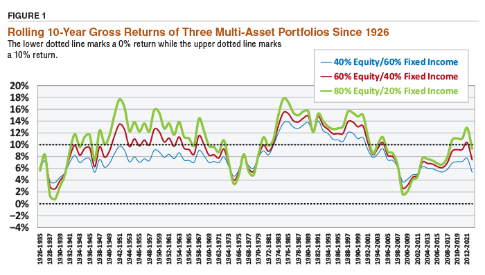
The performance of each portfolio was calculated over rolling 10-year periods starting in 1926. The first 10-year return was from 1926–1935. In that particular 10-year period, the three portfolios had very similar 10-year returns of roughly 6%. The next 10-year period was 1927–1936, and so on. The horizontal axis legend only shows the dates of every other 10-year period but be advised there are no data gaps in the rolling 10-year periods. The dotted horizontal lines denote a 0% return and a 10% return—which serve as visual “guardrails” of performance.
You will notice that the performance of the three portfolios tends to follow the same general performance “contour.” Sometimes the performance of the three portfolios was similar, and at other times quite different. For example, from 1934–1943, the 40%/60% portfolio had a 10-year return of 6.96%, the 60%/40% was at 8.22% and the 80%/20% was at 9.61%. Later, during the 10-year span from 1942–1951, the 80%/20% model (green line) had a 10-year average annualized return of 17.70%, the 60%/40% model was at 13.48% and the 40%/60% model returned 9.75%. Over the course of the 88 rolling 10-year returns (from 1926–2022), the performance of the three portfolios could be similar, widely different and then similar again. Nevertheless, the performance of the three portfolios tended to “hug” each other through time, but at different levels on the vertical axis (meaning different levels of return).
Interestingly, there was no 10-year period in which any of the portfolios produced a negative 10-year annualized return—though the 80%/20% portfolio got close to zero during the 1929–1938 period. The returns shown in Figure 1 are gross returns that have not been adjusted for inflation. The 80%/20% portfolio tended to have the highest returns—except for periods in which there were equity market meltdowns—a recent example being the 10-year period from 1999–2008.
Analyzing Portfolio and Individual Asset Class Performance
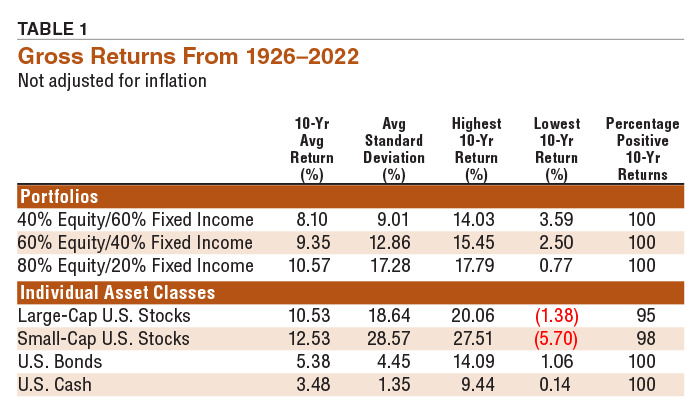
Table 1 summarizes performance measurements for each portfolio and each individual asset class. Investors who are patient for at least 10 years and are diversified across several asset classes have always experienced a positive return over the past nearly 100 years. If investing in individual asset classes, the likelihood of experiencing a positive return of 10-year periods is encouragingly high, but not 100% if invested in large-cap U.S. stocks or small-cap U.S. stocks. For bonds and cash, the 10-year gross returns (not inflation-adjusted) were always above zero.
If we adjust performance by inflation (based on the consumer price index, or CPI), we are measuring what is referred to as a “real” return. This is a gross return that has been adjusted downward by inflation. (Or, if there was a deflationary period, the gross return would be adjusted upward since the inflation rate would be negative). Those results for each portfolio and each individual asset class are summarized in Table 2. The three portfolios fare well, producing positive 10-year real returns 95% of the time for the 40%/60% and 60%/40% models, and 93% of the time for the 80%/20% portfolio.
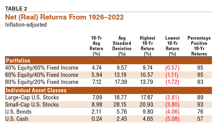
The individual asset classes did not do as well when measured in “real” terms. Large-cap stocks produced a positive 10-year return 89% of the time, small-cap stocks 93% of the time, bonds 76% of the time and cash only 57% of the time. We clearly see that diversification offers a natural defense against inflation.
Shown in Figure 2 are the rolling 10-year gross returns for large-cap U.S. stocks and small-cap U.S. stocks since 1926. The patterns are very erratic, indicating a high degree of volatility in performance—even over rolling 10-year periods. However, both large and small stocks rarely produced a negative 10-year gross return. So, if you can stomach the ride, they both deliver positive performance over 10-year holding periods—though at times rather close to zero.
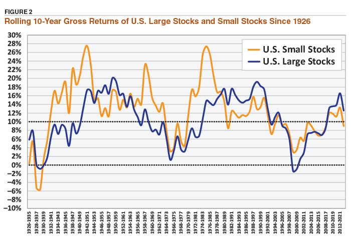
Figure 3 shows the rolling 10-year returns for U.S. bonds and U.S. cash. Here we see a very different picture. The purple line depicts the 10-year rolling returns of cash—which is essentially a graph depicting the rolling 10-year federal discount rate. The green line is bonds. It generally follows the curvature of cash from the 1940s to the 1980s. Interest rates peaked in 1981 and began a long descent starting in 1982. This descent pushed the return of bonds well above cash beginning in the early 1990s (as measured by 10-year returns). In the most recent 10-year period in Figure 3 (2013–2022), the returns of bonds and cash have come together—for the first time in several decades.
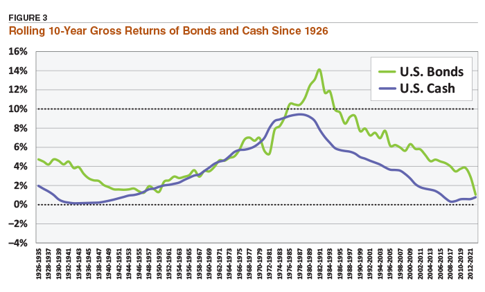
Should interest rates rise in the years ahead, cash could become an increasingly valuable component in a diversified portfolio. Bonds, on the other hand, will not likely produce the returns that many fixed-income investors have come to expect over the past 20 to 25 years. The poor performance of bond funds in 2022 may have provided a glimpse of the challenges that lie ahead.
This is not a call to abandon bonds; rather, it’s a reminder to consider well-diversified fixed-income exposure that includes cash, U.S. bonds, foreign bonds and Treasury inflation-protected securities (TIPS). The performance of stocks will fluctuate widely—that’s just what stocks do. Fixed income is more cyclical, as clearly shown in Figure 3. As we diversify both the equity portion and the fixed-income portion of our portfolios, we stand the best chance of achieving our investment goals over reasonable periods of time—such as 10 years.

Related

Portfolio Strategies
Meaningful Diversification Can Lead to Higher Returns
Related

Portfolio Strategies
Asset Returns During High and Low Inflationary Periods
Discussion
FREE REPORT

Get your free copy of our special
report analyzing the tech stocks
most likely to outperform the
market.
ROBERT A from NC posted over 3 years ago:
You need to log in as a registered AAII user before commenting.
Log InCreate an account