


Related

AAII Sentiment Investing
Build custom stock charts on AAII.com to determine whether the trend is your friend.
by Sam Levine | March 2026

In prehistoric times—pre-internet, anyway—many professional stock and market analysts spent hours each day putting rulers and pencils to expensive stock chart books, hoping to find tradable stock trends or price patterns. You may have heard of some of the more common ones, such as 200-day moving averages, candlestick chart patterns, pivot points and moving average convergence divergence (MACD).
Investors used to categorize themselves as either fundamental-driven or chart-driven, partly because it was too demanding to study both. As computers became ever more ubiquitous, investors and analysts began to practice what was once popularly known as “fusion analysis,” which combines both fundamental analysis and chart indicators. Now, we don’t even need to categorize ourselves as chartists, fundamentalists or fusion analysts. Tools are readily available and easy to use, especially on AAII’s Stock Evaluator page.
To access the Stock Evaluator page for a stock that interests you, first type its name or ticker symbol into the search bar located at the top of most pages on AAII.com. You can also access the Evaluator by clicking a stock’s ticker symbol in the lists at AAII Stock Screens, My Portfolio and other AAII webpages. For this example, we use General Motors Co.  (GM). Once on the Stock Evaluator page, select the Charts tab to pull up a chart. The charting feature is available to all AAII members.
Among the Evaluator’s chart options is the ability to select how much time you want your chart to cover and how often the chart should plot the stock’s price (Figure 1). Chartists usually prefer to look at the long-term trend first and then work their way to the short-term trend, as they prefer to trade with the prevailing trend rather than against it. For General Motors, we start with a five-year chart, with prices plotted daily.
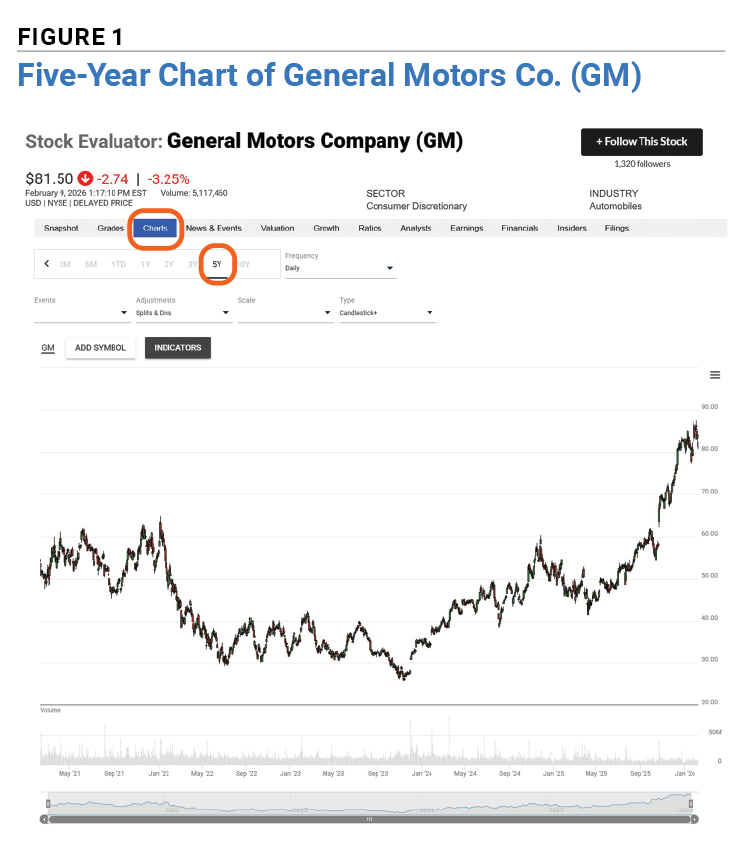
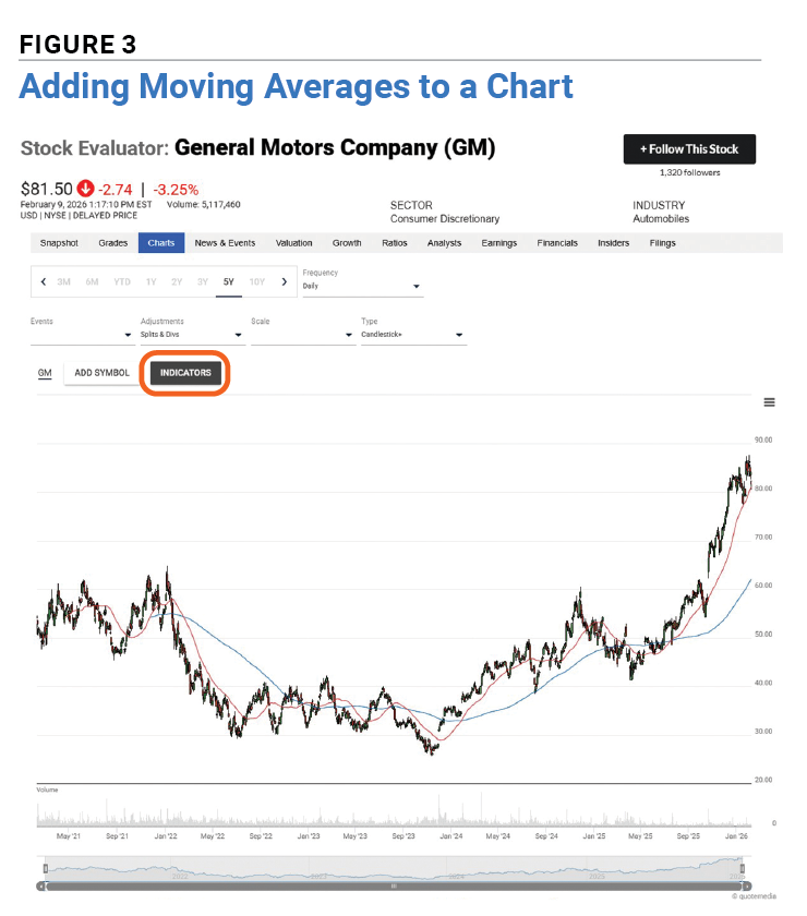
At first glance, it’s obvious that General Motors’ stock price has been trending up. But we can also add indicators to our chart to show whether that trend is strengthening or weakening. Adding two moving averages—the 200-day moving average and the 50-day moving average—will answer that question. If the shorter moving average is higher than the longer one, the trend has been strengthening. If the shorter average is below the longer one, the trend might be weakening.
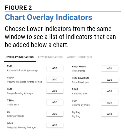
Figure 2 shows the indicators that can be overlaid on a stock chart. Adding one or more of these indicators is a snap. Click on the black Indicators button above the chart, and a menu will appear. The abbreviation for a simple moving average is SMA. Click Add, enter 200 for the period and choose a color for the line. Click Add Indicator and you’ll see a 200-day moving average line. Now repeat the same process to add a 50-day moving average line. When you are done, you should see a chart that looks like Figure 3. Hover over any spot on the chart to see the values for each moving average at that point, along with the open, high, low and close prices.
Most chartists would be impressed by how the 50-day moving average is accelerating upward faster than the longer 200-day moving average, but keep in mind that there’s a reason why chart indicators are called signals instead of guarantees.
Once you’ve decided to buy or sell, trend charts can help with timing or confirm that the market agrees with your buy or sell thesis.
You can add indicators below the chart, too, such as relative strength index (RSI) and MACD. If you’re evaluating whether a trend might be weakening, consider using the rate of change (ROC) indicator, which compares each price to an older price and scales it to 100. A reading of zero means the price momentum is flat. A negative number means the trend is weakening. When adding this indicator, you can enter a different period than you entered for the moving averages. Each indicator you use can have its own settings.
Quarterly earnings reports, stock splits and dividends can lead to some dramatic stock moves. That makes it a good idea to add this activity to your charts. Click on the Events drop-down menu located right below the chart’s date range setting toward the top-left of the page. You can add any or all three of the events to your chart. They show up on the chart as circles with the abbreviations E, S and D inside. Hover over any circle to bring up details of the event. For earnings releases, it shows the actual earnings per share, consensus estimate and surprise percentage. For dividends, it shows the payment amount per share and payable date. For stock splits, it shows the split ratio.
Did you overload your chart with too many indicators? We’ve all done that! Thankfully, it’s easy to remove indicators by clicking the Indicators button, selecting the Active Indicators tab at the top-right of the menu and deleting the ones you no longer want. Alternatively, you can opt to start over fresh.
If you want to save your chart, you can print or download a PDF of it by selecting the three bars at the upper-right side of the chart.
It’s often useful to compare the price action of a stock against another stock, or even an exchange-traded fund (ETF). For example, you might want to see if one stock reacted more to a tariff announcement than another stock or the broader market, enabling you to choose the stock with the highest momentum.
After setting up a chart for one stock, select the Add Symbol button and type in the name or ticker symbol of the stock or index ETF you want to compare against the original stock. You can add more than one security to the chart.
It’s a good idea to scale the chart for percentage change instead of simply price because percentage change makes it easier to compare securities with very different prices. It’s more common for a $100 per share stock to move by $2 per share than it is for a $10 per share stock to move by $2 per share. If you are considering investing the same amount of money in one of the two stocks, then the percentage change is the most relevant measure. The Scale drop-down menu allows you to scale the chart on price, dollar change or percentage change.
The saying “A picture is worth a thousand words” is just as true for investing as it is elsewhere. Charts instantly tell stories, but just like using ChatGPT without checking sources, it’s risky to only rely on charts. That’s why AAII offers many different tools to help you develop and implement an investing philosophy aligned with your needs.
AAII Sentiment Investing

AAII How-To

Technical Analysis

JOHN L from NJ posted 7 months ago:
BARRY J from TX posted 7 months ago:
You need to log in as a registered AAII user before commenting.
Log InCreate an account