

Related

AAII Sentiment Investing
The oscillator exposes whether market strength reflects broad-based buying or narrow leadership, a distinction that often determines whether rallies continue or reverse.

Wayne Thorp leads a class in AAII's new Essential Investing Video Course. Go to https://www.aaii.com/ves for more information and to subscribe.
The most expensive mistake individual investors make isn’t picking the wrong stocks; it’s misreading market conditions. As market concentration reached extreme levels in 2024—with just seven mega-cap stocks driving the entire S&P 500 index higher while the average stock declined—many investors continued buying aggressively despite narrowing market participation. A 55-year-old breadth indicator could have warned them.
The McClellan Oscillator, developed by Sherman and Marian McClellan in 1969, measures market participation beyond what price indexes reveal. While the S&P 500 can rise on the strength of its largest components, the oscillator exposes whether that strength reflects broad-based buying or narrow leadership. This distinction often determines whether rallies continue or reverse.
The oscillator calculates the difference between 19-day and 39-day exponential moving averages (EMAs) of net advancing issues (advancing stocks minus declining stocks). EMAs weight recent data more heavily than simple averages, making the indicator more responsive to changing conditions.
Modern implementations use ratio-adjusted calculations to account for the changing number of listed securities. The formula produces oscillating values around zero. Positive readings indicate that recent market breadth exceeds the longer-term average, meaning more stocks are participating in market moves. Negative readings suggest deteriorating participation, often preceding broader market weakness even when major indexes continue rising.
The oscillator consists of several components that work together to create a sensitive measure of market momentum.
A crucial limitation of raw advance/decline data is that the total number of stocks trading on exchanges changes over time. The New York Stock Exchange (NYSE) has grown from around 2,000 issues in 1990 to over 3,500 in 2000, settling at roughly 2,800 today. The first component adjusts for this limitation:
By using ratio-adjusted figures, we can compare McClellan Oscillator values across extended periods. Those oscillators are:
EMAs reduce lag compared to simple moving averages by applying more weight to recent data. The weighting multiplier equals [2 ÷ (time periods + 1)]. For the 19-day EMA, this produces a multiplier of 10%: 2 ÷ (19 + 1) = 0.10.
With weighting applied, the McClellan Oscillator is calculated as:
The final calculation subtracts the longer-period average from the shorter-period average and multiplies by 1,000 to eliminate decimals.
Consider NYSE data from a volatile period. On a day when 1,847 issues advanced and 1,331 declined, the raw net advances is +516. However, applying the RANA calculation results in:
= (1,847 – 1,331) ÷ (1,847 + 1,331)
= 516 ÷ 3,178
= 0.162, or 16.2%
This means that, on that trading day, net advancing issues represented 16.2% of all NYSE stocks that either advanced or declined. Without additional context, the raw net advances value of +516 is meaningless.
This RANA figure feeds into both EMAs. If the previous day’s 19-day EMA was 0.140, the new 19-day EMA becomes 0.142: [(0.162 – 0.140) × 0.10] + 0.140. A similar calculation updates the 39-day EMA.
The final oscillator reading equals +7: (0.142 – 0.135) × 1,000. This indicates modest positive momentum in market breadth.
The McClellan Oscillator is sometimes described as the moving average convergence/divergence (MACD) of the Advance/Decline (A/D) line, which accurately captures its function. Like MACD, it identifies momentum changes through the interaction of two moving averages.
The oscillator moves between positive and negative territory based on crossovers between the 19-day and 39-day EMAs. Positive readings indicate that recent breadth exceeds the longer-term average, while negative readings suggest deteriorating participation.
Extended periods in positive territory typically correspond with strong uptrends in the underlying index. Conversely, sustained negative readings often accompany significant downtrends. However, the oscillator can be quite volatile due to its EMA construction, which responds quickly to individual data points.
Like many momentum oscillators, the McClellan Oscillator indicates possible overbought conditions when reaching the +70 to +100 range and possible oversold conditions in the –70 to –100 range. These traditional thresholds have expanded somewhat in more recent periods, with extreme readings now often reaching ±150 or beyond during periods of intense market stress.
Divergences represent the McClellan Oscillator’s most powerful application. A divergence occurs when the indicator moves in one direction while the index moves in the opposite direction.
Bearish divergences develop when the indicator makes lower highs while prices make higher highs. Think of this as the market putting on a brave face while losing stamina underneath.
A clear example unfolded during February and March 2024. The S&P 500 kept climbing to new highs week after week, which is exactly what you’d want to see in a bull market. But beneath the surface, something concerning was happening: The McClellan Oscillator (based on NYSE data) was making progressively lower peaks. Each time the S&P 500 hit a new high, fewer NYSE-listed stocks were participating in the advance.
Here’s how to spot this pattern: Draw an imaginary line connecting the oscillator’s recent peaks. If that line slopes downward while the price index continues to rise, you’re seeing a bearish divergence develop. It’s like watching a runner who keeps moving forward but is clearly getting tired; eventually, they’ll have to slow down.
The divergence in early 2024 was confirmed when the oscillator moved into negative territory in March 2024, signaling that broad NYSE participation had turned negative despite the S&P 500’s strength. This warned that the rally was running on fumes. Sure enough, the broader market subsequently weakened as the narrow leadership became unsustainable.
The key insight is that when fewer and fewer stocks participate in market advances, those advances become vulnerable. The McClellan Oscillator reveals this weakness before it becomes obvious in price action.
Bullish divergences occur when the indicator makes higher lows while prices mark lower lows. In August 2023, the NYSE Composite started a pronounced downtrend, but the McClellan Oscillator began making higher lows. This bullish convergence was confirmed when the oscillator moved into positive territory in early September, followed by the NYSE Composite gaining over 4% in less than three weeks.
The key to successful divergence analysis lies in patience and confirmation. Patterns are much easier to identify after the fact than while they are developing. Avoid identifying patterns where none truly exist, and wait for confirmation before acting on apparent divergences.
A breadth thrust occurs when the McClellan Oscillator moves rapidly from extreme negative readings to strong positive readings. Most analysts look for at least a 100-point move that starts below –50 and rises above +50. Such moves indicate powerful shifts from selling exhaustion to broad-based buying. They sometimes mark the beginning of prolonged advances.
Breadth thrusts gain additional significance when preceded by bullish divergences. In the NYSE example from August through September 2023, bullish divergence developed before a breadth thrust from –100 to +55 (+155 total move) confirmed the reversal. This combination of divergence followed by thrust provided high-confidence entry signals.
The rarity of true breadth thrusts adds to their significance. During May 2024, markets experienced one of the most powerful breadth thrusts in decades, with the McClellan Oscillator surging from deeply oversold levels to strongly overbought readings in just a few trading sessions. Historical analysis shows that similar patterns occurred only 21 times since 1940, with 20 instances followed by significant market gains.
Learning from past market extremes helps investors recognize similar opportunities and warnings. The McClellan Oscillator’s extreme readings have consistently coincided with major market turning points, providing valuable lessons for today’s investors.
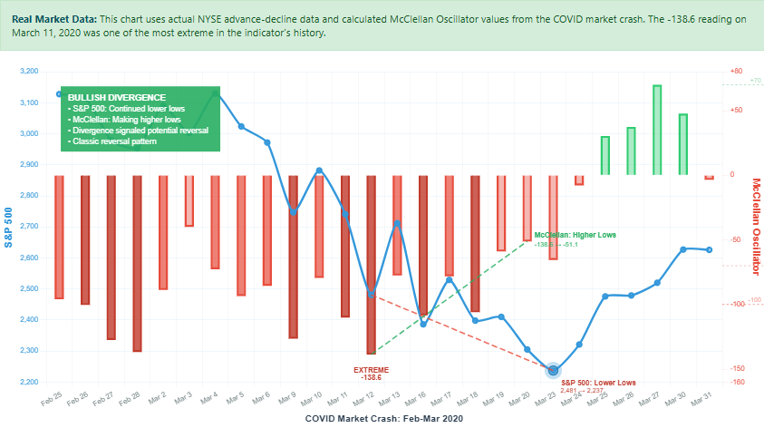
When markets crashed in March 2020, fear dominated headlines, but the McClellan Oscillator told a different story. As the S&P 500 fell 34% from its February peak, the oscillator plunged to –300—one of the most extreme oversold readings in its 55-year history.
Figure 1 shows the power of divergence analysis during the March 2020 crash. The bullish divergence provided an early warning that selling pressure was exhausting, giving investors objective evidence to consider adding positions near the market bottom.
Figure 1
Though the S&P 500 index continued making lower lows through March 23, 2020 (red dashed trend line), the McClellan Oscillator made higher lows after its March 12, 2020, extreme of –138.6 (green dashed trend line).
Source: QuoteMedia; chart generated by Claude.ai.
This wasn’t just another market decline; it was panic- selling. When the oscillator reaches such extreme levels, it signals that selling has become exhausted and indiscriminate. Smart investors who recognized this pattern and began buying in late March—when everyone else was paralyzed by fear—captured the entire recovery that followed. The lesson is: Extreme fear often creates the best buying opportunities.
The Lehman Brothers collapse sent shockwaves through global markets. The McClellan Oscillator hit –400 in October 2008—the most extreme reading ever recorded. While this seemed terrifying at the time, it actually marked the final capitulation that preceded the bear market.
Investors who understood that such extreme readings typically mark major bottoms positioned themselves for the 11-year bull market that followed. This real example offers a key insight: When everyone is selling and the oscillator reaches unprecedented extremes, contrarian positioning often pays off handsomely.
The opposite extreme occurred during the dot-com bubble. Throughout 1999 and early 2000, the McClellan Oscillator frequently exceeded +150 as internet stocks soared. These extreme positive readings warned that too many investors had become euphoric—a dangerous sign.
While the oscillator couldn’t pinpoint the exact market top, it correctly warned that participation had reached unsustainable levels. Investors who heeded this warning and reduced exposure avoided much of the subsequent 78% decline in the Nasdaq Composite.
These examples reveal a consistent pattern: Readings below –200 typically mark significant bottoms when fear reaches extreme levels, while sustained readings above +150 often warn of dangerous optimism. The timing varies, but the oscillator’s message about market participation extremes has remained reliable across different market environments.
Contemporary markets present unique challenges for breadth analysis that didn’t exist in 1969 when the McClellan Oscillator was developed. Algorithmic trading now accounts for over 70% of equity volume, creating rapid intraday breadth shifts that can generate false signals. The rise of passive investing, with approximately 60% of U.S. equity funds now passive, means that exchange-traded fund (ETF) flows can cause entire sectors to move in lockstep regardless of individual fundamentals.
These structural changes require adaptation rather than abandonment of breadth analysis. Professional analysts increasingly use longer time frames to filter algorithmic noise and combine breadth measures with other indicators for confirmation. Individual investors can adopt similar approaches by focusing on weekly rather than daily patterns and using the oscillator to assess market health rather than precise timing.
Tom McClellan, current editor of The McClellan Market Report and son of the oscillator’s inventors, acknowledges these challenges while maintaining the tool’s validity. “The McClellan Oscillator measures acceleration in breadth, not just direction,” noted McClellan on the McClellan Financial Publications site. “While market structure changes affect readings, breadth divergences remain valid warning signals when properly interpreted.”
Individual investors should approach McClellan Oscillator analysis as a risk management tool rather than a timing mechanism. Here is what the most effective applications involve.
Even experienced investors can misapply the McClellan Oscillator, leading to poor timing and unnecessary losses.
No single technical indicator is infallible, and the McClellan Oscillator has specific limitations investors must understand. It measures market participation, not direction, and it can remain at extreme levels longer than expected during powerful trends. False signals occur, particularly during transitional periods when market structure changes rapidly.
The McClellan Oscillator’s 55-year track record demonstrates that market breadth analysis remains relevant despite significant changes in market structure. While algorithmic trading and passive investing create new interpretation challenges, the fundamental principle that sustainable moves require broad participation hasn’t changed.
Individual investors who master breadth analysis gain perspective unavailable from price charts alone. They can distinguish between healthy rallies supported by broad participation and vulnerable advances driven by narrow leadership. They can identify oversold conditions that create opportunities and avoid the common mistake of buying during distribution phases when smart money is selling.
The tool requires no complex software or advanced mathematics—just the discipline to monitor periodically and the wisdom to act on what it reveals.
AAII Sentiment Investing

AAII Sentiment Investing

Technical Analysis

ROBERT A from NC posted 11 months ago:
BARRY J from TX posted 11 months ago:
JOHN L from NJ posted 11 months ago:
JOHN L from NJ posted 11 months ago:
You need to log in as a registered AAII user before commenting.
Log InCreate an account