

Related
AAII Sentiment Investing
The new highs/new lows indicator provides a simple yet powerful window into the market’s internal health.
by John Bajkowski | April 2026

Stock market indexes such as the S&P 500 index often dominate financial headlines, but they don’t always tell the full story about what is happening beneath the surface of the market. Because most major indexes are weighted by market capitalization, a relatively small number of large companies can drive index performance even when many other stocks are struggling or surging.
Breadth indicators help investors look beyond the index level to see how broadly stocks are participating in a market move. By measuring how many individual stocks are rising or falling, these indicators provide insight into the market’s internal strength or weakness. When large numbers of stocks advance together, it suggests a healthy and broadly supported market trend. When only a narrow group of stocks is driving gains, the advance may be more fragile.
One of the simplest and most widely followed ways to evaluate market breadth is the new highs/new lows indicator, which tracks how many stocks are reaching new 52-week highs compared to those falling to new lows over the same period. Among the most closely watched versions of this indicator is the New York Stock Exchange (NYSE) new highs/new lows, which provides a straightforward snapshot of how widely market leadership is spreading across stocks.
Understanding this participation dynamic can help investors interpret market conditions more clearly, identify potential turning points and avoid being misled by headline index movements.
The most common way to evaluate new highs and new lows is through a measure known as net new highs.
The calculation is straightforward:
Net New Highs = Number of New 52-Week Highs − Number of New 52-Week Lows
For example, if 160 stocks reach new 52-week highs while 40 fall to new lows, the net reading would be +120. This positive reading indicates that more stocks are advancing strongly than declining sharply.
Conversely, if 40 stocks reach new highs while 180 fall to new lows, the net reading would be –140, signaling widespread weakness across the market.
Because the indicator measures the behavior of individual stocks rather than weighting companies by market cap, it provides a clearer picture of market participation than traditional indexes.
Daily new highs and new lows can fluctuate significantly from one trading session to the next. Large market swings, earnings announcements and sector rotations can create short-term spikes that may not reflect the market’s underlying trend. For this reason, analysts often smooth the data using a moving average.
A commonly used approach is the 10-day moving average of net new highs, which helps reduce day-to-day volatility and highlights the underlying direction of market participation.
When the moving average rises steadily into positive territory, it indicates expanding participation in the market’s advance. When it declines into negative territory, it suggests that weakness is spreading across a larger portion of stocks.
By smoothing daily readings, investors can better distinguish between temporary fluctuations and meaningful shifts in market internals.
Analysts often classify market conditions based on the level of net new highs. When smoothed with a moving average, the indicator can help identify broader breadth regimes, which reflect the underlying strength or weakness of the market.
These thresholds provide practical benchmarks for net new highs.
These ranges help investors determine whether market leadership is expanding broadly across stocks or narrowing to a smaller group of companies.
Periods when net new highs remain strongly positive often correspond with sustained market advances, while extended negative readings frequently accompany market corrections or bear markets.
While these thresholds help define overall market conditions, analysts also watch for changes in the trend of net new highs, particularly when breadth begins to diverge from price.
One of the most valuable signals provided by the new highs/new lows indicator occurs when market breadth diverges from price.
A bearish divergence develops when a market index continues rising while the number of stocks reaching new highs begins to decline. This indicates that fewer stocks are participating in the advance, suggesting that market leadership is narrowing.
Such conditions often appear late in market cycles, when a small group of large stocks continues pushing indexes higher while the broader market begins to weaken.
Conversely, a bullish divergence occurs when market prices decline but the number of new lows begins to shrink or net new highs start improving. This pattern suggests that selling pressure may be diminishing even though prices have not yet stabilized.
Divergences often develop weeks or even months before major market turning points, making them one of the most valuable signals provided by breadth indicators.
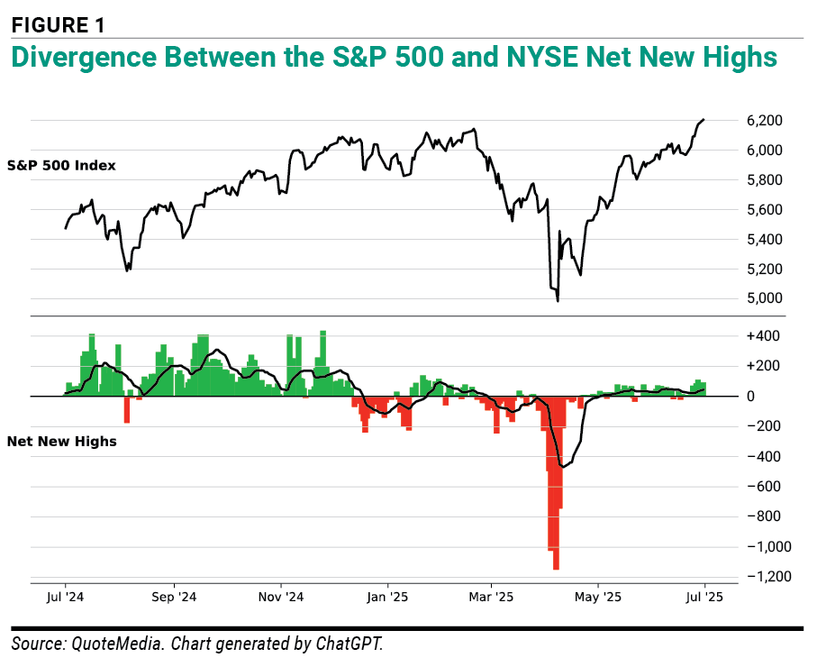
Figure 1 illustrates this type of divergence. While the S&P 500 continued rising from October 2024 into early 2025, net new highs began declining, signaling weakening participation beneath the surface. Narrowing breadth like this often precedes market pullbacks, as leadership becomes concentrated in a smaller group of stocks.
Net new highs can also be used in a way similar to the Advance/Decline (A/D) line by creating a high/low line based on cumulative net new highs. This approach transforms daily readings into a running total, producing a line that reflects the longer-term trend in market breadth.
The calculation is straightforward. Starting with the first day’s net new highs reading, each subsequent day’s value is added to the running total. When new highs consistently exceed new lows, the line rises, indicating strengthening market participation. When new lows dominate, the line declines, signaling weakening breadth.
Because the high/low line smooths daily fluctuations, it can help investors identify longer-term changes in market participation that may not be immediately visible in daily readings.
Like other breadth indicators, the high/low line can also reveal important divergences when market indexes continue rising while the cumulative breadth trend begins to weaken. Such divergences may signal that fewer stocks are supporting the market’s advance and the underlying trend is losing momentum.
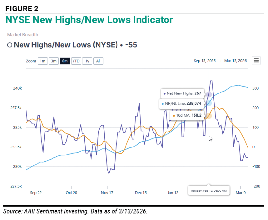
Figure 2 is a chart of the NYSE new highs/new lows indicator tracked in AAII Sentiment Investing. It combines the daily net new highs readings (purple line), the 10-day moving average of the net new highs (gold line) and the cumulative high/low line (light blue line) to illustrate their interaction over the six-month period ended March 13, 2026.
Occasionally, market participation expands rapidly over a short period. These episodes are known as breadth thrusts.
A breadth thrust occurs when the number of new highs increases sharply within a short time after a period of weak breadth. This sudden surge reflects broad buying demand across many sectors and industries.
Historically, powerful breadth thrusts have often appeared near the beginning of sustained market advances. When many stocks begin rising at the same time, it suggests that investor confidence is improving and that upward momentum may be spreading more broadly across the market.
Because breadth thrusts are relatively rare, they tend to carry added significance when they occur.
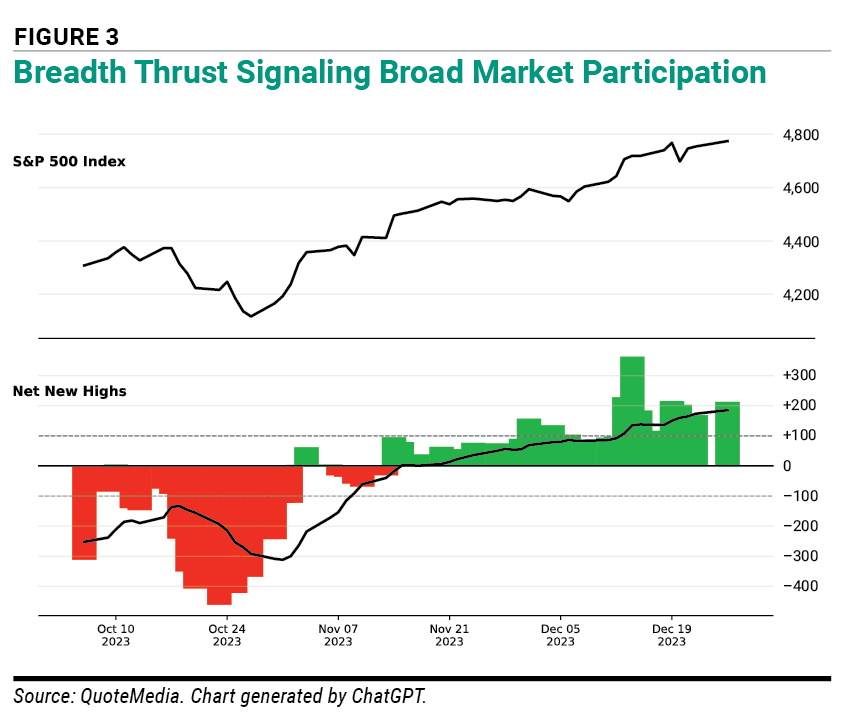
Figure 3 shows an example from late 2023, when the NYSE new highs/new lows indicator improved sharply over a short period. After a stretch of weak breadth in late October, daily net new highs turned strongly positive and the 10-day moving average climbed rapidly, signaling a broad expansion in market participation. At the same time, the S&P 500 moved higher, confirming that the rally was being supported by more than just a narrow group of stocks. Such surges in breadth often indicate that buying interest is spreading across the market and can help confirm the strength of an advancing trend.
The new highs/new lows indicator can help investors better understand the strength or weakness underlying market moves.
Trend Confirmation: When major indexes rise while net new highs expand, the rally is being supported by broad participation and is generally more sustainable.
Early Warning Signals: If market indexes continue rising while the number of net new highs weakens, investors should be more cautious. Such a pattern suggests that the advance may be relying on a narrowing group of leaders rather than broad market strength.
Identifying Opportunities: Extreme negative readings often occur during periods of panic selling. When large numbers of stocks are simultaneously falling to new lows, selling pressure may be nearing exhaustion. In some cases, such conditions mark the early stages of important market recoveries.
Even experienced investors can misinterpret breadth indicators if they rely on them improperly.
Reacting to Single-Day Readings: Daily new highs and new lows can fluctuate widely. Investors should focus on the broader trend rather than on isolated daily spikes.
Ignoring Market Context: Breadth signals should always be interpreted within the broader market environment. A moderately negative reading during a bull market correction may carry different implications than the same reading during a bear market decline.
Expecting Precise Timing: Breadth indicators often highlight changes in market participation before prices fully respond, but they rarely identify exact market turning points.
Using the Indicator in Isolation: Breadth analysis is most effective when used alongside other tools, such as price trends, volume patterns and momentum indicators.
Financial markets have changed significantly in recent decades. Algorithmic trading now accounts for a large share of daily trading activity, while passive index funds and exchange-traded funds (ETFs) can influence price movements across entire sectors at once.
These structural changes can create rapid shifts in market breadth that were less common when many traditional indicators were first developed.
Even so, the core principle behind breadth analysis remains the same: Sustainable market trends usually require broad participation across many stocks.
Professional investors increasingly use breadth indicators alongside other analytical tools and often place greater weight on longer-term trends than on short-term fluctuations. Individual investors can take a similar approach by monitoring breadth indicators to evaluate the market’s internal strength.
The new highs/new lows indicator provides a simple yet powerful window into the market’s internal health. While headline indexes may be driven by a relatively small number of large companies, breadth indicators reveal whether strength or weakness is spreading across the broader market.
By monitoring the balance between stocks reaching new highs and those falling to new lows, investors can gain useful insight into market participation, momentum and potential turning points.
No indicator can predict the future with certainty. But understanding market breadth can help investors distinguish between healthy rallies supported by broad participation and more fragile advances driven by narrow leadership.
Looking beneath the surface of the market can give investors a clearer perspective and help them navigate changing conditions with greater confidence and discipline.
AAII recently launched a new Sentiment Investing Dashboard to help you interpret and apply sentiment indicators. It includes 10+ indicators measuring investor sentiment and market sentiment, breadth, valuation, trend and volatility. The NYSE new highs/new lows indicator is tracked with other market breadth indicators. Find out more at AAII Sentiment Investing.
AAII Sentiment Investing

AAII Sentiment Investing

AAII Sentiment Investing

ROBERT A from NC posted 6 months ago:
BARRY J from TX posted 5 months ago:
You need to log in as a registered AAII user before commenting.
Log InCreate an account